It'd be awesome if you help us to spread the word!
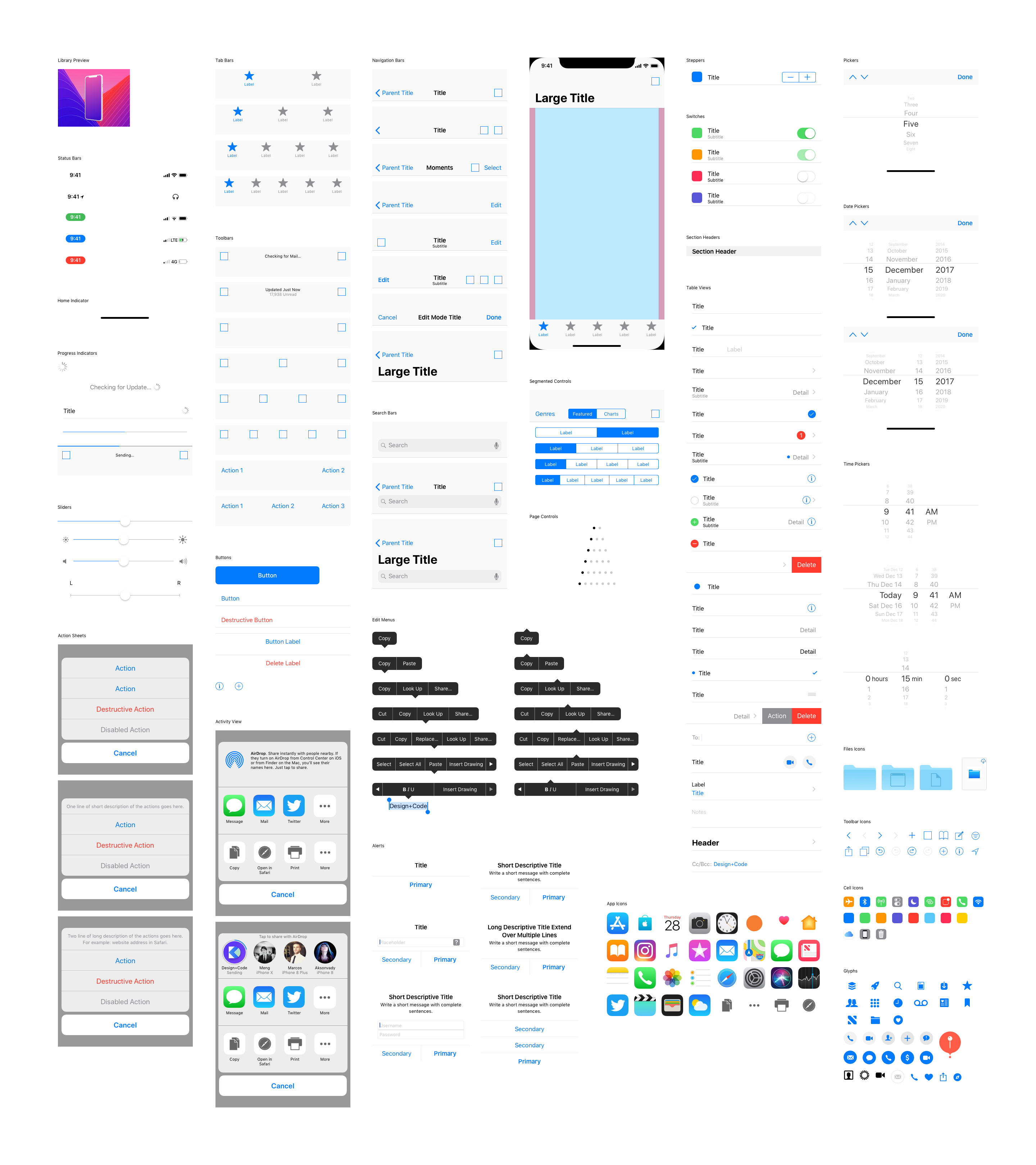
iOS 11 UI Kit
for iPhone X
The most comprehensive iOS 11 UI Kit for Sketch
 Made for Sketch
 Watch theVideo
Designed with deep consideration of Apple's Human Interface Guidelines.
All of the components, layouts and typography are made according to Apple's Human Interface Guidelines. The naming convention of each component strictly follows Apple Developer Documentation so you can get familiar with it when you implement your designs in Xcode.

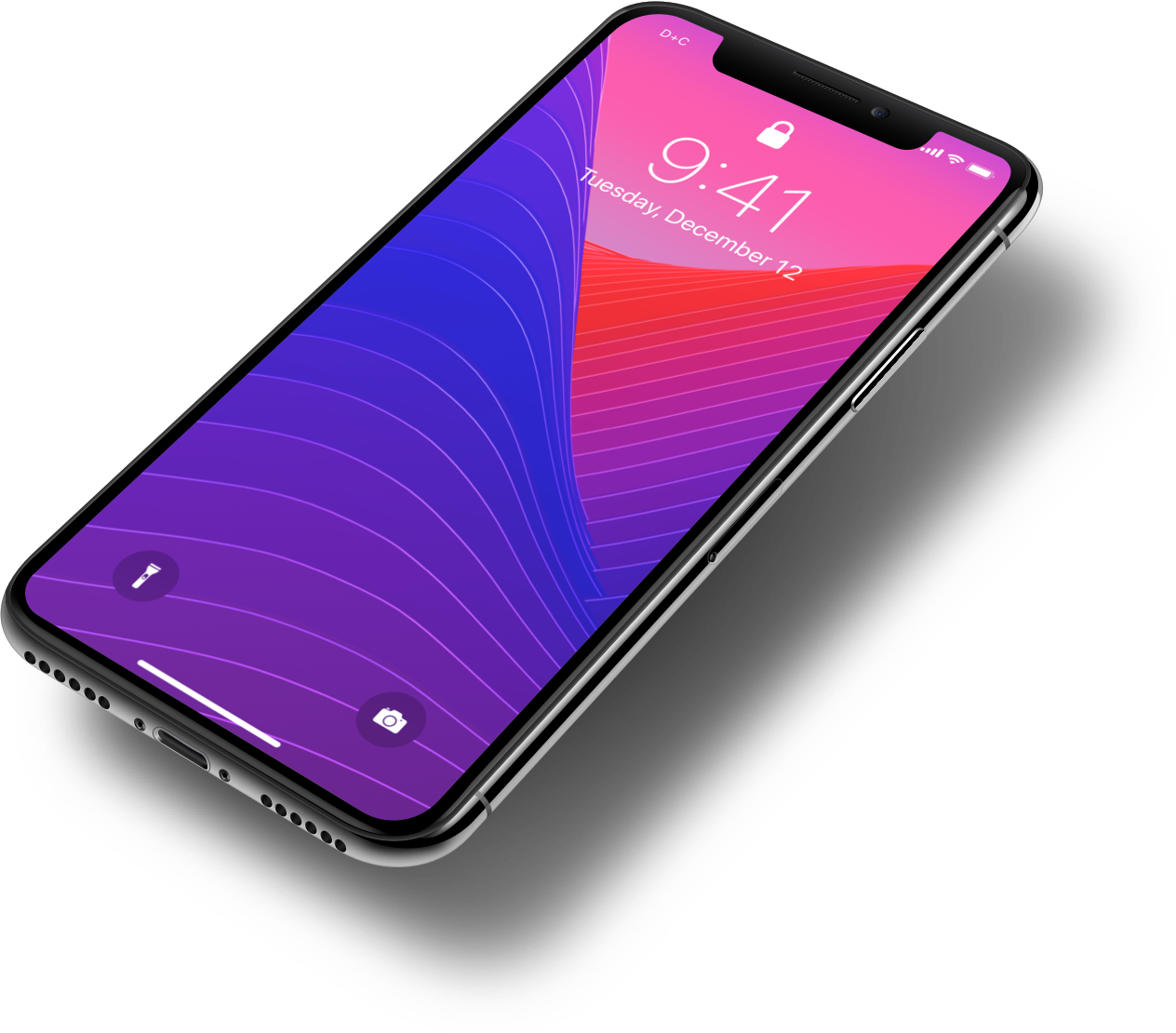
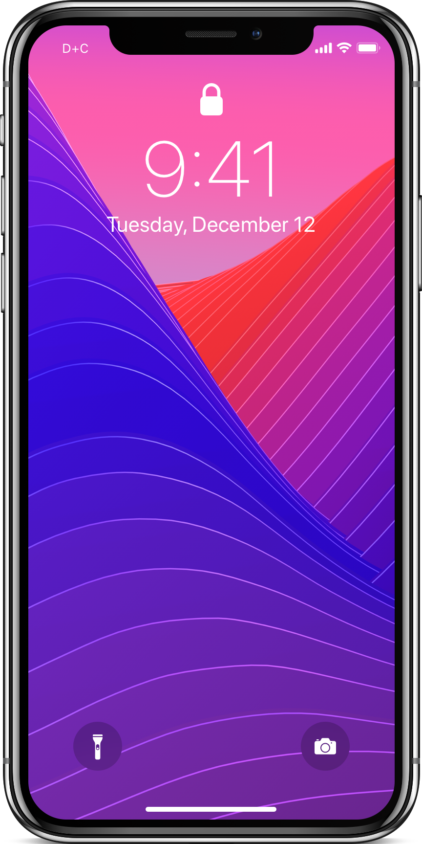
Designed at 1x for iPhone X in Sketch

Customizable iOS 11 native components

Ready to be use as Sketch Library
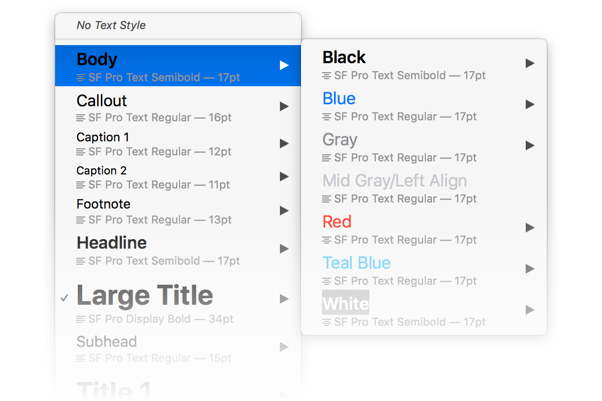
iOS 11 Typography
The whole UI Kit is design with iOS 11 type sizes with the system typeface in iOS, San Francisco. You can easily apply or change text style with the font you desire. Download the latest version of SF Pro font here.
Resizable Nested Symbols
All elements can be easily resized to any width or height for different screens sizes. Most of the Symbols are created with customization in mind. You can override Symbols labels, icons or states at any time.

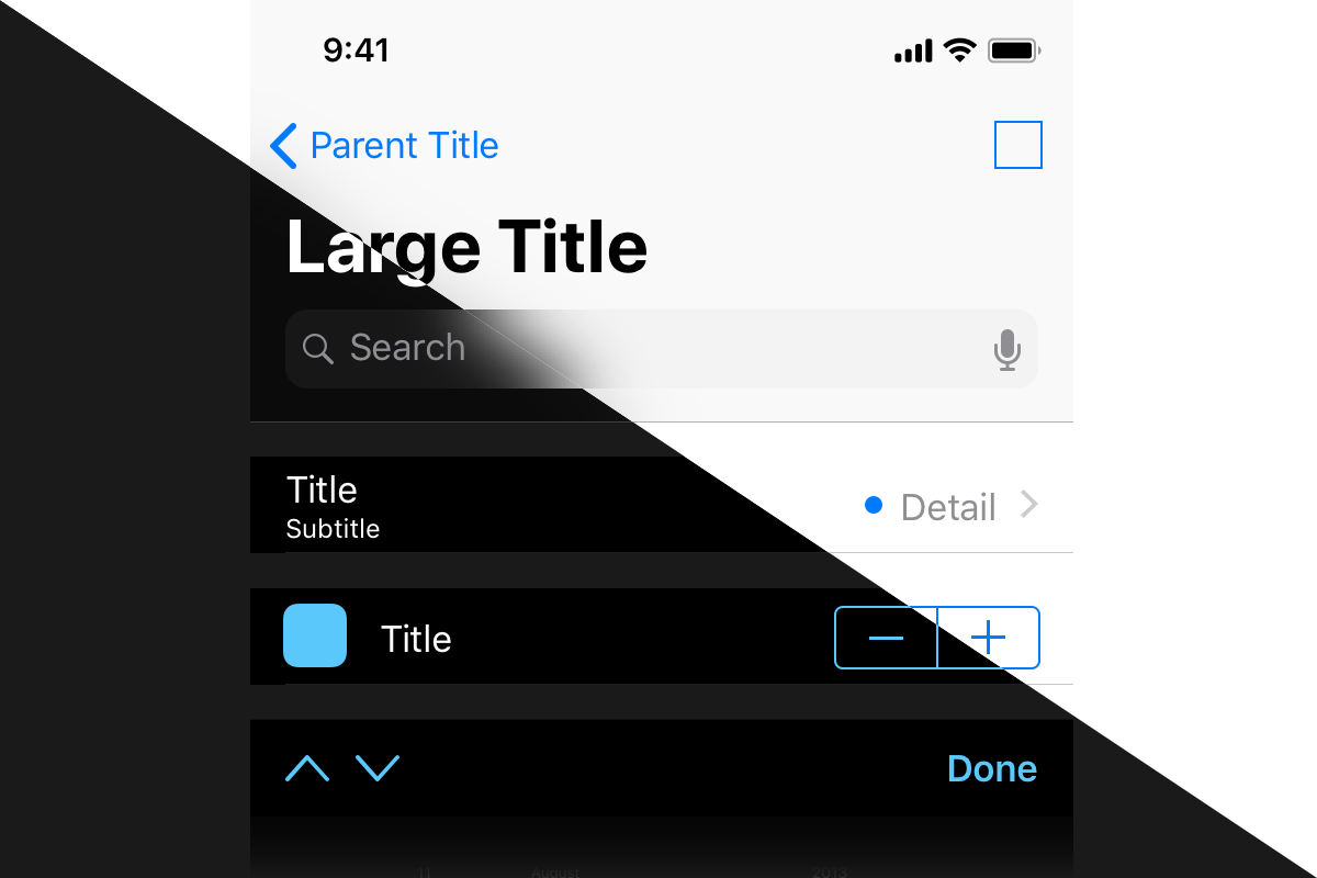
Dark Theme UI Kit
Most of the components have been designed in two versions, the light and the dark themes. Because who doesn't love a dark UI?
Dark Mode Enabled
Hope this will be useful to you. If you have any request or questions for the UI , email us at support@designcode.io