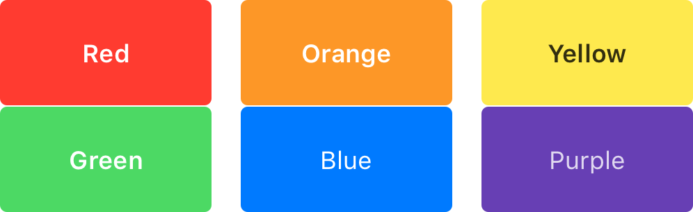
Primary, Secondary and Tertiary Colors
I suggest starting with a vibrant, pastel color that is Primary or Secondary. There is no wrong pick. It’s how you use it and what you choose to complement it.

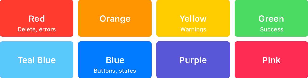
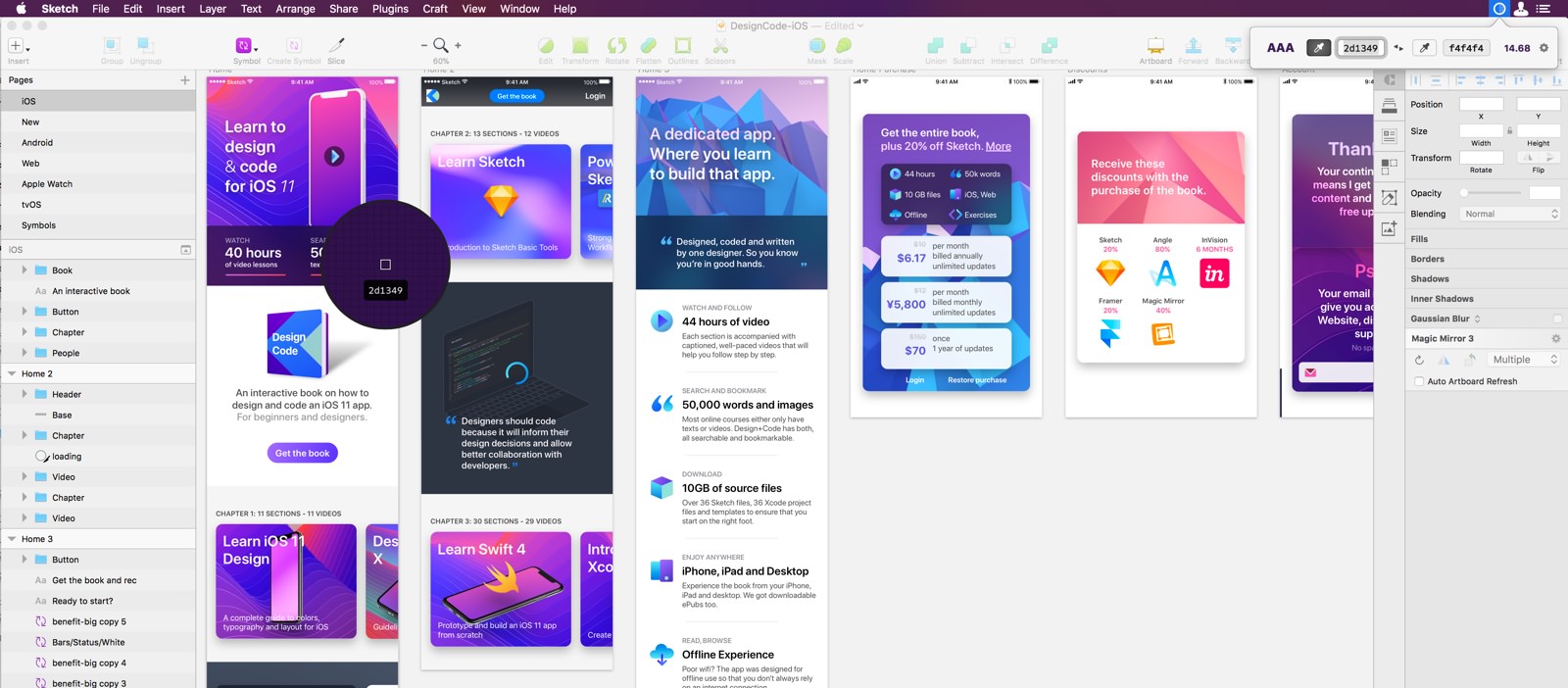
iOS Palette
These are the colors used by Apple in their native apps. They’re vibrant, but not too flashy. In general, blue is used system-wide as the universal color for buttons, icons and actionable items. But other colors can be used to set the brand like yellow for Notes, pink for Apple Music, green for Messages, etc. If you’re in doubt, use blue. When designing, please keep in mind that red is generally used for destructive actions and green for successful actions.
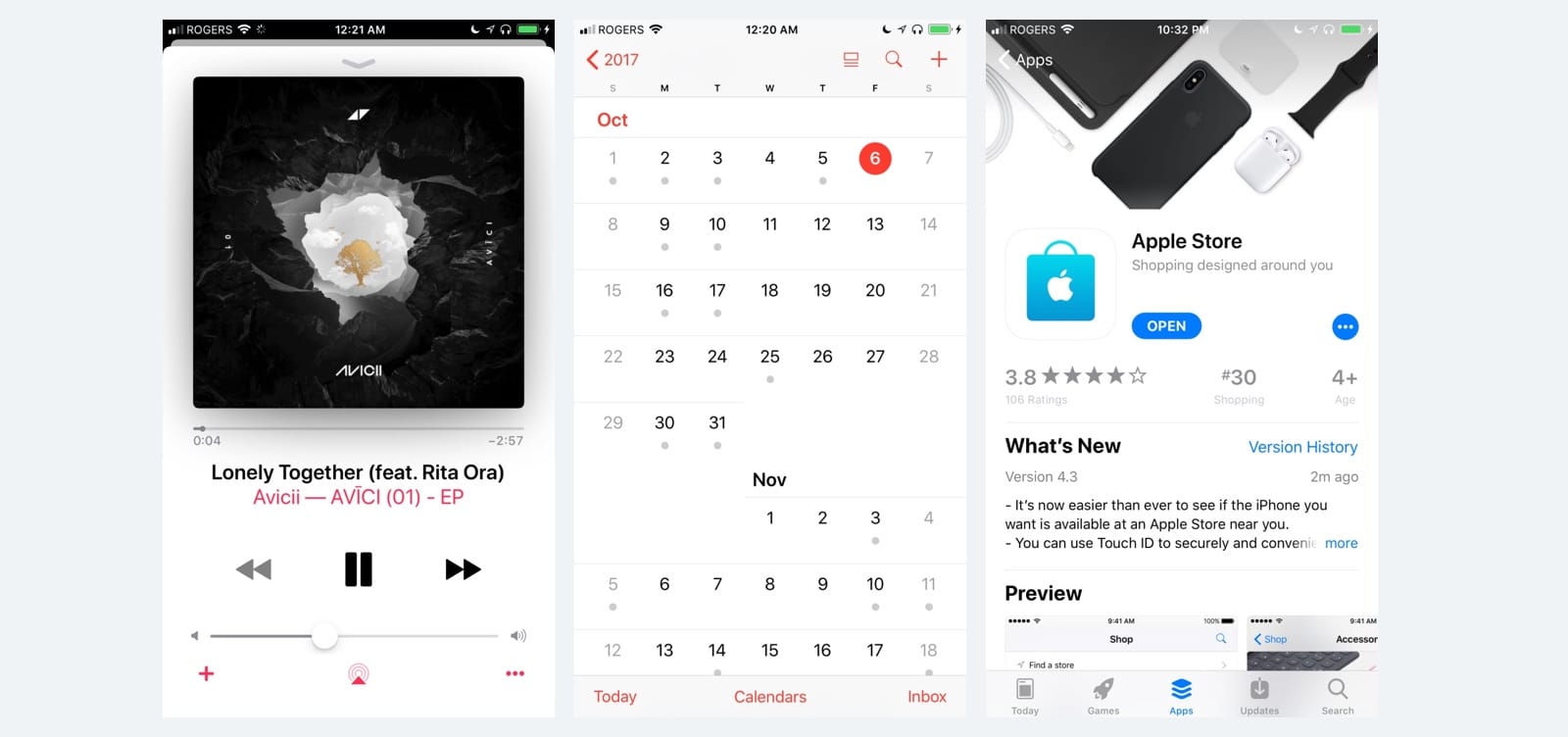
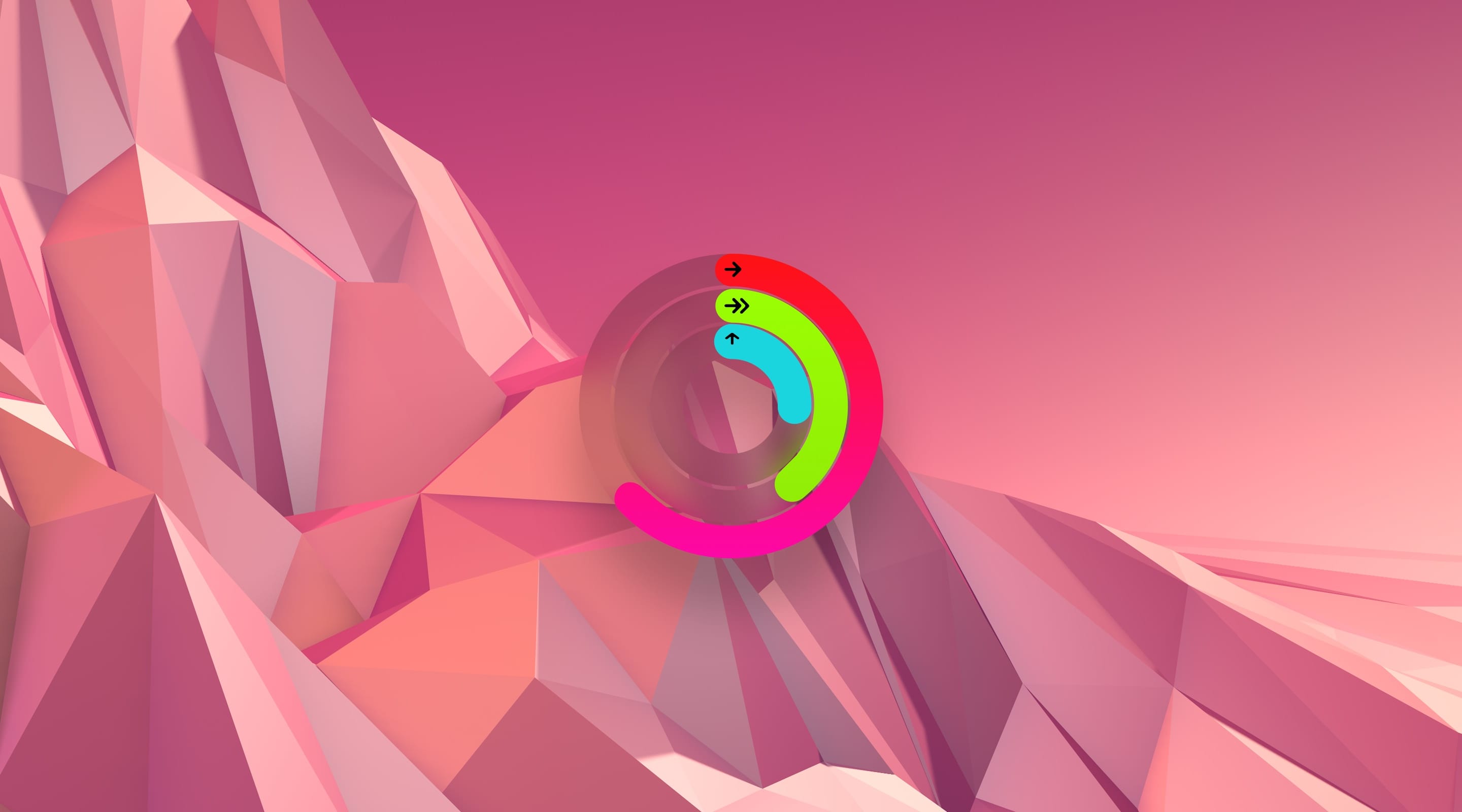
Example
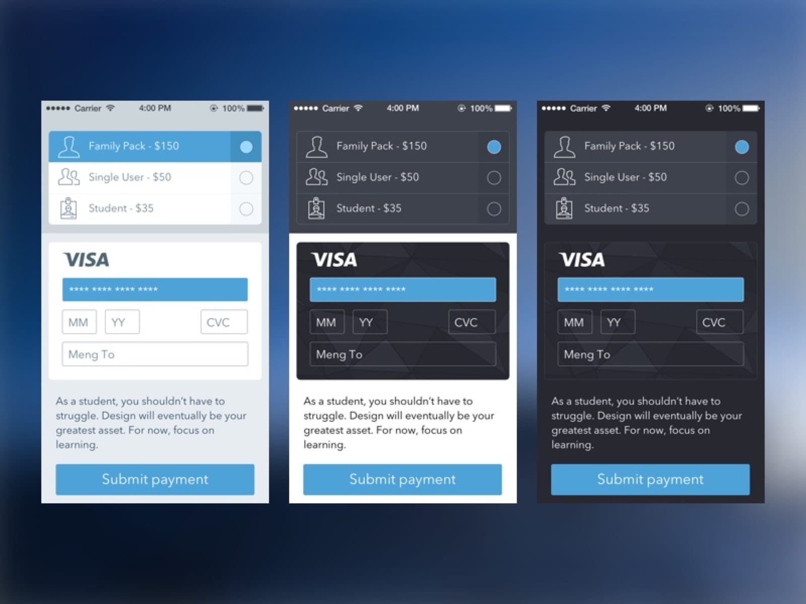
Colors are used minimally to direct the attention to interactive places. Items that are not actionable are generally more muted and neutral, using black, grey or white. Try to use a single color if possible and let the content do the speaking.
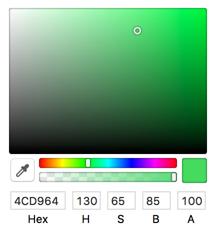
Hue, Saturation, Brightness
When manipulating colors, it is important to understand the properties relevant to colors. A lot of people use RGB, but personally I found HSB to be a lot easier to manipulate. That’s because it is hard to tell how much Red, Green or Blue there is to a color. On the other hand, I can easily map in my mind how much Hue, Saturation and Brightness. Those values make a lot more sense to me.
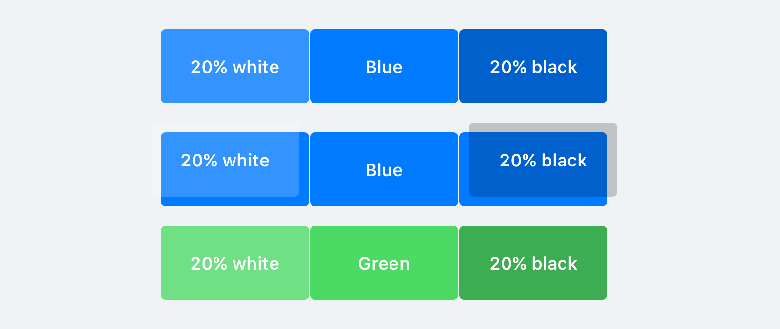
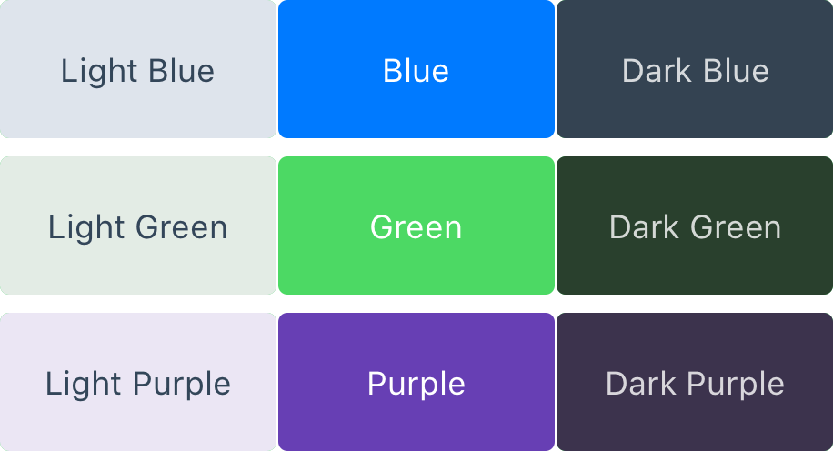
Monochrome Colors
The most common scenario is to have one main color and apply a 10-90% white or black layer on top. Sticking to one main color can prove to be a wise decision, especially for those who are not comfortable with colors yet. Simplification always helps new concepts.
By adding a Black or White layer with varying degrees of opacity, you get new monochrome colors, and they complement each other well.
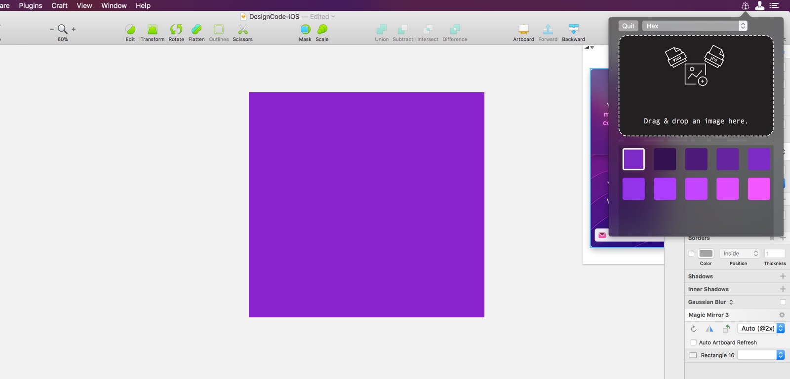
Create a Monochrome Color
As you get more comfortable, you can also use the Color picker to change the Brightness and Saturation. As long as the Hue value is approximately the same (red must remain red), you’ll get monochrome colors.
Analogous Colors
This means picking nearby colors to the main one. From the color wheel, it would be one color next to it. This is especially useful when you have a feeling that your content doesn't provide enough color variations and you have to resort to new colors to spice it up.
For example, Red is next to Orange, which is next to Yellow.

Create an Analogous Color
By changing the Hue value by about 30-50, you get a new Analogous color.
Complementary Colors
The Complementary color is the opposite of the main color. On the color wheel, it's the one in the opposite end. Complementary colors provide excellent contrast, which is important for energizing the mood of your user interface. However, they’re harder to work with, so thread carefully.
Create a Complementary Color
Using the Color picker, you can simply drag the color spectrum (Hue) by about half the width of the bar.
Neutral Tones
Perhaps the most important aspect of colors are the neutral tones. They're the neutralizer and they keep your designs from feeling too heavy. Too many colors mean less usable over a long period of time. Most importantly, the neutral tones defer the user's attention to the content.
Create a Neutral Tone
Neutral tones shouldn’t compete against the main colors. In order to get neutral tones, you have to drag the Saturation to almost 0. Then, you change the Brightness to Light or Dark.
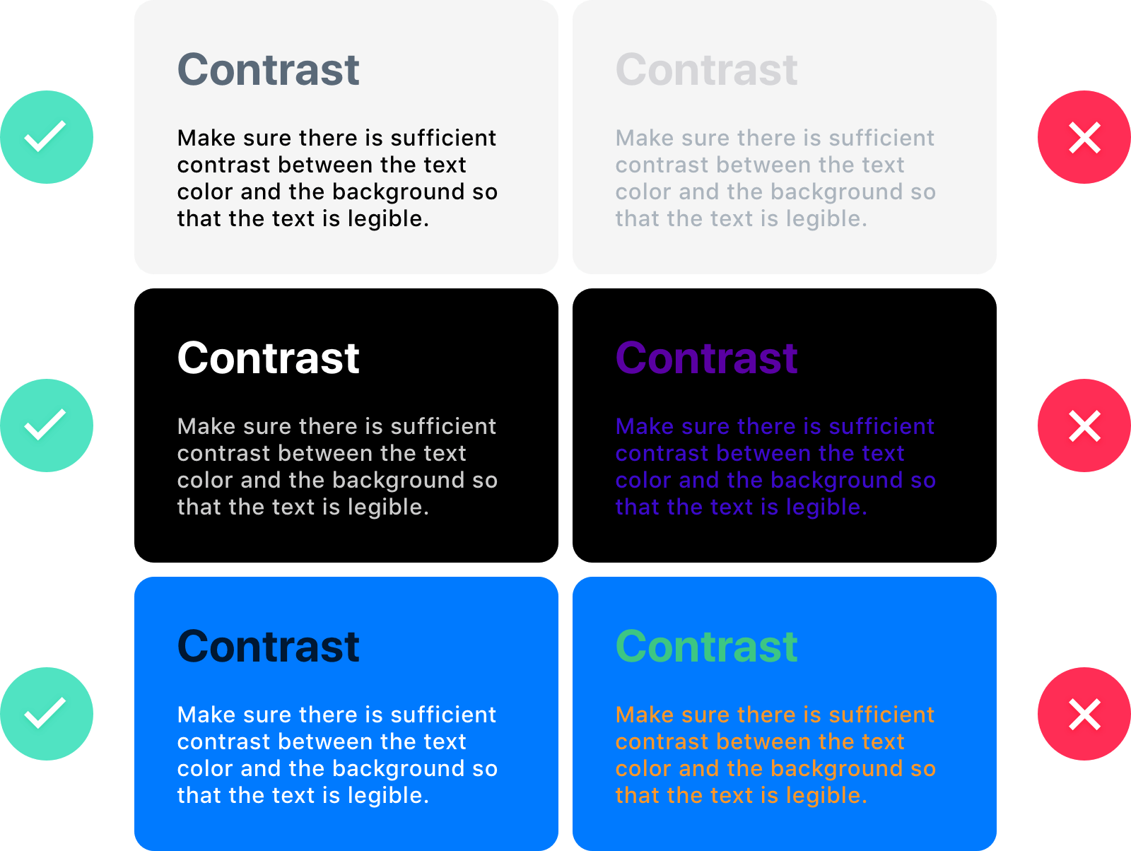
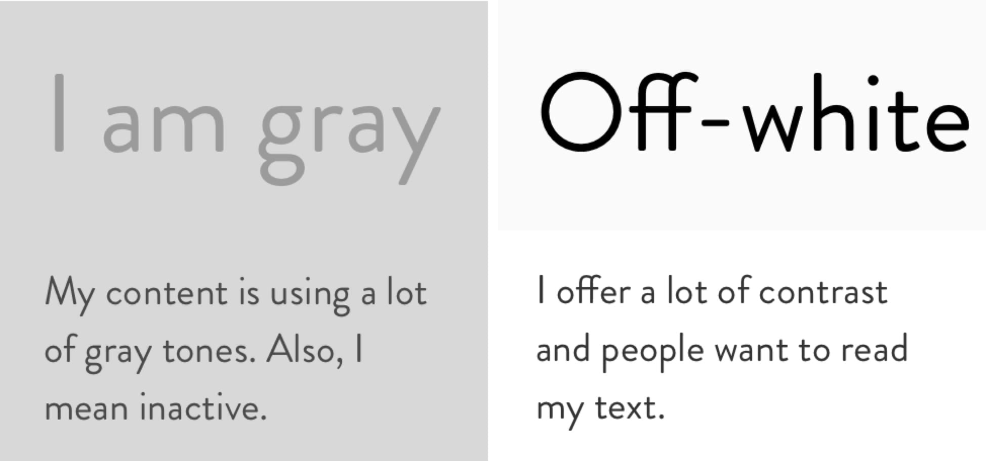
Contrast
Colors shouldn’t be in the way of legibility. Contrast is needed to allow comfortable reading and to immerse the viewer. For good contrast, use opposite ends: white against black, light blue against dark blue, high brightness against low brightness.
Using an Image's Colors
Your surrounding is full of colors that inspire. When you look at beautiful photographs, objects or digital designs, one of the first things that you notice is how beautiful the colors are. When that happens, you should take a picture or screen capture the image, and extract the colors. From those colors, you can create a palette out of it.
Sip is a great iOS app that lets you create a palette out of an photo.

The Manual Way
Manual palette creation is the best way but requires a good understanding of colors. Anything automatic always comes with a price: accuracy. It is best to use your intuition.
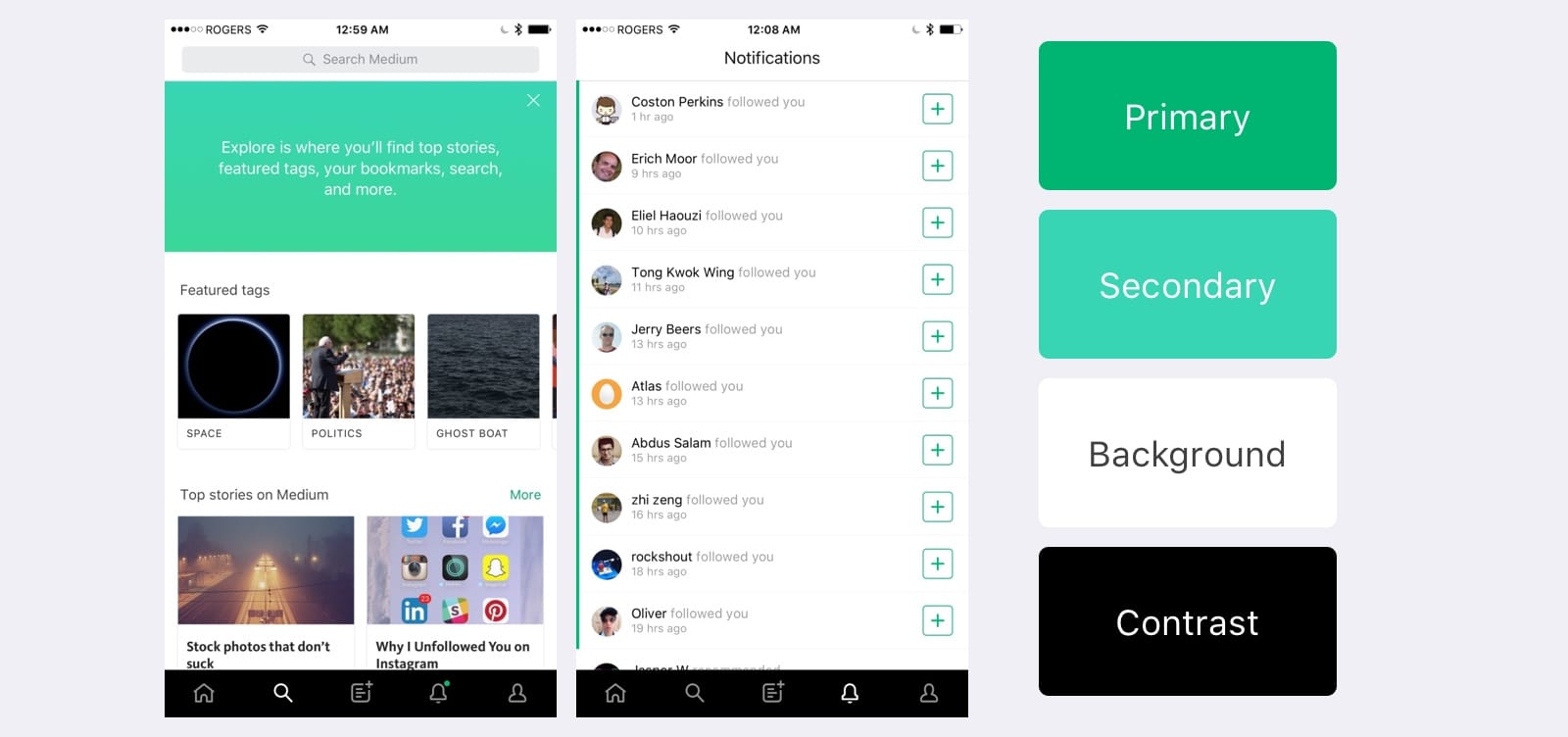
In this example, I picked Medium's iOS App and manually extracted the primary, secondary and neutral tones.
The main color is typically used to draw attention to the call to actions. The second color complements the main color and add variations. As for the background colors, they're used to defer to the content as well as add contrast to the whole design. That's why we have both light and dark (contrasted) backgrounds.
Using Adobe’s Kuler
If you drag and drop an image to Adobe Kuler, it is able to give you the main colors and even the ones in the background.
You can play with the different themes and even move the circles to focus on the UI instead of the background. It's not perfect. However, by customizing a little, I got the palette that I wanted from the image I uploaded.

Collecting Colors
On Dribbble, you can browse and save great color schemes. Then, you can browse colors from a design that inspired you.
The Neutral Palettes
While the main colors are easy to extract, the backgrounds and text colors are not. They're a lot more subtle and require more experimentations and study to get them right. Here are some of my favorite palettes for UI design in term of neutral tones.
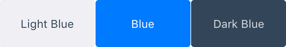
The Blue Palette
Blue is a pleasant color because it reminds people of the sky and water. When people see blue, they’re more likely to feel calm and trusting. Blue generally goes well with other colors.
The Gray Palette
UI colors should avoid absolute black. Black offers too much contrast and blends too well with the iPhone’s physical black screen.
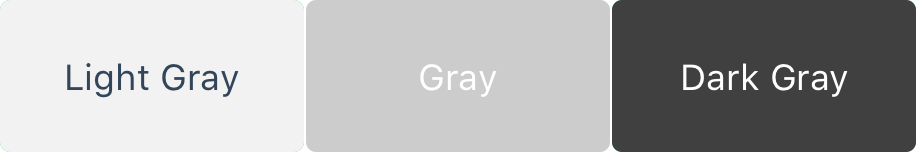
Gray Usage
If you are to use gray, remember to make it dark below 30% or light above 70%. Average gray tones looks dull and don’t complement well other colors.
In this example, we get far more contrast when the Brightness is in that range. As soon as the gray goes mid-tone, we can hardly read the text and the colors don’t look attractive together.
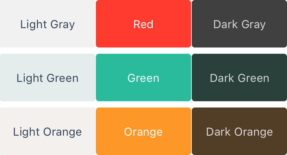
The Custom Palette
Beyond the common blue and gray palettes, you can always pick any color you’d like, just make sure that they complement each other well.
Slide the Hue in your color picker and experiment with Monochrome, Analogous and Complementary colors (in that order). Then, play with Saturation and Brightness to increase contrast and vibrancy.
Light and Dark UI
Sometimes, you have to juggle between light and dark, either for branding or for usability. Think of iBooks: the user interface automatically switches to Dark mode when the ambient light is low.
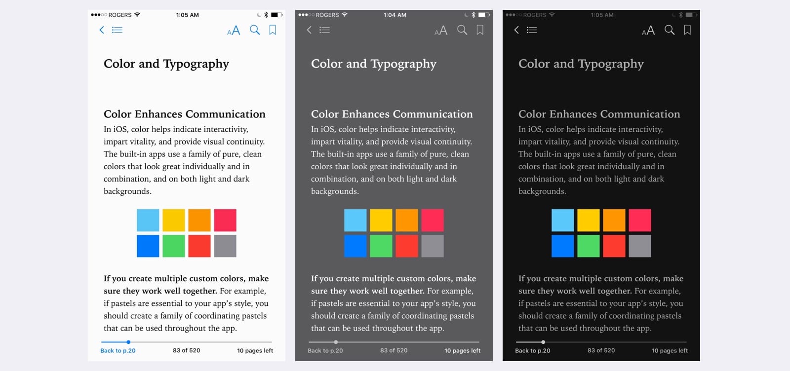
Example for Dark UI
Another example is the Apple Watch: it uses an absolute black background to blend perfectly with the physical bezel.

Guidelines for Light UI
1. The content should be lighter than the background. Objects in focus are usually better lit than the background.
2. Don’t overuse colors. They really grab your attention. Use colors to give importance to buttons and highlighted states.
3. Avoid average colors. 90-100% white is usually the best range.
Guidelines for Dark UI
1. Don’t use absolute black. It’s very hard to see the details in pitch black and the contrast can be too high against white.
2. If you must use black, make sure to have variations of dark gray to alleviate the high contrast.
3. Avoid grays when using blue. Dark blue complements blue better than gray.
Additional Resources
Understanding how colors work, how they complement each other and when to use them is crucial to the branding and usability of your app. These resources will strengthen your mastery of colors and give you valuable tools and examples to apply that knowledge in real projects.
Material Design Colors
A fantastic guide about colors from Google's Material design. This will help you for iOS as well.
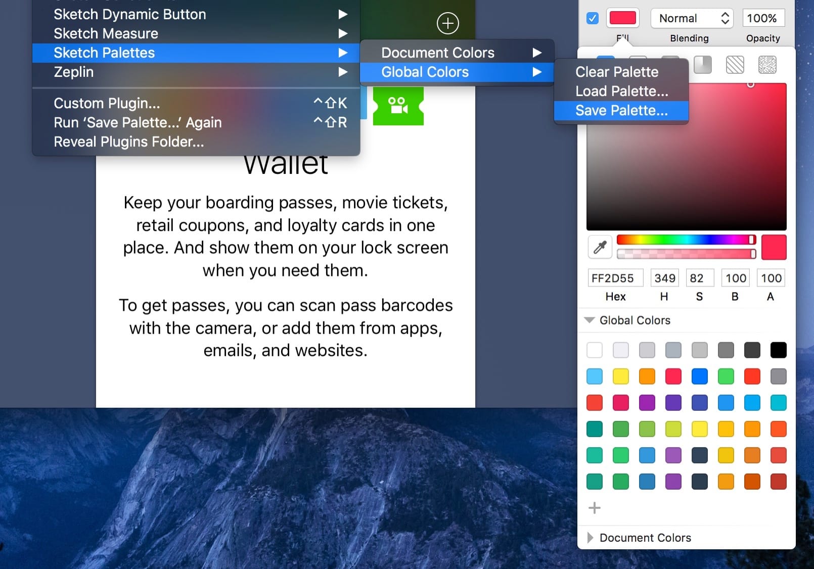
Sketch Palettes
Sketch Palettes lets you easily save and import palettes for both global and document colors. I started a palette using iOS, Material Design and Flat UI colors.
UI Gradients
iOS is known to use beautiful gradients. You can incorporate them inexpensively for your UIs by having two colors that complement each other. This is a nice collection of gradients.
Design your app with accessibility in mind
Contrast App is a practical tool to design and choose the right colors following the accessibility guidelines.
You can make sure that the text you're designing isn't too light in your interface designs. You can enter hex codes manually or use the built-in color picker for sampling colors directly from your designs.
It'll stay on top of your active design tool for quick access to the WCAG contrast scores.
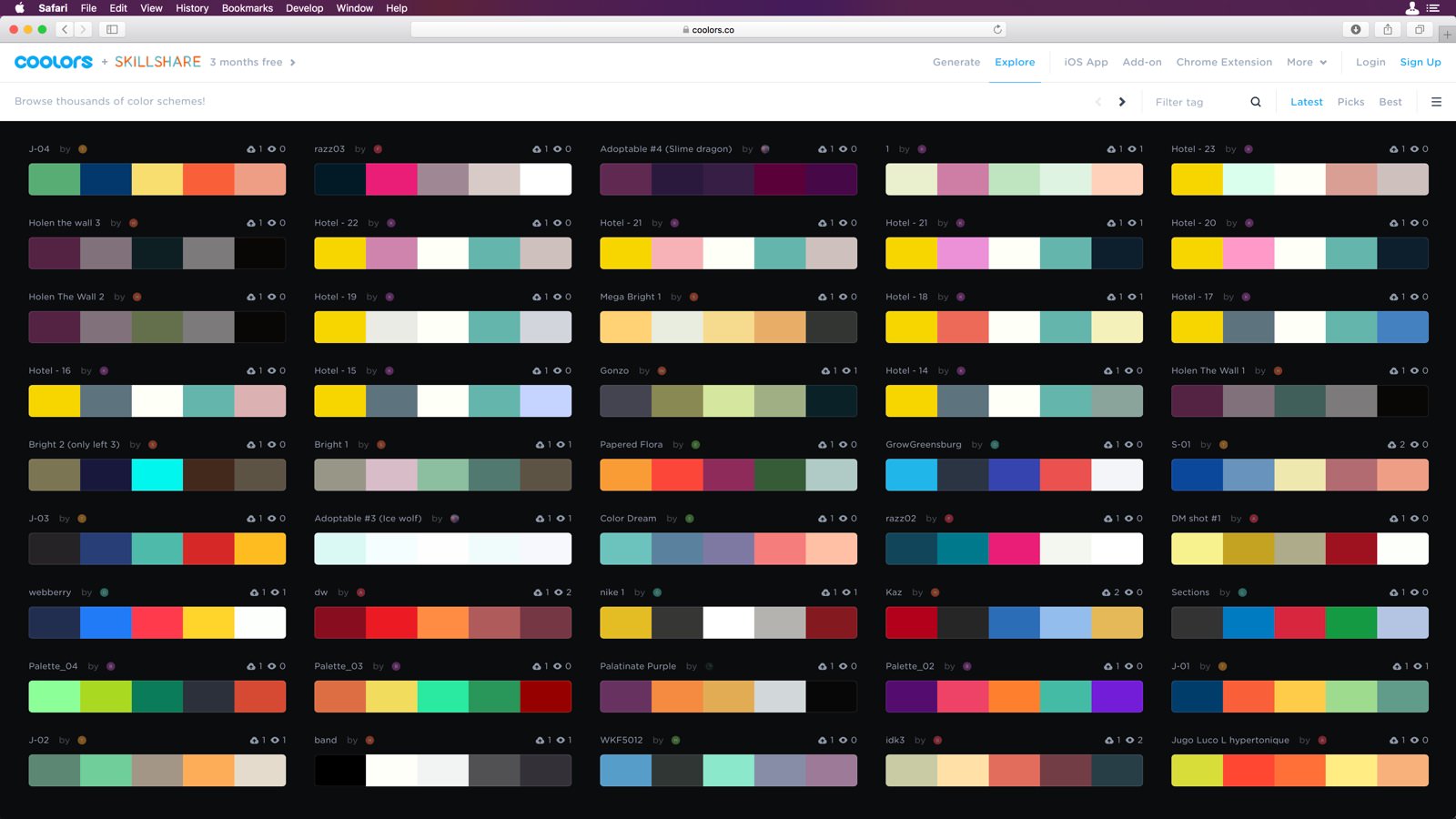
Coolors.co
Coolors.co is a quick color scheme generator, with just pressing the spacebar you will be able to browse through different palettes in seconds. If you like a single color, you can lock that color and keep browsing until you find your dreamed palette, once you have your palette you can export it. It also has its iOS App which is handy.
Color Juicer
This is another helpful App which will help you to obtain the dominant colors from an image and create your palette in seconds with just dragging and dropping the image to the App. Once the App will create for you a palette, you will be able to copy any color with only one click.


