Typography Basics
It’s important to learn these typography terms and what they mean. These names will be employed often when explaining typography.

Rules of Good Typography
Unless you’re a typography aficionado, you’ll want something clean and simple first, not necessarily original. Good typography makes us want to read, so it's best to focus on its utility. Let’s look at these 5 rules of good typography and apply them to modern design for mobile and for Websites.
San Francisco Font
The default font for iOS is San Francisco, which is made in-house by Apple. You can download the new fonts at this link. It’s beautiful, free and most importantly, designed for legibility. I encourage you to watch the video to understand how it affects the design for iOS.
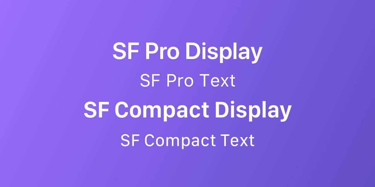
SF Pro Font Tracking Value
iOS automatically adjusts the tracking value and Text/Display for San Francisco based on the font size. This ensures that the typeface is always easy to read. At 20 pt or more, SF UI Display should be used, otherwise use SF UI Text. These tracking values can only be applied in Photoshop, but here’s a formula for converting in Sketch.
Use this Sketch plugin to quickly apply the correct character spacing values.
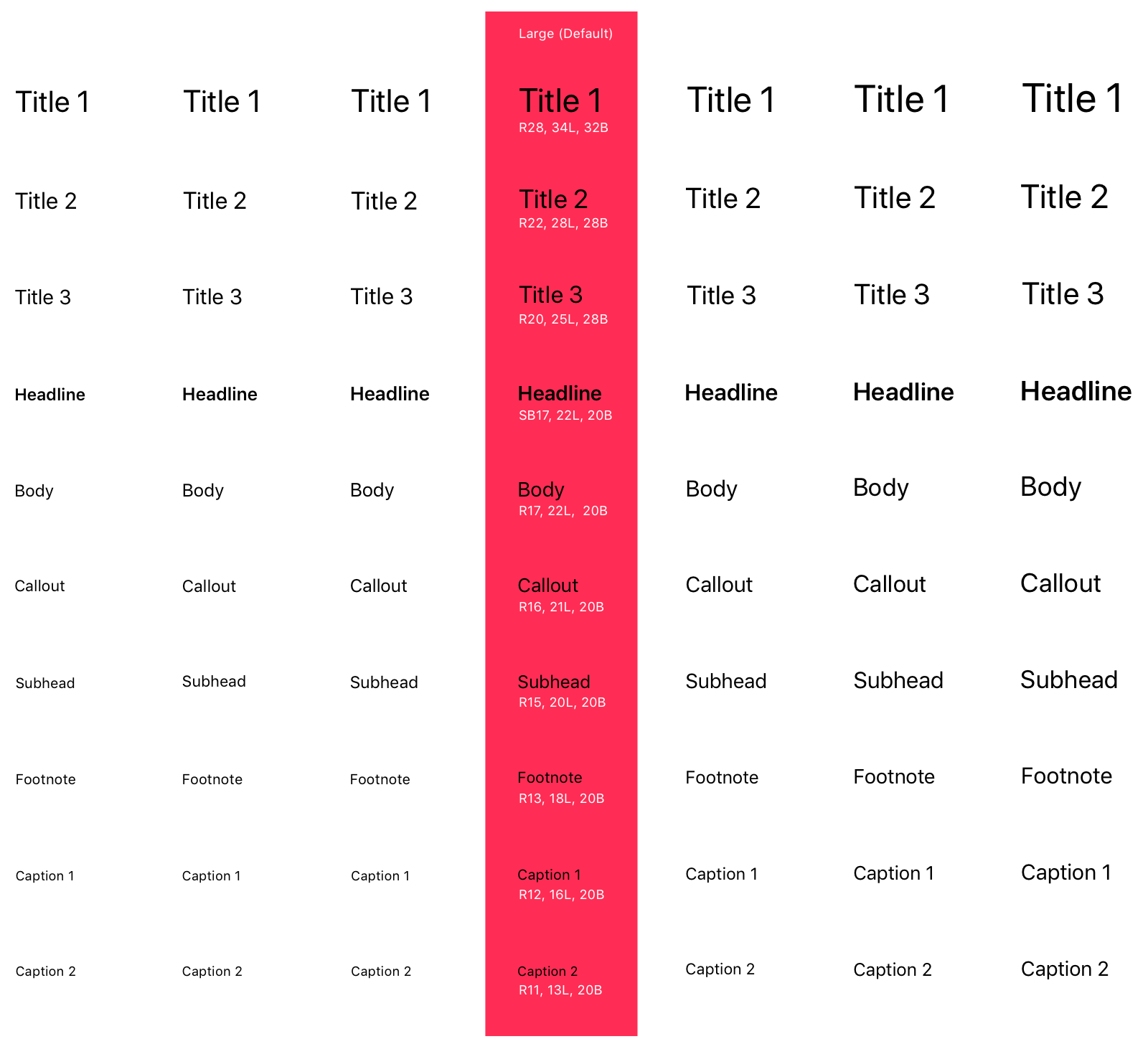
Dynamic Type
Accessibility is a prominent theme in iOS 11. Now, there are dynamic font presets, as shown in this image. Like this, if you set your text to Body, and enable Dynamic Type, the system will automatically increases the size based on the user’s preferences.
Body Text
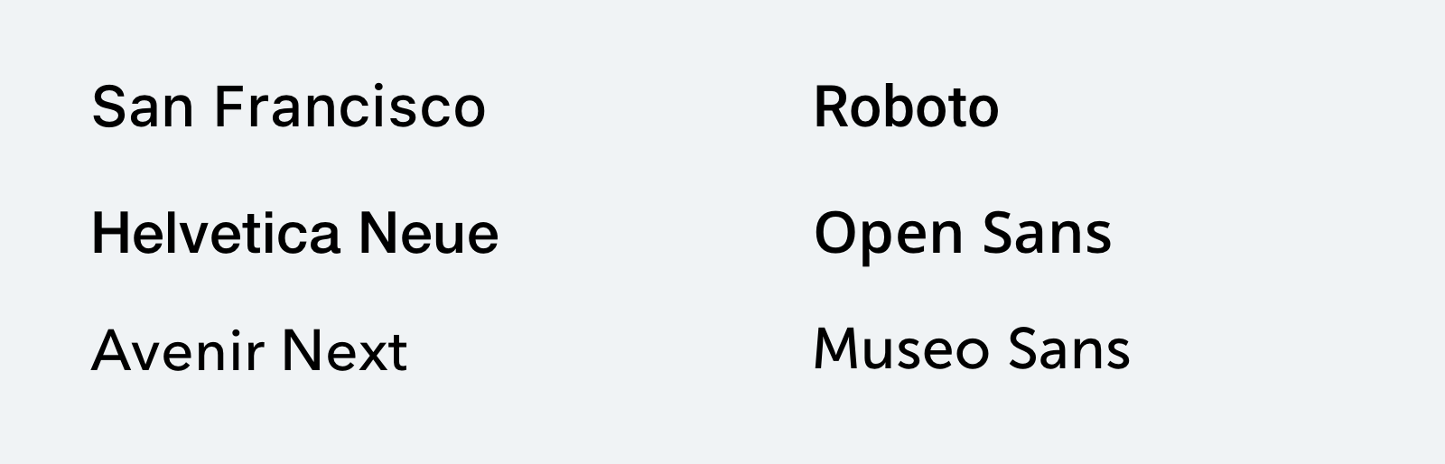
Pick a font that looks good in the body text. When in doubt, pick one that is both clean and comfortable to read. San Francisco, Helvetica Neue, Open Sans, Roboto, Proxima Nova and Museo Sans are some of my favorites. They’re all available for free on Google Fonts and Typekit (with Creative Cloud account).
Font Size
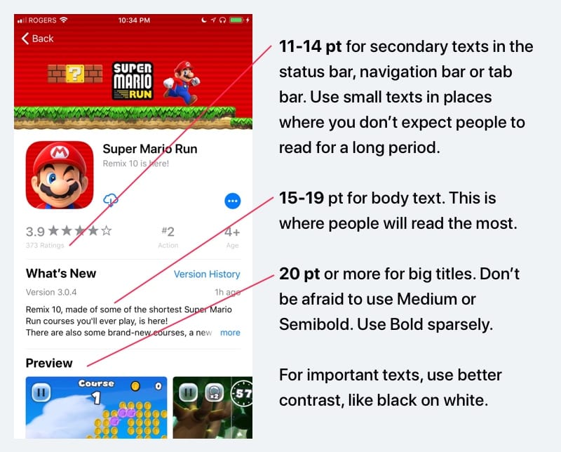
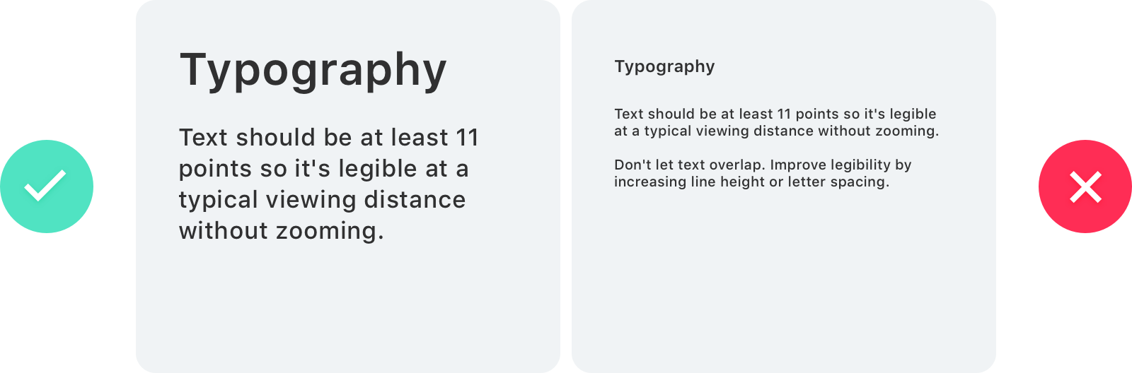
The font size should be at least 11pt to be readable on the iPhone, iPad and Apple Watch. While that is the minimum value, the recommended size for the body text is actually 15-19pt.
Font Size Do and Don’t
Your texts should never be below 10 pt since that would make them unreadable for many of your readers.
Font Weight
Modern fonts such as SF have many extra font weights: Thin, Ultralight, Light, Medium, Semibold, Heavy and Black in addition to the usual suspects: Regular, and Bold.
In general, at 11-19 pt, use SF Text Regular. At 20-34 pt, use SF Display Medium and at 34 pt or more, use SF Display Bold. Please note that at bigger sizes, you can afford using thinner fonts like Light and Ultralight, but I would suggest doing that if you are comfortable with typography. In iOS 11, large titles are generally much bolder.

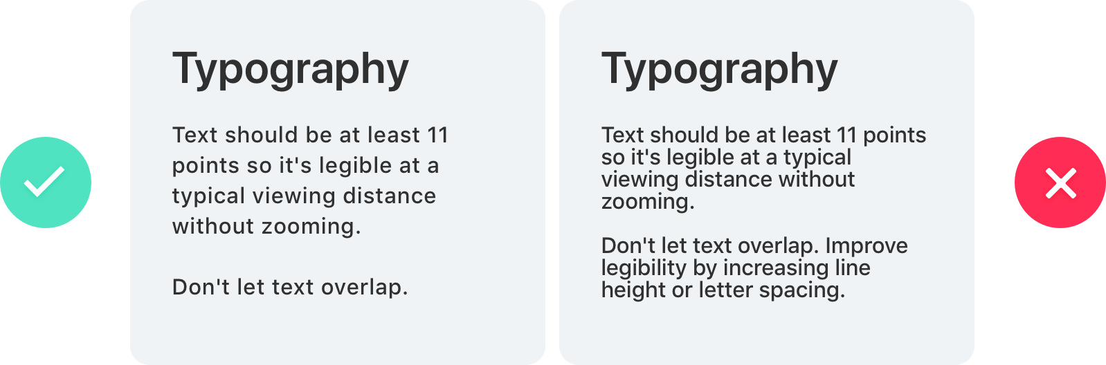
Line Height
The line height should be between 120% to 145% of the font size.
The right example has a line height that equals the font size (100%). In the left, I applied a 145% scale. The difference is substantial. Now, multiply that quantity of words by 10 and you get an idea of how frustrating it can be to have to read such condensed text.
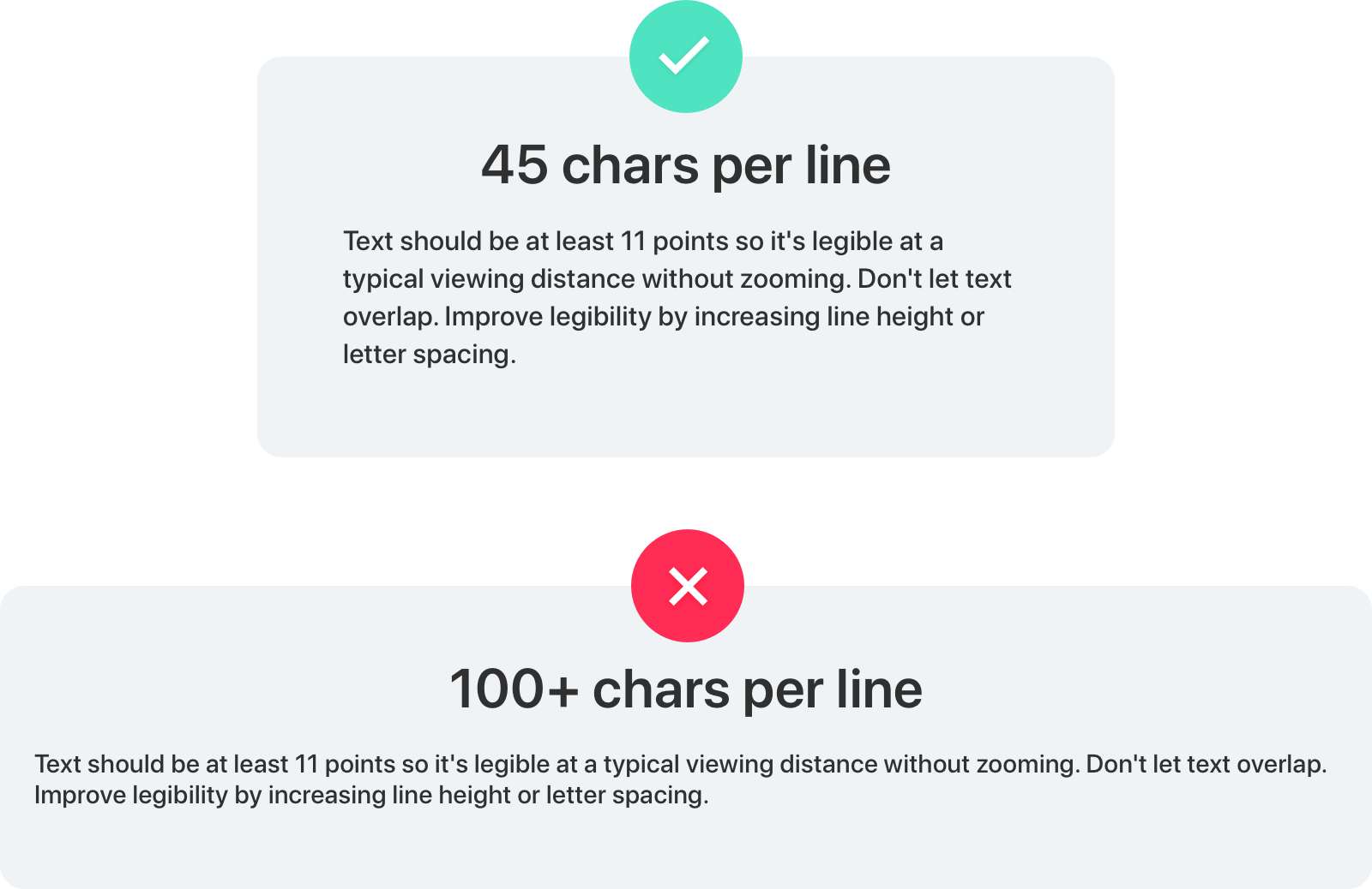
45-90 Characters Per Line
When your line is too long, the reader will have a hard time focusing. The overwhelming amount of text per line wears them off, because each jump to a new line gives excitement and that happens less when lines are too long.
Use Your Typeface Wisely
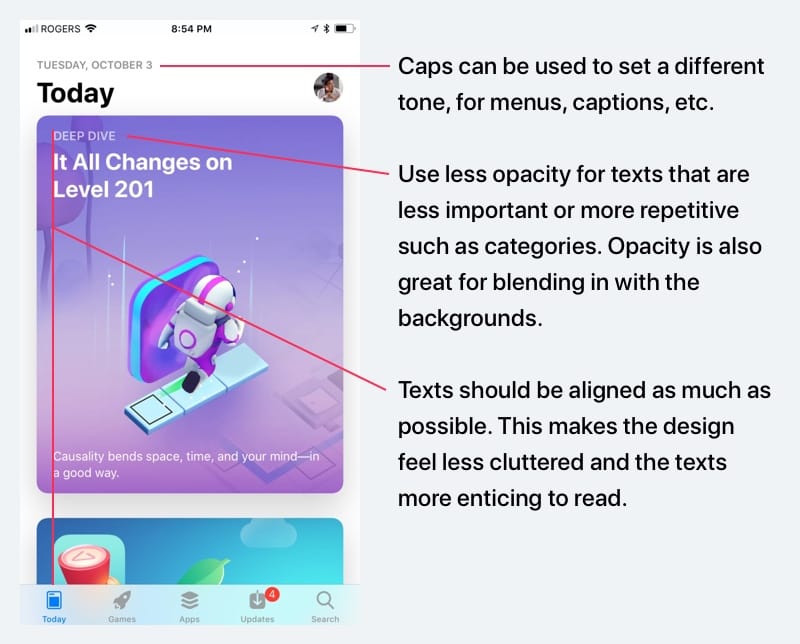
It’s one thing to know about typefaces, it is another to know how to use it. Beautiful typography doesn’t just happen, you have to carefully curate and customize it. For instance, don’t force bold or italic if the font doesn’t support it.
Use italics, underline, bold, lists and colors to reinforce the hierarchy and interactions.
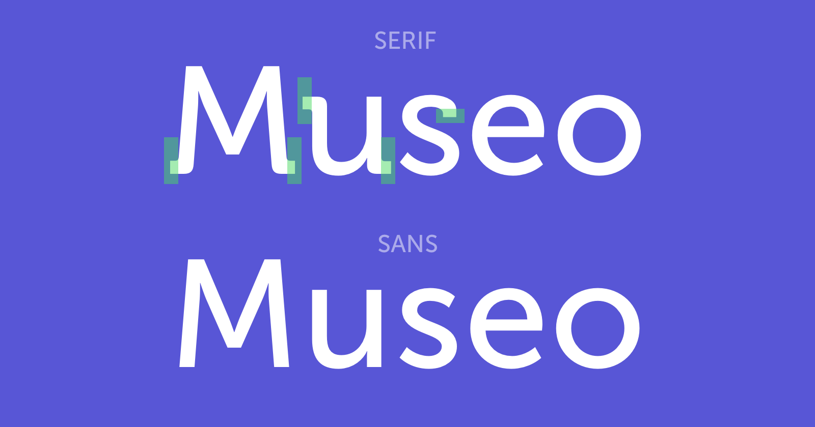
Serif and Sans-Serif
A sans-serif typeface is one that does not have the small projecting features called "serifs" at the end of strokes. Both Serif and Sans are good choices.
The Serif fonts are more commonly used in more traditional apps that encourage reading and storytelling such as Medium, iBooks and The New York Times. It has a lot of charm. Personally, I believe it's important to go back to our roots when it comes to design, so I would definitely encourage using Serif fonts for storytelling. As they're less used in modern apps, you get a unique feel to them.
The Sans typefaces are more utilitarian and neutral, used widely in most modern apps. Its popularity also means that it's more generic. The amount of Sans serif typefaces out there is overwhelming, so pick carefully.
People say design isn’t art. It isn’t. Great design is art.
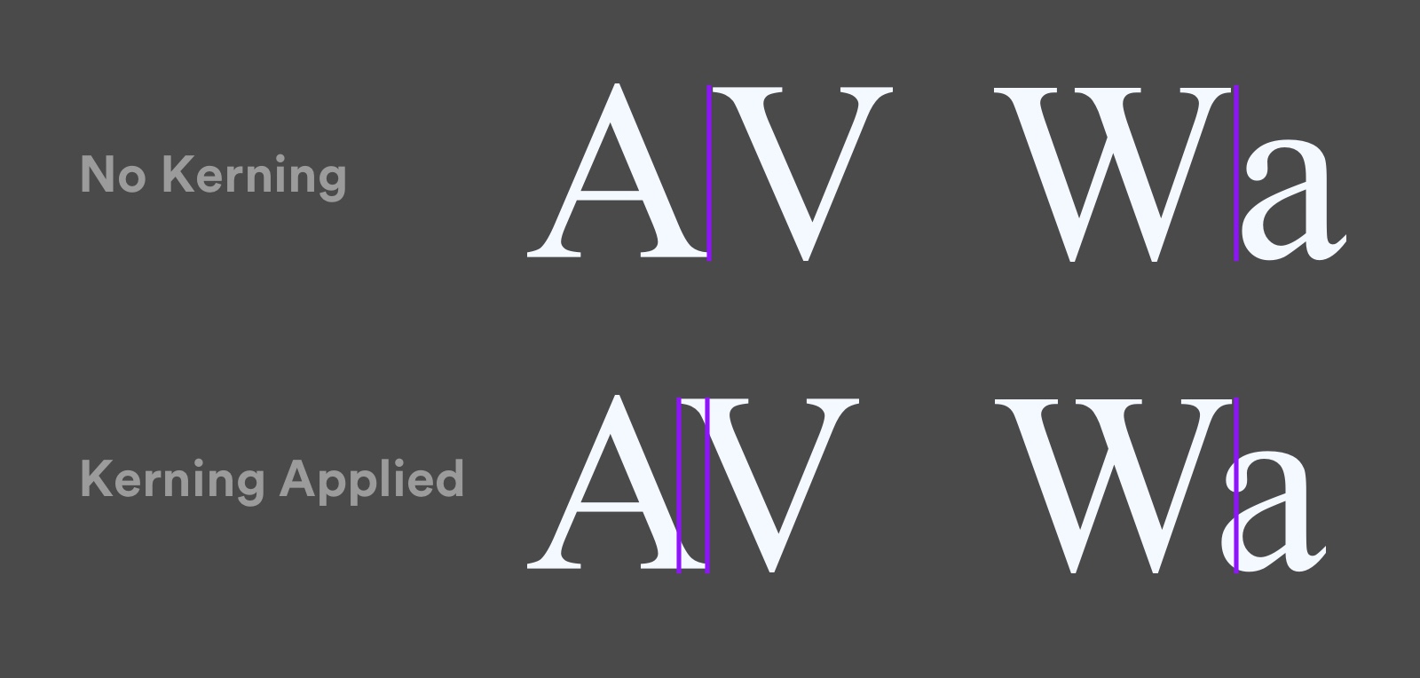
Kerning
Kerning is the process to adjust the space between two specific characters,
to achieve a pleasing visual result.
There is an awesome site where you can test your Kerning abilities.
Where to Find Fonts
Some fonts are expensive. However, there are a lot of free ones that are excellent. Just make sure you pick the fonts that you love. Here are some of the best places to find them.
Google Fonts
With Google Fonts, you can download fonts for free and use them in your projects as you see fit. It's as good as it gets as far as free fonts go. Since the only way to get custom typefaces on iOS is to download and import the font files, the download option is very useful. There are at least two great fonts: Open Sans and Roboto, which is used by default in modern Android phones.
You can use SkyFonts for Mac to automatically synchronize to your Desktop.
In case you want to download all the fonts available from Google fonts there is a GitHub repositorywhere you can do that.
Typekit
Typekit is part of the Creative Cloud subscription and has a wealthy selection of great fonts. It’s perfect for those who are starting. Great fonts that I enjoy include: Proxima Nova, Museo, Adelle Sans and Brandon Grotesque.
Fontstand
The great thing about Fontstand for Mac is that you can try fonts for 1 hour before purchasing them. Also, instead of buying the fonts, you rent them for a fraction of the price per month.
Fonts.com
For a monthly subscription, fonts.com lets you use as many fonts as you want. It has the largest selection by far. You can go really specific at picking a font you love. For example, Avenir Next has a Rounded family that isn’t available for free.
Fonts.com also allows you to self-host the font files, meaning you can download and host them on your server. Because I'm fascinated with typography, I use this service pretty much on all my projects.
Resources
Typography is an art form that is worth exploring. It goes well beyond iOS. When you've reached a level where you can call your craft Art, that is the biggest achievement that you can get.
Typography Guide
If you'd like to learn more about combining typefaces, apostrophes, quotes, dashes and brackets, I suggest heading to typogui.de.
A Five Minutes Guide to Better Typography
A real treat to read. Smartly designed to give you time to stop and think about each point. It’s also cleverly animated to give better impact.
Guide to Pairing Fonts
At some point, you’ll want to have multiple fonts in your design to set a contrast between body text and titles, captions or block quotes. This guide is particularly helpful to help you pair fonts based on a set of criteria.
Hand Lettering
There is also a fascinating course for hand lettering. With these techniques, you can create logos, personal brands and explore typography in general.
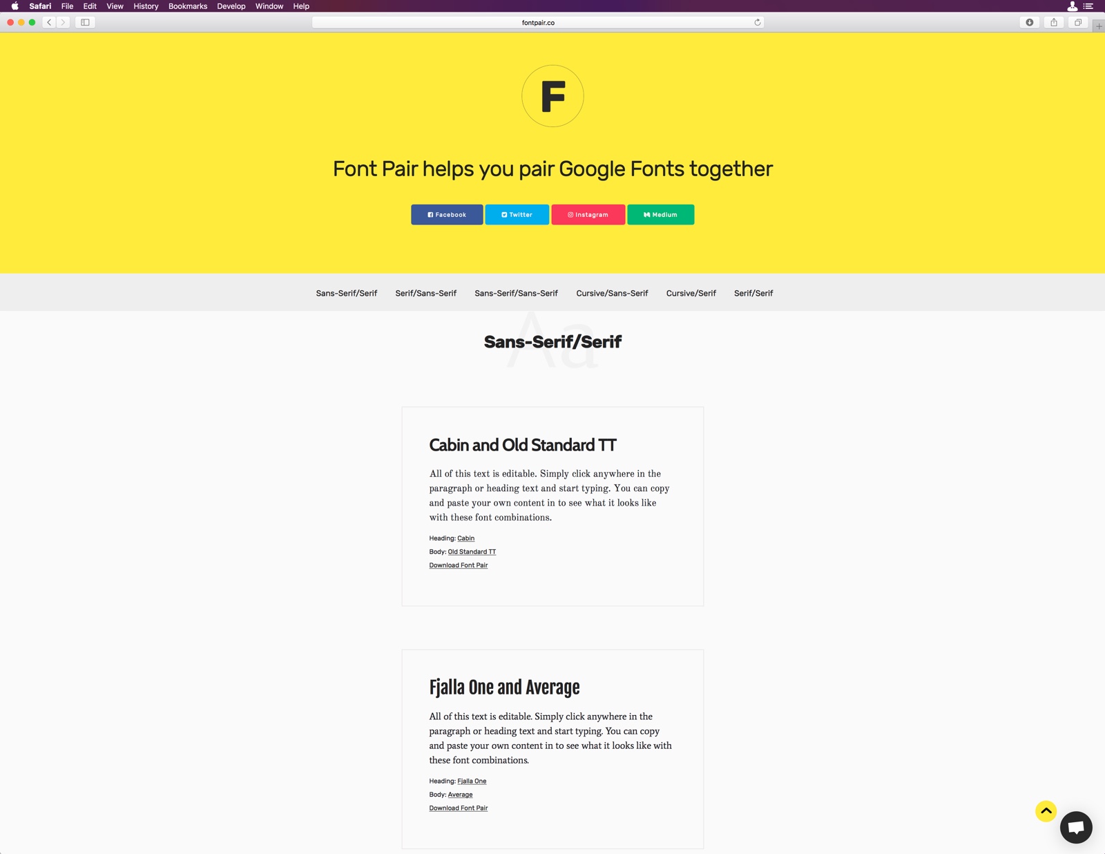
Font Pair.co
Font Pair is a useful site which helps you to pair Google Fonts together, it has different combination types, like Sans-Serif with Serif , Serif with Sans-Serif, and many others.
Font Base
FontBase is a font manager app, with it you can share fonts with your whole team just by adding them to any cloud folder.
You also have access to any font from Google's library in a single click.
It is a really interesting tool with many hidden features.
Right Font
With Right Font you can also sync your fonts with your team, can favorite any font. It automatically sync fonts from Google Fonts and Adobe Typekit. You can also access to different icons that you can use them for your designs, is a really nice app.
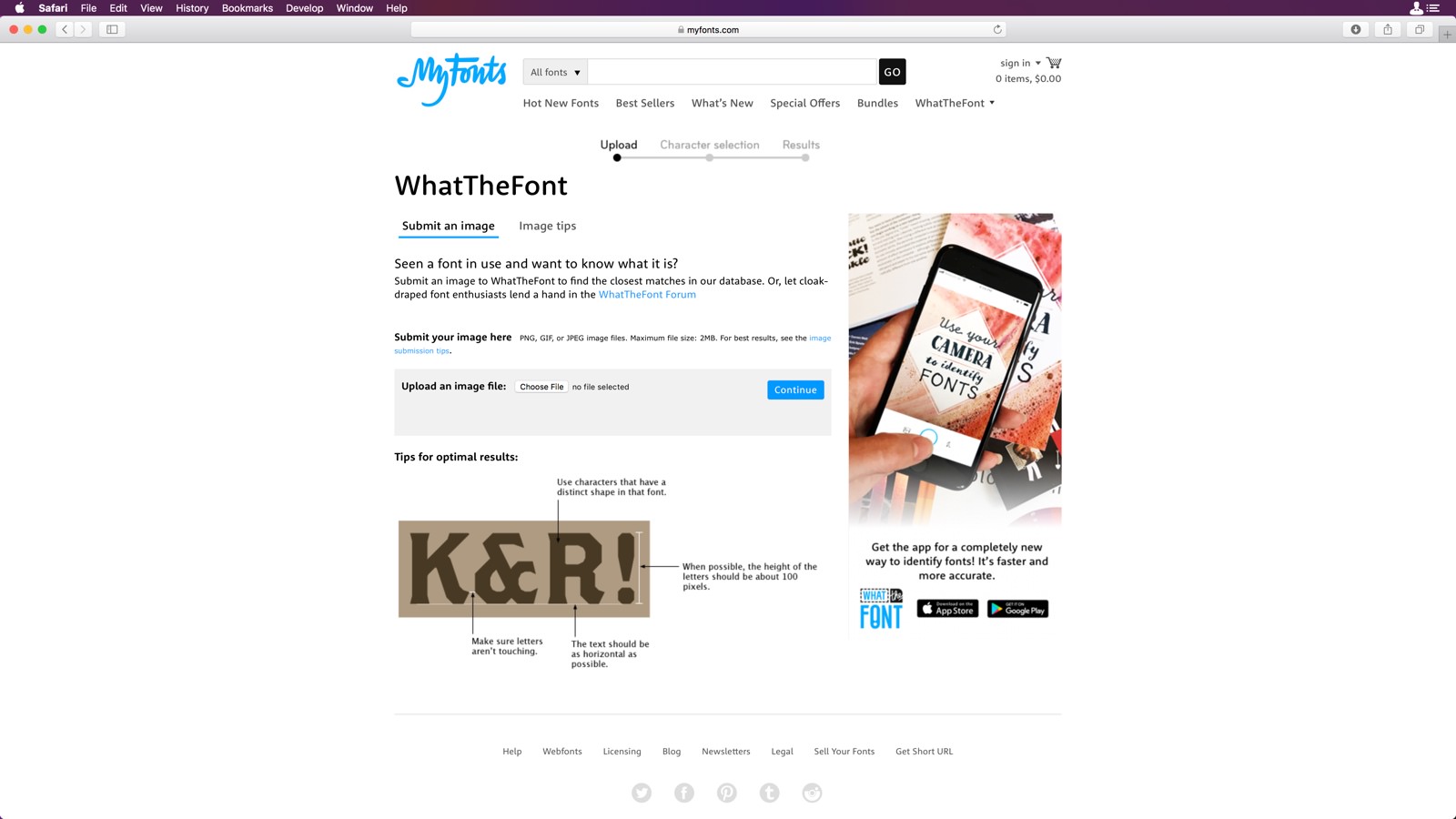
What The Font
Did you ever seen a font and wonder which font it is ?, so there a tool for that. What The Font is an App where you can upload an image, and WhatTheFont will find the closest match on its database. It also has an iOS version of its App.