Invert
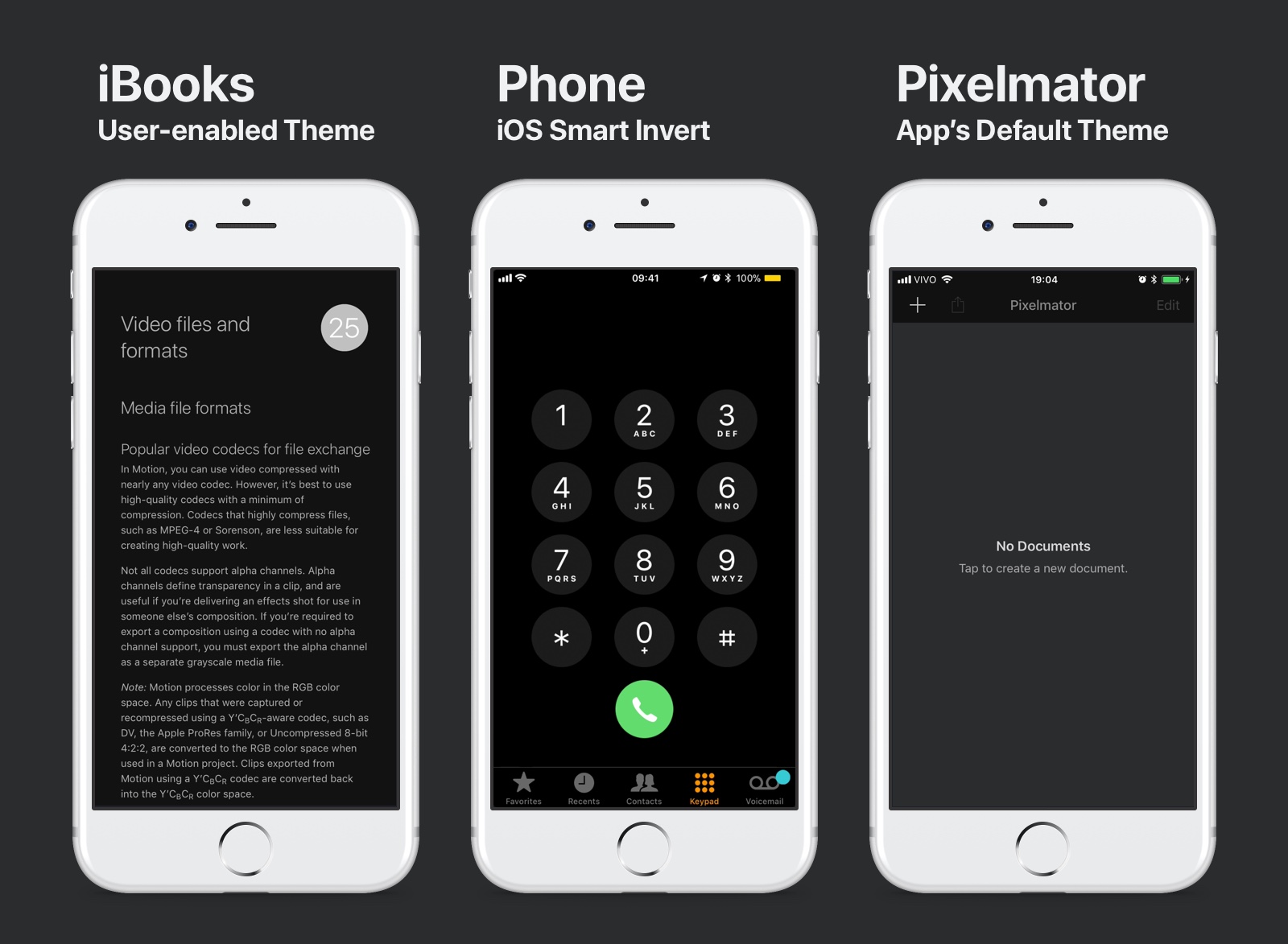
Apart from that, Apple has built into iOS a Invert feature under Settings > General > Accessibility > Display Accommodations > Invert Colors. The Smart Invert, although pretty smart, is very much buried.
Ambience
In this project, you will come into contact with Ambience, a brightness aware ambient lightning accessibility framework.
Since the launch of iOS, the iPhone features an ambient light sensor that maps its readings to screen brightness. This yields a lot of battery savings, and a better life expectancy for your phone. Also, the delight of having your screen adapt to your viewing conditions is now an industry standard.
Although Apple has yet to publicize the APIs for the ambient light sensor, it does let a given app look for screen brightness events. And that’s exactly what Ambience does. It listens to events and relays state thresholds to your app so it can adapt its looks and layout.
Downloads for Dark Mode
To follow this tutorial, you’ll need Xcode 9 and the initial project. Make sure to also download the final project for comparison.
If you don’t know or don’t feel comfortable installing CocoaPods you may download the initial project with CocoaPods. To open CocoaPods enabled projects, use the Xcode Workspace file (a Xcode Project icon on white).
Applying Ambience to the interface
Applying does not take a single line of code. It leverages advanced Swift features so as to make its application as seamless as possible.
In this section, we are going to apply custom styled states to the layout. Then, we are going add user control over the states. And finally, we are going to brush up on custom behavior features and extensibility.
Project Activation
To turn on Ambience on you project, go to the App Delegate file and import Ambience at the top and write the following line in the didFinishLaunchingWithOptions method:
_ = Ambience.shared
In this code we have only included the library in the App Delegate file and started the shared instance of Ambience right after the application launches. This is a common pattern you will see in many third party libraries that share functionality across an app.
Background
To have your view comply with Ambience you can use the built-in Interface Builder support. Go to the Main.storyboard file and locate the More Scene.
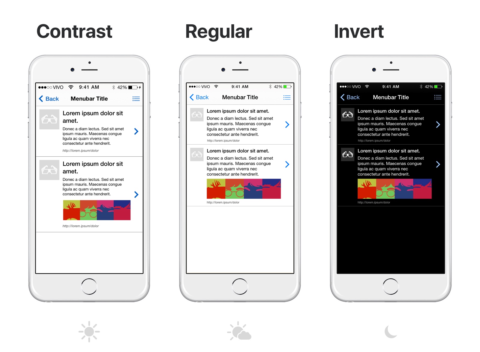
Ambience has built-in support for changing a given view’s background color. Using the Attributes Inspector, set a the Invert Color and Contrast Color for a given view.
Listening to Ambience
For performance and coherence reasons, it is also mandatory that a given object states that it does respond to Ambience. Using the Attributes Inspector, look for Ambience under a Object Section and set it to On.
This will tell this object that it should listen to Ambience. We will set this value for every view that needs to react to Ambience.
Text
It is also included support for text color for Label, Button and Text Area object types. Do the same process, paying attention to only attribute Text Color Invert and Text Color Contrast. These values are going to target the text.
Note that it is still mandatory to set Ambience to On under the Object section on the Attributes Inspector.
First Trial
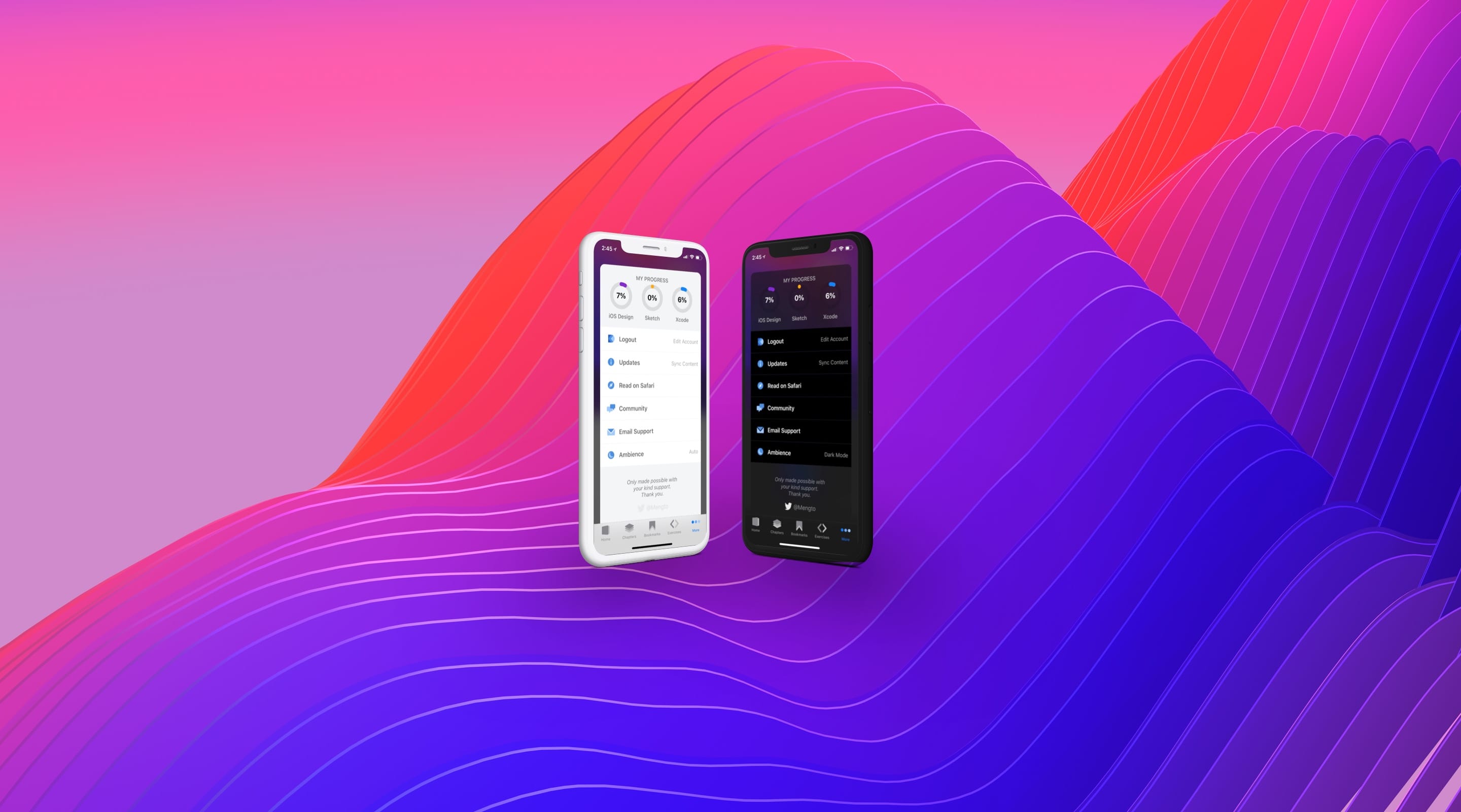
By now the app already has an automatic brightness driven dark mode on your app.
Tab, Navigation, Search and Tool Bars
Setting states for systems bar is just as easy as iOS comes with built-in support for dark and default themes on its bars. To have a given Tab Bar respond to Ambience it suffices to set it to listen.
Navigate to the Tab Bar Controller Scene and, using the Attributes Inspector, set it to listen to Ambience. That’s it.
User-Controlled States
It could not be easier to enable user-controlled states. Using the Object Library, drop a Object into the More Scene and class it Ambience Object.
For it to work properly it needs to trigger an action sheet. Using the Connections Inspector, connect the View Controller and a given Button object to the action using Touch Up Inside.
Custom State Labels
Select the Ambience Object so we can customize it. All actions are on by default, turn the Contrast Available to Off. Later, set the labels to Dark Mode, Ambience Off, and Auto for the Invert, Regular and Auto label fields.
As this object is not going to transition itself according to Ambience, there is no need to set its Ambience to On, therefore leave it be.
Custom Behaviors
Although we have built a lot, Ambience can also be extended to adapt many features that supersede color schemes. For those features to be accessible, there is support baked in every NSObject.
Let’s create the simplest of functionalities on a label. Create a new Swift file named CustomAmbienceLabel. Our custom label is nothing but a classic UILabel.
import UIKit
import Ambience

class CustomAmbienceLabel : UILabel { }
Under it, let’s place only one override function. This function determines how it reacts to Ambience Events by extending its inherent text color and background color behavior.
override func ambience(_ notification: Notification) {

    super.ambience(notification)

    guard let currentState = notification.userInfo?["currentState"] as? AmbienceState else { return }

    if Ambience.forcedState == nil {
        text = "Auto"
    } else {
        switch currentState {
        case .contrast: text = ""
        case .invert: text = "Dark Mode"
        case .regular: text = "Off"
         }
    }
}
On the occasion of an Ambience Event, it changes its content to reflect on what state is active. In this case, you can see that any state may be represented by Auto so long as no state is being forced. Also, the Invert and Regular states are mapped to Dark Mode and Off.
Classing the Label
Go back to the storyboard and select the state label on the More Scene. Using the Identity Inspector, class the Label as Custom Ambience Label. Never forget to turn on Ambience under the Object section.
Conclusion
Using Dark Theme and other features in your app may enrich your user experience and take your app to the next level. Responsiveness of user interface is a trend that is turning into a design standard.
Apart from offering a 0-code Dark Mode solution, Ambience also enables extensibility so you may perform theming in a flexible way. It works out of the box for simple layouts and may be easily extended to fit an app’s custom needs.
Credit
Special thanks to Tiago Mergulhão for co-authoring this section.