Flat Navigation
Flat is the navigation paradigm that lets the user switch between a number of given context independent of order. Its inherent freedom and ease of use are the reasons it’s widespread.
Being also the simplest navigation pattern, its key characteristic is free flow. It’s built on the premise that the user is able to flow back and forth with no data loss or lock states.
Easy to Use
One main reason for choosing Tab Bar Navigation for your app is the convention behind it. Many of the most popular apps, these days, have it as their root navigation.
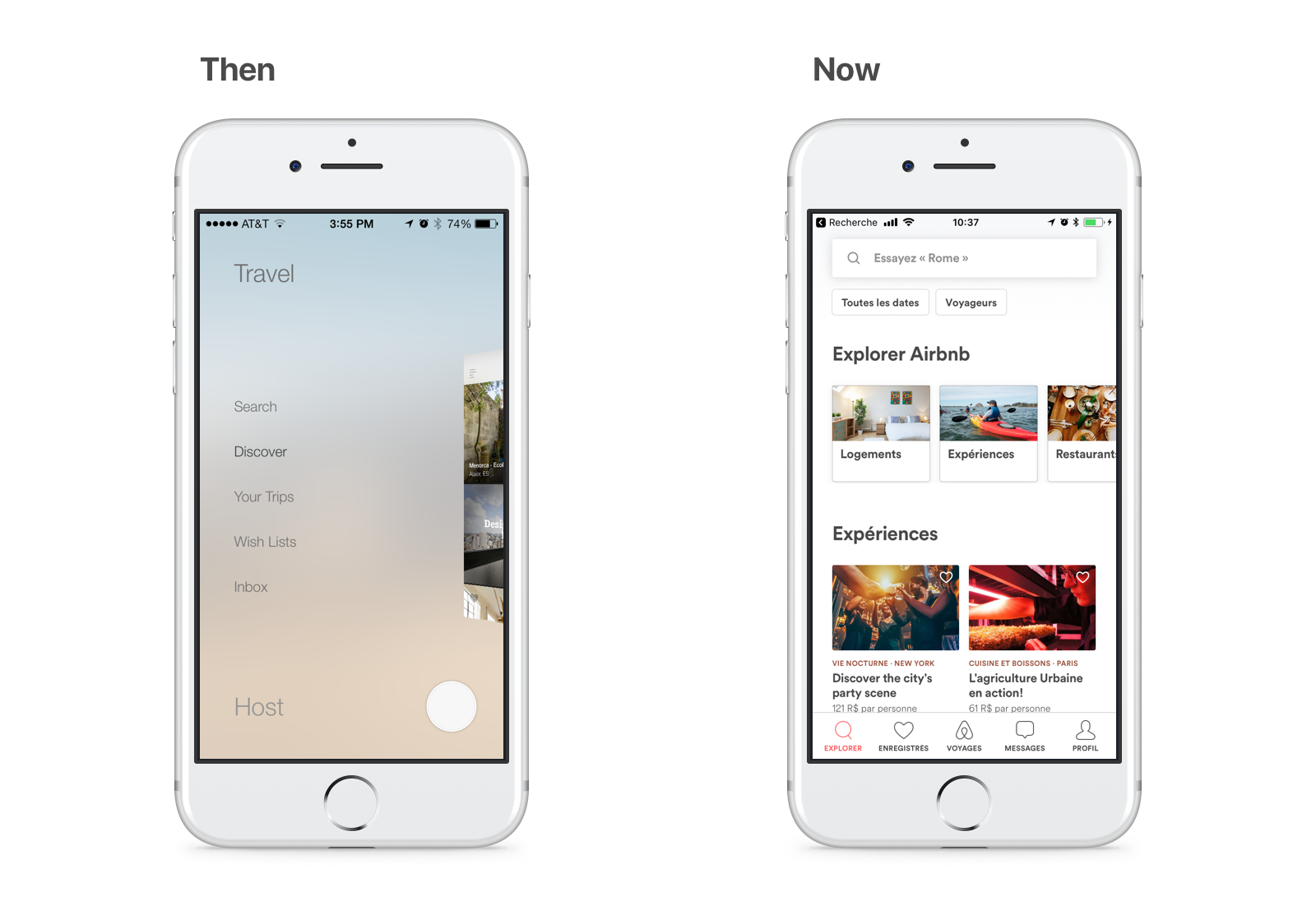
Among the examples of apps that converted to it is Airbnb. For many years, this app had used the sleekest of 3D animated hamburger menus. After being on the market for so long, it went back to basics on this.
The Tab Bar is easy to use and easy to place on your app because it leverages many iOS features and is widely recognized. For that reason, it’s recommended to place the Tab Bar at the root of the navigation. This ensures high usability and behavior conformance with other apps.
Downloads for Tab Bar
To follow this tutorial, you’ll need Xcode 9 and the final Xcode project from the Status bar. You can download the final Xcode project to help you compare with your own progress.
Importing Assets
Before we begin, please download the assets bundle that comes with the iconography and place-holding elements needed to set our layout. If you have knowledge on how to export assets from the Sketch file built on previous sections, feel free to do so.
On the project’s outline, there is a file called Assets.xcassets. This file type is actually a folder that is interpreted in a symbolic fashion by Xcode. Drag and drop the assets bundle subfolders in its Outline so we have them accessible on Interface Builder.
Namespacing Assets
A good way to organize your project is by using a convention called namespacing. You might already be familiar with it by coding some Swift. You may be familiar that the initials to all classes that are contained in UI Kit are UISomething.
In Xcode, we have the same functionality for the Asset Catalog. Select the 3 downloaded asset folders and then, at the Attributes Inspector, check Provides Namespace.
This will ensure that you can use the same asset name in different contexts and this feature may come in handy sooner than you think.
Preparing Icons
A Tab Bar Item is the unit of both icon and labels you see in the Tab Bar. In the default Tab Bar, implementation all icons are tinted to your app’s main color, which is the default color iOS blue.
In the Design+Code app, the design requires that the Tab Bar icons are displayed in full color. There are many ways to enable this, the simplest way is to configure the image assets.
For each assets folders, select all the images and edit their Render As to Original Image so they show in full RGBA. For the Resizing attribute, check the Preserve Vector Data so that it shows crisp vector drawing on any screen resolution. Finally, set the Scales attribute to Single Scale as vector drawing need no pixel density directive.
Place-holding View Controllers
Before we place the Tab Bar, we need to create some place holding view controllers to act as the views we are going to develop further along.
In the Object Library, place beside the already present View Controller 4 additional View Controllers that are going to be worked on in the next sections according to this list.
- View Controller for Chapters
- Table View Controller for Bookmarks
- Table View Controller for Exercises
- View Controller for More
Placing the Tab Bar
To add a Tab Bar Controller to the Storyboard, select the 4 placeholders that we just created and the View Controller. Then, go to Editor, select Embed in and Tab Bar Controller. This will envelop all those scenes in a single Tab Bar Controller. Put the new Tab Bar Controller on top of the other controllers.
Don’t forget to make the Tab Bar Controller the Initial View Controller in the Attributes Inspector. You may also use this Tab Bar Controller to customize the looks of the Tab Bar.
Coloring the Tab Bar
To style just like in the App, we are going to deselect the Translucent checkbox in the Attributes Inspector of the Tab Bar.
Optional: Code
Depending on your design, it may also be important to further customize the bar. This is possible using the Tab Bar’s appearance upon launching your app.
func application(_ application: UIApplication, didFinishLaunchingWithOptions launchOptions: [UIApplicationLaunchOptionsKey: Any]?) -> Bool {
    UITabBar.appearance().barTintColor = .black
    UITabBar.appearance().tintColor = .white
    return true
}
In this code, we change the background color for all the Tab Bars to black and the tint of their text and icons to white.
Bar Items
To customize the looks of each item, you should use the Tab Bar Item inside each View Controller.
In the System Item field, there are preset styles used in various iOS Stock Apps. For this project, we are going to use the provided icons for the Design+Code app. Select and change the items images by typing the image name for each bar item.
Home View Controller:
Selected image: Tab Bar/home-active
Title: Home
Image: Tab Bar/home
Chapters View Controller:
Selected image: Tab Bar/chapters-active
Title: Chapters
Image: Tab Bar/chapters
Bookmarks Table View Controller:
Selected image: Tab Bar/bookmarks-active
Title: Bookmarks
Image: Tab Bar/bookmarks
Exercises Table View Controller:
Selected image: Tab Bar/exercises-active
Title: Exercises
Image: Tab Bar/exercises
More View Controller:
Selected image: Tab Bar/more-active
Title: More
Image: Tab Bar/more
Reordering Items
As the items are probably in the wrong order, in the Tab Bar Controller, re-order the items by Drag and drop. From left to right, it should be: Home, Chapters, Bookmarks, Exercises and More.
More Scene
By now, the project already provides access to the root interfaces that are going to build the experience. Now, it is required that we continue populating them piece by piece. In this part, we are going to build upon the More Scene that has an inner Dialog View.
Card Scrolling
The More Scene is composed of a self-sized card view that moves inside a Scroll View. Let’s start by opening the Document Outline, select the More View and uncheck Safe Area Layout Guide. Then, place a Scroll View inside the More View from the Object Library. Put constraints to 20 top and 0 for the rest. Don’t forget to uncheck Constraints to margins.
Dialog Inside
The Dialog View is going to float inside the Scroll View. Using the Object Library, place a view inside it and change the background color to Default. Proceed by constraining it to 20 points on every side.
So as to have rounded corners, turn on Clip to Bounds in the Attributes Inspector. Also, using the Identity Inspector, add a Runtime Attribute of layer.cornerRadius to the Number 14.
To make it easy to identify this element, set the Label field under Document to Dialog View.
Self-sizing
By now, your view must be presenting red constrain elements for sizing. This is an issue that leads to an underlying lesson. A Scroll View does not know how to move its inner elements, it is up to them to describe in which direction to scroll by sizing themselves bigger than their container. These criteria have not been met because the Dialog View sizes itself in relation to the Scroll View.
Auto Layout solves constraints by finding minimal situations in which all the criteria can be met. Let’s include yet another view inside this Dialog View to guide the system.
In the Identity Inspector or Document Outline, label this view Sizing View. Using the Add New Constraints, place constraint on all sides to 0 points to its parent, the Dialog View. Then, center it horizontally to the Scroll View. And finally, constrain its height to 680 points.
Using the Attributes Inspector, set its background color to an F0F3F5 blue color.
This gives Auto Layout enough information to infer the sizing and scrolling of elements. Later on, we will deactivate this constraint and have the inner elements fulfill this need.
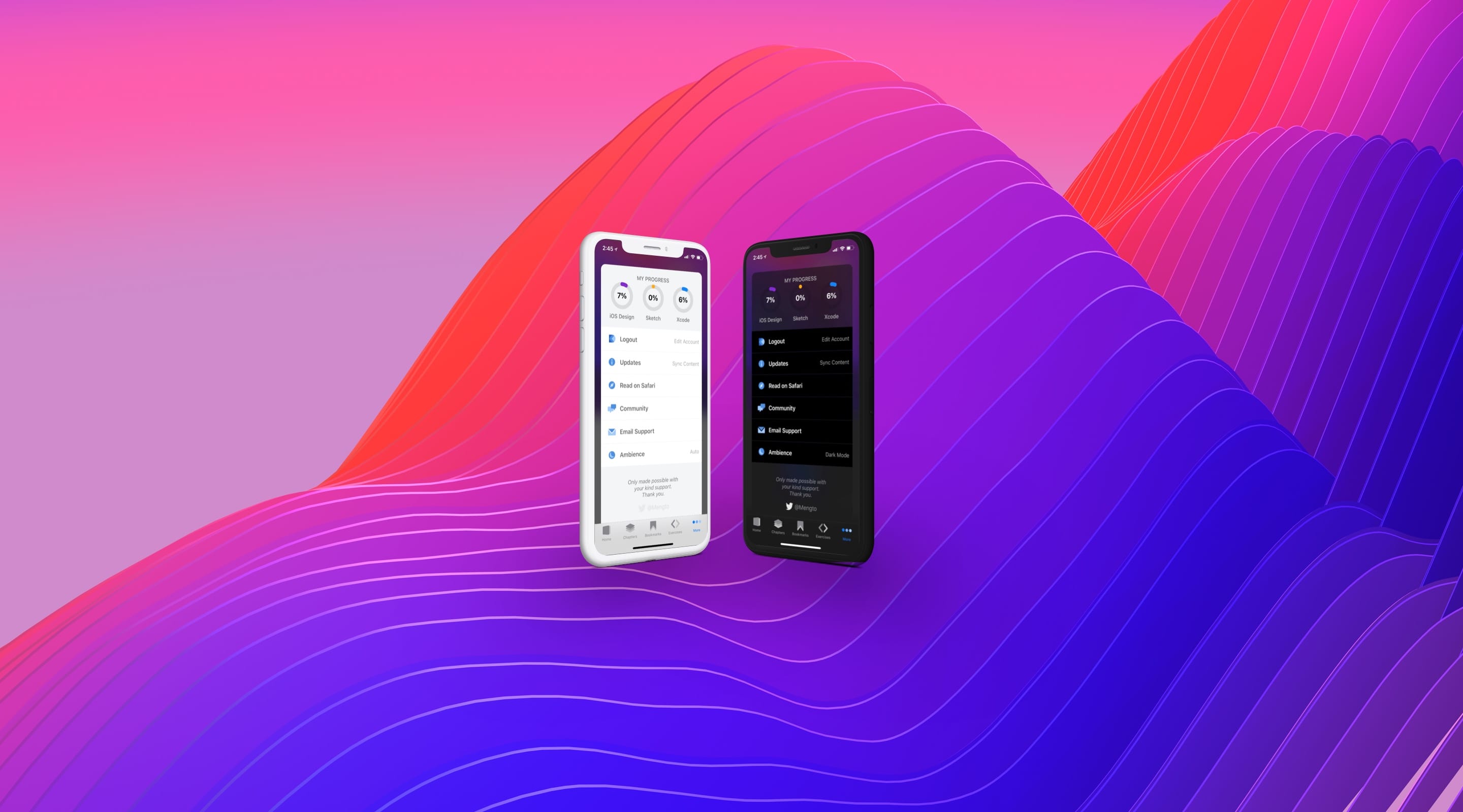
My Progress Label
From the Object Library, add a label near the top and name it MY PROGRESS. The progress element is made of a Black 50%, 15 point Semibold System Font label placed 20 points from the top of the Sizing View. Constrain it to the Sizing View with Control + drag and choose Center Horizontally in Container. It should suffice to constrain it from the top and to the center.
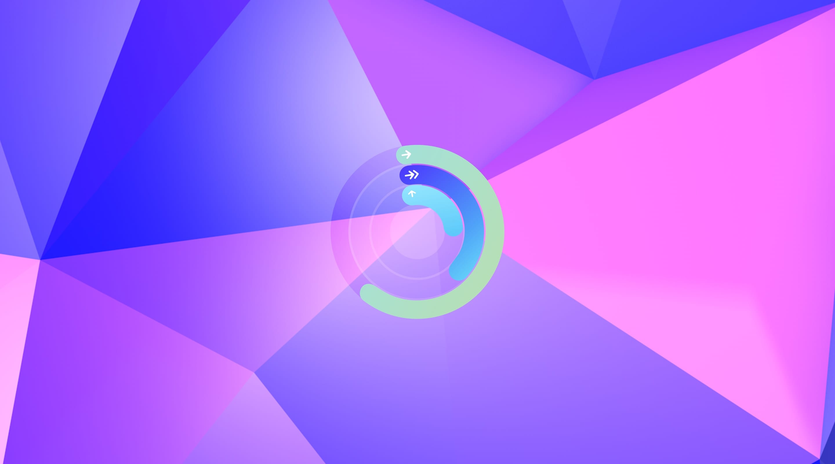
Progress Placeholders
Let’s also put some placeholders for the Progress Rings, to which we are going to dedicate a whole section further on. Using the Object Library, place an Image View below the label and resize it a 70 point square in the Size Inspector. Then, constrain its width and height using the Add New Constraints.
Continue by triggering Embed In Stack and constrain this stack from the sides to 20 points and from the top nearest neighbor to 8 points. Using the Attributes Inspector, set its axis to Horizontal and its distribution to Equal Spacing.
Then, you just need to Copy and Paste it to have 3 elements inside the stack, which is going to size itself vertically accordingly. The image elements should be the placeholder rings provided in the assets bundle: Placeholder/image-ring-1, Placeholder/image-ring-2 and Placeholder/image-ring-3.
Action Button
The More Scene has 6 default action buttons. Place a Button element using the Object Library, customizing it with the More/logo image and labeling it Login. Then, style the attributed text to a Dark Gray Color 17 point Semibold System Font.
To distance the inner elements of a given button, you may use the Size Inspector to adjust insets. In this button template, we are going to use a 16 point left inset for the content and a 7 point left inset for the title. Also, set the control alignment to left and its background color to White Color.
More Action
The element we have just set is the template for all the actions. Push it under a stack by triggering Embed In Stack. Then, constrain the stack to 0 points to the left and right side, 20 points to the top nearest neighbor and to 360 of height. The stack should also be on the Vertical axis, on a Fill Equally distribution, and have a spacing of 1 point.
Finally, duplicate the button element until you reach 6 elements and customize name and image accordingly using the assets provided for:
Title: Login
Image: More/logo
Title: Updates
Image: More/info
Title: Read on Safari
Image: More/safari
Title: Community
Image: More/community
Title: Email Support
Image: More/email
Title: Ambience
Image: More/ambience
Epilogue
This element is a Label placed below the actions. If it gets difficult to reach elements in a small scene, you can always select the scene and set its simulated height using the Size Inspector under Freeform. A value that may be suitable is 800 points.
Place a Label element for the epilogue right below the Actions stack, center it horizontally and constrain it in width to 170 points and 34 points from the top nearest neighbor. The content of this epilogue on the app is Only made possible with your kind support. Thank you. Then, center its text and style it to System Font Italic 15 points in size, colored 50 percent Black Color. It should also be set to have 0 lines, simply put, decide how many lines it should have on its own.
Twitter Button
The Twitter label should be an imaged Button just like the actions. Place a Button from the Object Library and style it to a 10 percent, Black Color, 18 point System Font.
Also, constrain it to the horizontal center with 170 of width and 15 points to the top nearest neighbor.
Implicit Stack
To finish this layout, select the Twitter Button and, triggering the Add New Constraints dialog, apply the suggested constraint value for the bottom.
By now, you might have guessed that every element inside this Sizing View is able to position and size itself according to their parent and neighbors. This would correctly suggest that the height constraint for the Sizing View is no longer required.
Using the Outline View, select this constraint and uncheck Installed using the Size Inspector. No constraint should be marked red, indicating that Auto Layout has sufficient information to place and size all elements.
Conclusion
Also known as Bottom Navigation, the Tab Bar may be used to segregate content, advertise functionality, notify information, situate navigation, and much more. This is the stepping stone needed to access all other interfaces we are going to build forward.
The simplest way of building navigation on iOS is also the most recognizable. Don’t be afraid to use it in your app and reap its benefit.
Credit
Special thanks to Tiago Mergulhão for co-authoring this section.