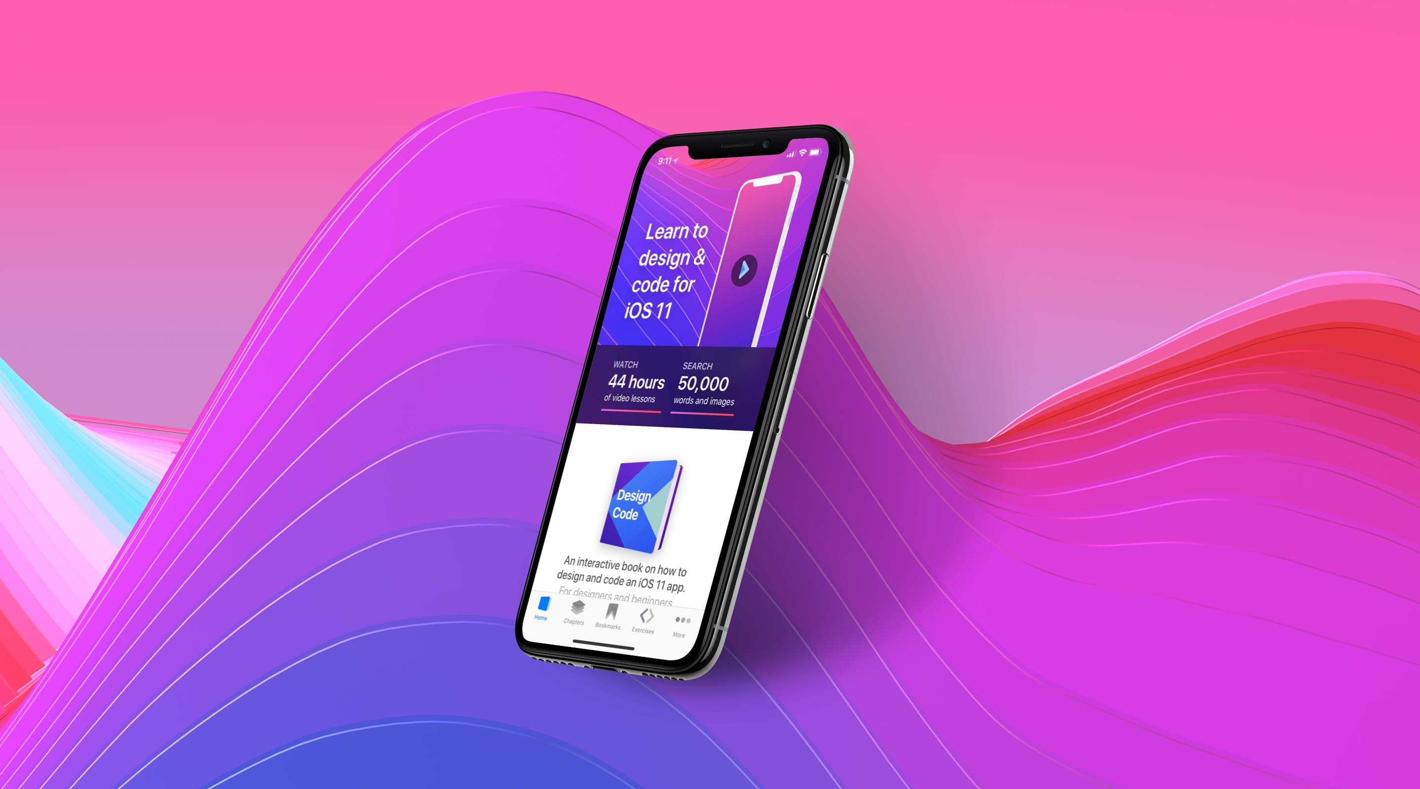
Prototyping in Swift
Personally, I consider prototyping a little differently. I don’t separate the process from actual development. I don’t like to add extra processes between design and development. After all, even if your prototype ends up looking great, you’re not actually reducing the build time. You may in fact add to it. Your developer may reject it, because understandably they have too much on their plate. They do 70% of the work, hence why iOS apps traditionally take 10x longer than Websites.
What if your prototype can actually be a real product?
Most designers today know how to build a Website. We can certainly apply the same attitude towards making apps, by learning Swift and Storyboard instead of CSS and Javascript.
Downloads for Design in Playground
To follow this tutorial, you’ll need Xcode 9 and the starting Playground file. You can download the Final Playground file to help you compare with your own progress.
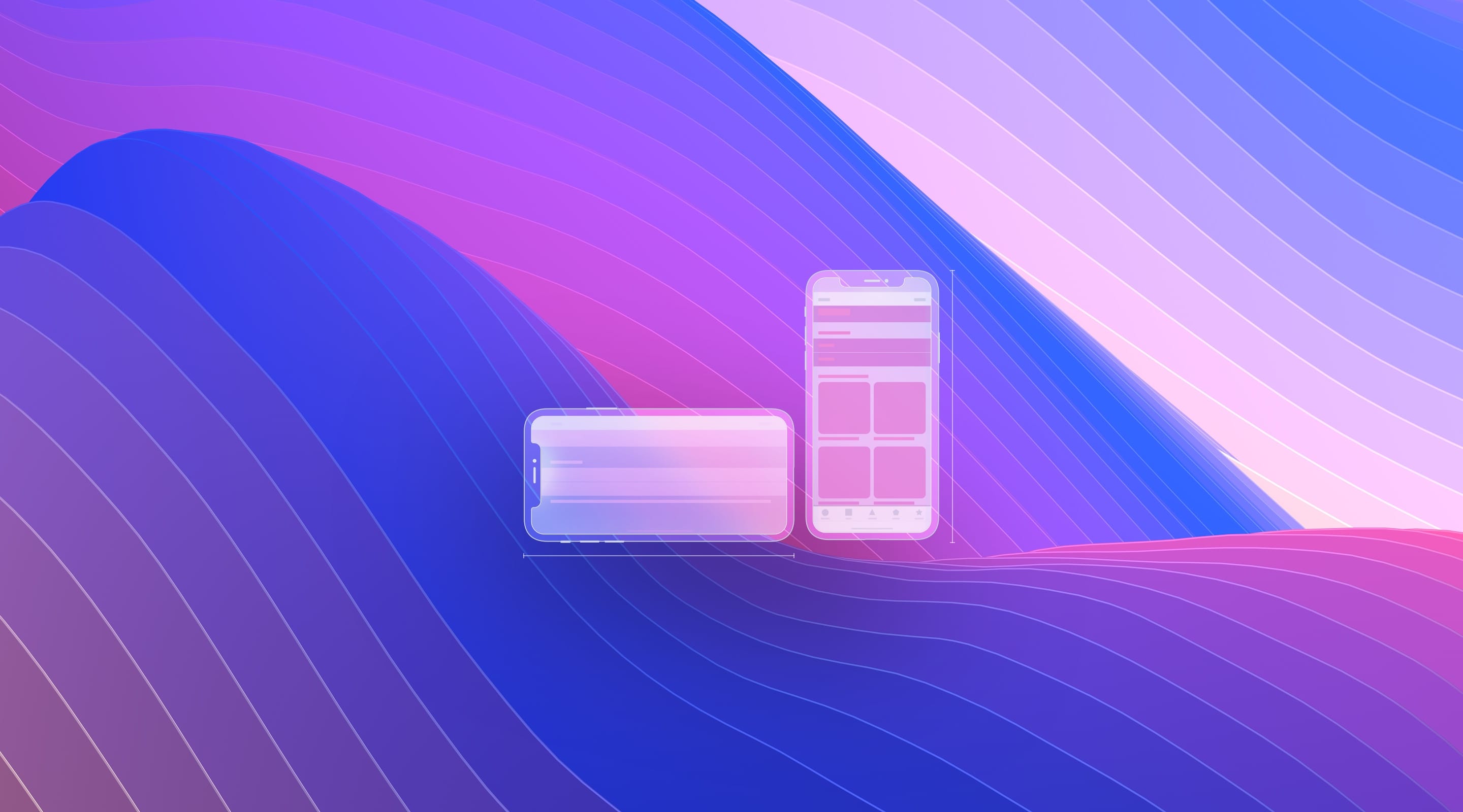
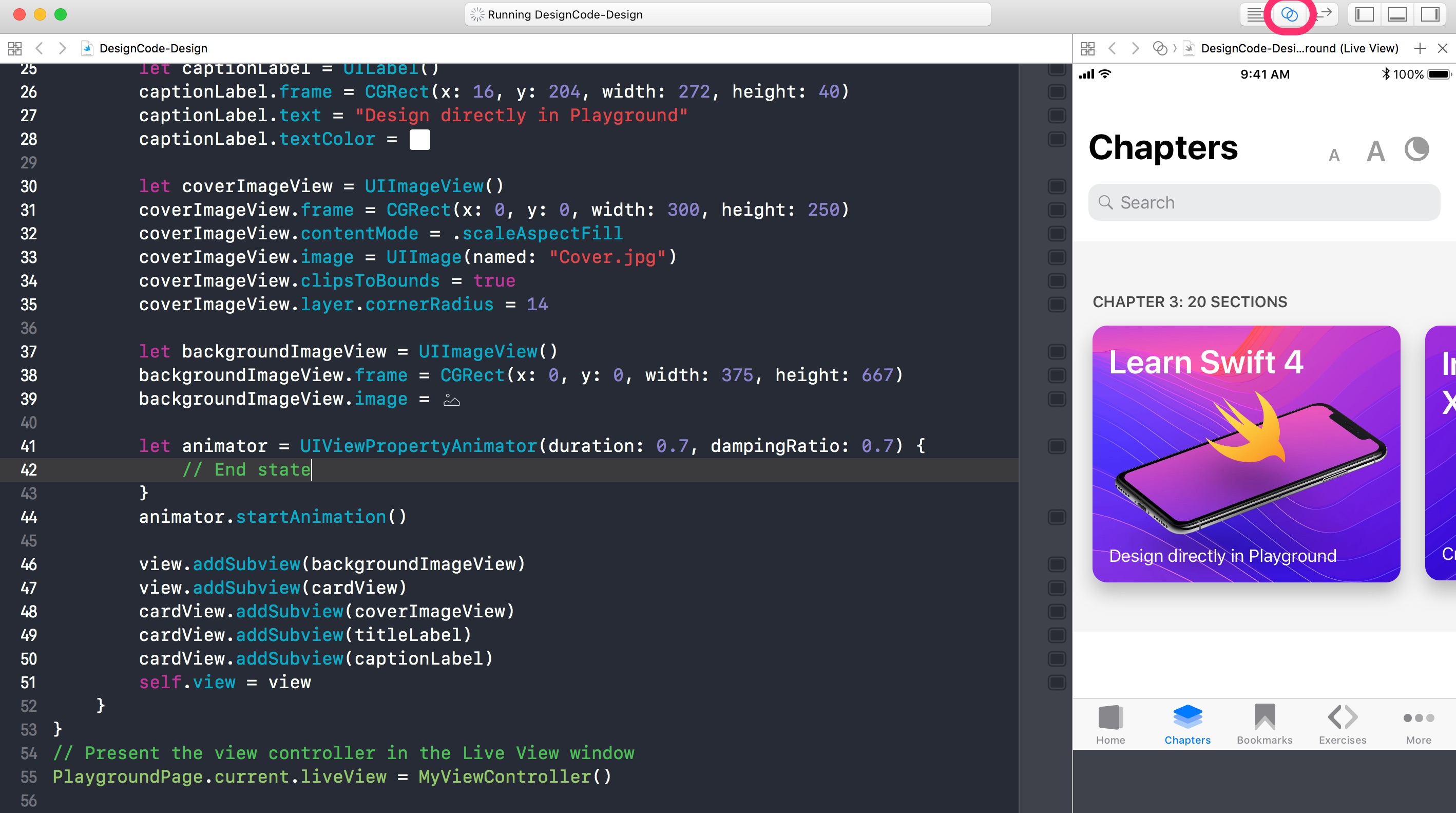
Final Result
We’re building a simple transition from the Main screen to the Section screen. While Playground may not allow you to test on devices, the code that you create here can easily be transported to Xcode. We’re using Playground to get a firm grasp at some of the basic concepts of animating in Swift.
Open Playground File
We’re going to use the Playground file we created from Design in Playground. Basically, we have set up the basic UI elements from scratch, so that we can animate them here.
Animation Basics
iOS 11 and Material Design set new standards for animations. Now, we expect screens to transition gracefully from one to another. If you plan your animations carefully, you can transition multiple elements to end like the next screen’s beginning state.
How do you animate, you may ask? To understand some of the theory behind animation, I suggest heading to the Animations section. Basically, you need to set the beginning state and end state. The beginning state is our current view. The end state is the Section view.

UIViewPropertyAnimator
Let’s look at the UIViewPropertyAnimator class. This is just one of the many ways to animate in Swift. With this, you can move things, change colors and sizes and have complete control over the animation later. In the End state, we’ll make sure to align and resize the same elements, like the cardView, coverImageView, titleLabel and captionLabel.
Let’s type this after we set up backgroundImageView. Also, make sure that the Assistant Editor is open.
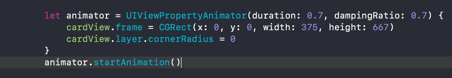
let animator = UIViewPropertyAnimator(duration: 0.7, dampingRatio: 0.7) {
    // End state
}
animator.startAnimation()
Duration
Set how long you want your animation to run. Typically, it would be somewhere between 0.5 seconds to 2 seconds. In this case, set the Duration to 0.7.
Damping Ratio
Spring and bouncing animations are used everywhere in iOS, so we’re going to replicate that with the Damping Ratio combined with the duration. The great thing about this technique is that it’s fully customizable. Let’s set the Damping Ratio to 0.7.
Animate Card
You can change the position, the size and other properties available to your UI object. New in Xcode 9, you can now animate the cornerRadius as well. In this animation, we want to expand the card so that it takes the full size of the screen. Make sure that the cardView has a white background.
Write this code in the animator, between the curly brackets.
cardView.frame = CGRect(x: 0, y: 0, width: 375, height: 667)
cardView.layer.cornerRadius = 0
Finally, outside of the curly brackets, we’re going to start the animation by referencing the animator that we created and use the startAnimation method.
Customizing the Animation
At this point, you can start customizing the springiness of the animation. If you wish to have less bouncing and overshooting, you can use duration 1, damping 1. If you want more, you can use duration 0.5, damping 0.5. The lesser the values, the more exaggerated the animation is going to be.
Animate the Cover
The Cover image will be animated similarly to the Card. It’ll take the full width, but the height will be limited to 420. Also, the rounded corners will be set to 0.
coverImageView.frame = CGRect(x: 0, y: 0, width: 375, height: 420)
coverImageView.layer.cornerRadius = 0
Animate the Labels
Since we have more space for our design, we’ll push the margins a little for our titleLabel and captionLabel. Instead of a 16 pt margin, we’ll use a 20 pt margin. Additionally, the captionLabel will be further down.
titleLabel.frame = CGRect(x: 20, y: 20, width: 374, height: 38)
captionLabel.frame = CGRect(x: 20, y: 370, width: 272, height: 40)
Description Label
In the Section screen, we’ll want to have a body text. Let’s create one right before we declared the animator.
let descriptionLabel = UILabel()
descriptionLabel.frame = CGRect(x: 20, y: 448, width: 335, height: 132)
descriptionLabel.text = "Three years ago, Apple completely revamped their design language for the modern users. It is now much simpler, allowing designers to focus on animation and function rather than intricate visual details."
descriptionLabel.textColor = .black
Add the descriptionLabel to cardView, right after captionLabel.
cardView.addSubview(descriptionLabel)
Number of Lines
Notice that our long paragraph of text is not showing everything. We’ll need to spread that over multiple lines of text. Let’s use the property numberOfLines.
descriptionLabel.numberOfLines = 10
Add Delay
As we preview the animation on the right, we can see that our animation is happening too fast at the beginning, so it’s really hard to follow what’s going on. Let’s add a slight 1 second delay at the beginning. This is completely optional and will need to be removed at the end of the tutorial when we use tap events.
animator.startAnimation(afterDelay: 1)
Fade In Animation
We can animate the opacity to give a nice fade in animation. Let’s set the descriptionLabel opacity to 0 at the beginning, and opacity to 1 at the end state.
Outside of the animator class, right below where you set up descriptionLabel.
descriptionLabel.alpha = 0
Inside the animator’s curly brackets.
descriptionLabel.alpha = 1
UIButton
Once we reach the Section screen, we need a way to go back to the Chapters screen after the animation is completed. Let’s create a close button.
let closeButton = UIButton()
closeButton.frame = CGRect(x: 328, y: 20, width: 28, height: 28)
For the background color, we want to get a 50% black. Let’s use Color Literal and set it in the color picker.
closeButton.backgroundColor = #colorLiteral(red: 0, green: 0, blue: 0, alpha: 0.5)
closeButton.layer.cornerRadius = 14
closeButton.alpha = 0
One of the things that set buttons apart is that they have different states. As a result, we must use the setImage method and specify not only the image, but also for which button state. The normal state is the state that you see by default.
closeButton.setImage(#imageLiteral(resourceName: "Action-Close@2x.png"), for: .normal)
When a user presses the button, we need to fire an event by using addTarget. Here, we’re firing the function closeButtonTapped.
closeButton.addTarget(self, action: #selector(closeButtonTapped), for: .touchUpInside)
Close Tap Function
Since the Close Button is calling a function called closeButtonTapped, we’ll create that function outside of the loadView main function. It’s right before the last closing curly bracket.
Notice that new in Swift 4, we must add @objc in front when calling from a #selector, which is what the error recommends us to do.
@objc func closeButtonTapped() {
    // Do something when user taps on close button
}
Moving Objects to Class
When you start referencing objects in the closeButtonTapped function, you’ll notice that the autocompletion doesn’t kick in. That’s because those objects were initialized inside of loadView, which is not inherited by closeButtonTapped. We need to move those object declarations at the root level of MyViewController instead, which then will be inherited by all functions inside.
For every object that we initialized, we’ll move them right before the func loadView.
let cardView = UIView()
let coverImageView = UIImageView()
let titleLabel = UILabel()
let captionLabel = UILabel()
let descriptionLabel = UILabel()
let backgroundImageView = UIImageView()
let closeButton = UIButton()
Using Self in a Nested Class
Class-wide objects can get conflicted with newly declared objects. For example, if you create a second object cardView in loadView, how do you differentiate between the two cardView?
let cardView = UIView()
In that case, you’ll need to be explicit and use self to specifically target the Class-wide cardView. Now self.cardView references the Class-wide object, but just cardView references the newly created object.
self.cardView
However, inside a nested Class, you cannot reference a Class-wide object unless you use self. So, inside our animator Class, we’ll have to use self for every object referenced.
let animator = UIViewPropertyAnimator(duration: 0.7, dampingRatio: 0.7) {
    self.cardView.frame = CGRect(x: 0, y: 0, width: 375, height: 667)
    self.cardView.layer.cornerRadius = 0
    self.coverImageView.frame = CGRect(x: 0, y: 0, width: 375, height: 420)
    self.coverImageView.layer.cornerRadius = 0
    self.titleLabel.frame = CGRect(x: 20, y: 20, width: 374, height: 38)
    self.captionLabel.frame = CGRect(x: 20, y: 370, width: 272, height: 40)
    self.descriptionLabel.alpha = 1
    self.closeButton.alpha = 1
}
animator.startAnimation()
Dismiss Animation
Now that all our objects are accessible Class-wide, we can finally reference them in the closeButtonTapped function. Let’s create the animation. Essentially, we need to set all the states back to their original properties before the first animation starts. You almost copy and paste the same properties found in the objects, before animation.
@objc func closeButtonTapped() {
    let animator = UIViewPropertyAnimator(duration: 0.7, dampingRatio: 0.7) {
        self.cardView.frame = CGRect(x: 20, y: 255, width: 300, height: 250)
        self.cardView.layer.cornerRadius = 14
        self.titleLabel.frame = CGRect(x: 16, y: 16, width: 272, height: 38)
        self.captionLabel.frame = CGRect(x: 16, y: 204, width: 272, height: 40)
        self.descriptionLabel.alpha = 0
        self.coverImageView.frame = CGRect(x: 0, y: 0, width: 300, height: 250)
        self.coverImageView.layer.cornerRadius = 14
        self.closeButton.alpha = 0
    }
    animator.startAnimation()
}
Tap Event
Currently, the first animation is triggered 1 second after the view is loaded. The real interaction that we’re looking for is to start the animation when the user taps on the cardView. For this to happen, we’ll need to use a UITapGestureRecognizer class, which will call a cardViewTapped function. Additionally, we’re going to attach the tap gesture to cardView, and set isUserInteractionEnabled to true.
let tap = UITapGestureRecognizer(target: self, action: #selector(cardViewTapped))
cardView.addGestureRecognizer(tap)
cardView.isUserInteractionEnabled = true
Present Tap Function
Let’s create the missing cardViewTapped function.
@objc func cardViewTapped() {
    // Do something when user taps on cardView
}
Move the Animator Code
Let’s move all our animator code from loadView to the cardViewTapped function. Make sure to remove the startAnimation delay.
@objc func cardViewTapped() {
    let animator = UIViewPropertyAnimator(duration: 0.7, dampingRatio: 0.7) {
        self.cardView.frame = CGRect(x: 0, y: 0, width: 375, height: 667)
        self.cardView.layer.cornerRadius = 0
        self.coverImageView.frame = CGRect(x: 0, y: 0, width: 375, height: 420)
        self.coverImageView.layer.cornerRadius = 0
        self.titleLabel.frame = CGRect(x: 20, y: 20, width: 374, height: 38)
        self.captionLabel.frame = CGRect(x: 20, y: 370, width: 272, height: 40)
        self.descriptionLabel.alpha = 1
        self.closeButton.alpha = 1
    }
    animator.startAnimation()
}
Conclusion
Using these techniques, you can create a fairly complex animation prototype using real production code that can be used by you and your developer.