Downloads for Design in Storyboard
To follow this tutorial, you’ll need Xcode 9 and the finished Xcode project from Introduction to Xcode 9. You can download the final Xcode project to help you compare with your own progress.
UIView for Group
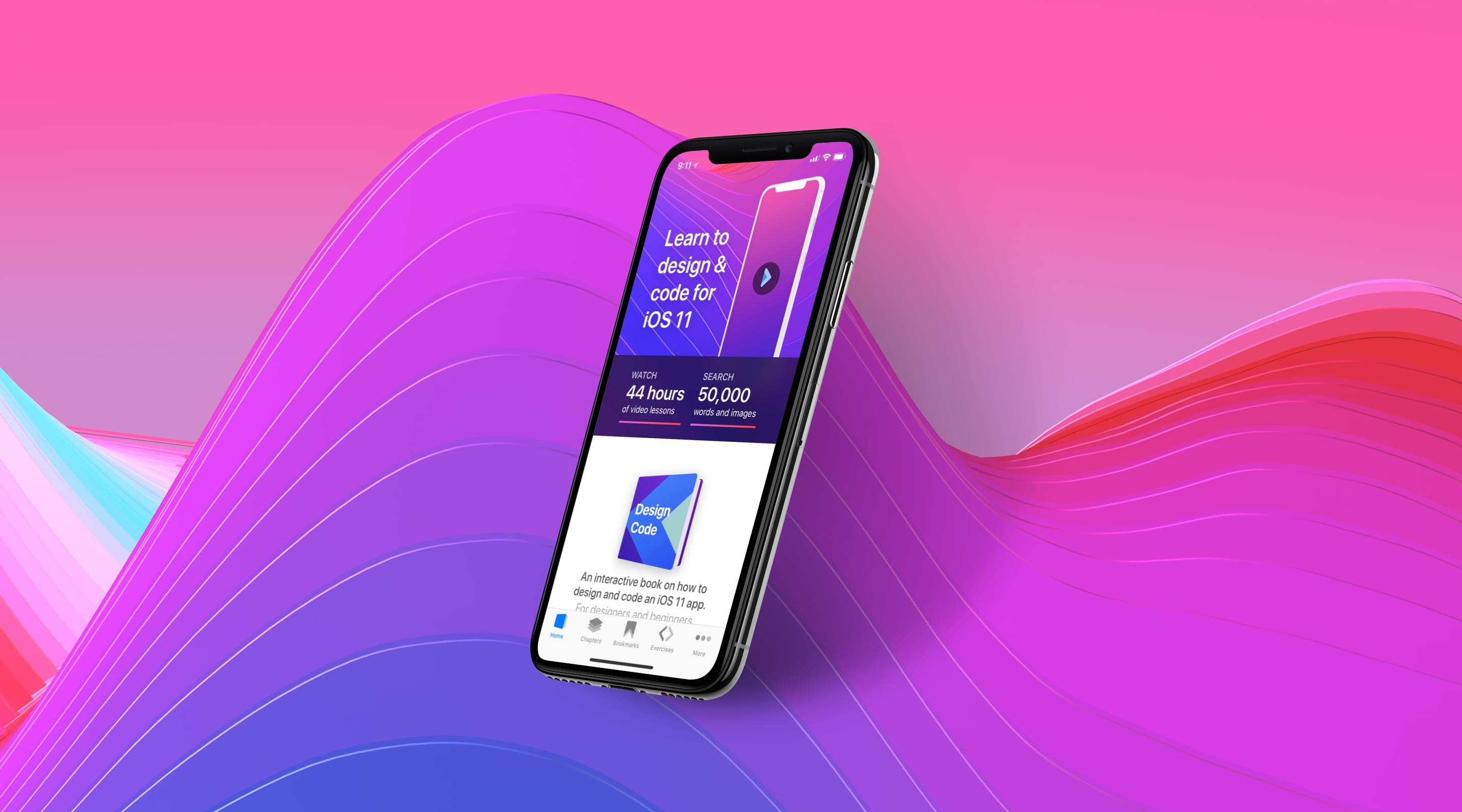
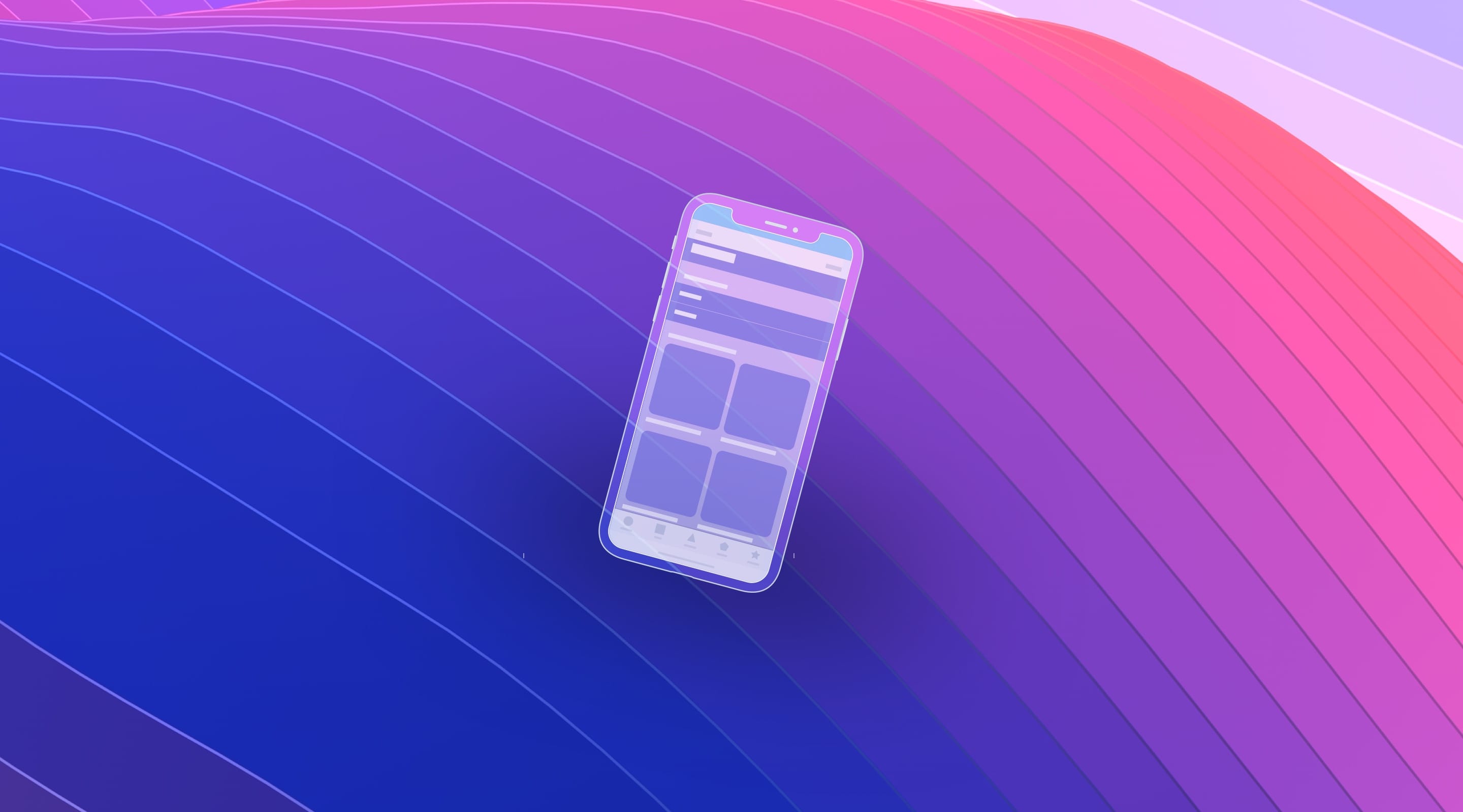
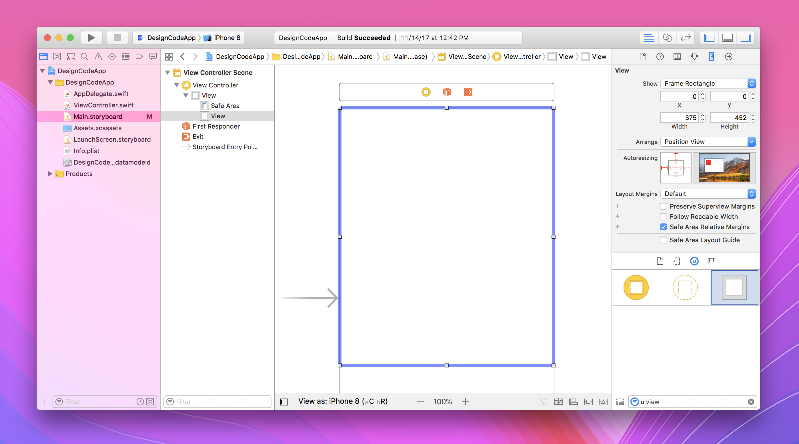
Let’s create the container for the Hero section. Usually, you want to use a UIView to group together a bunch of objects. Drag and drop the UIView and go to Size Inspector and change the properties to x 0, y 0, width 375 and height 452.
UIImage for the Background
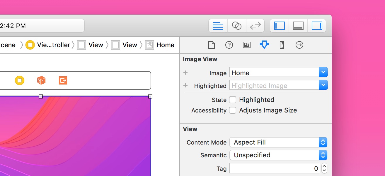
Drag and drop a UIImage inside the UIView, and set it to the same properties: x 0, y 0, width 375 and height 452. Set the Image to Home and the Content Mode to Aspect Fill.
UILabel for Text
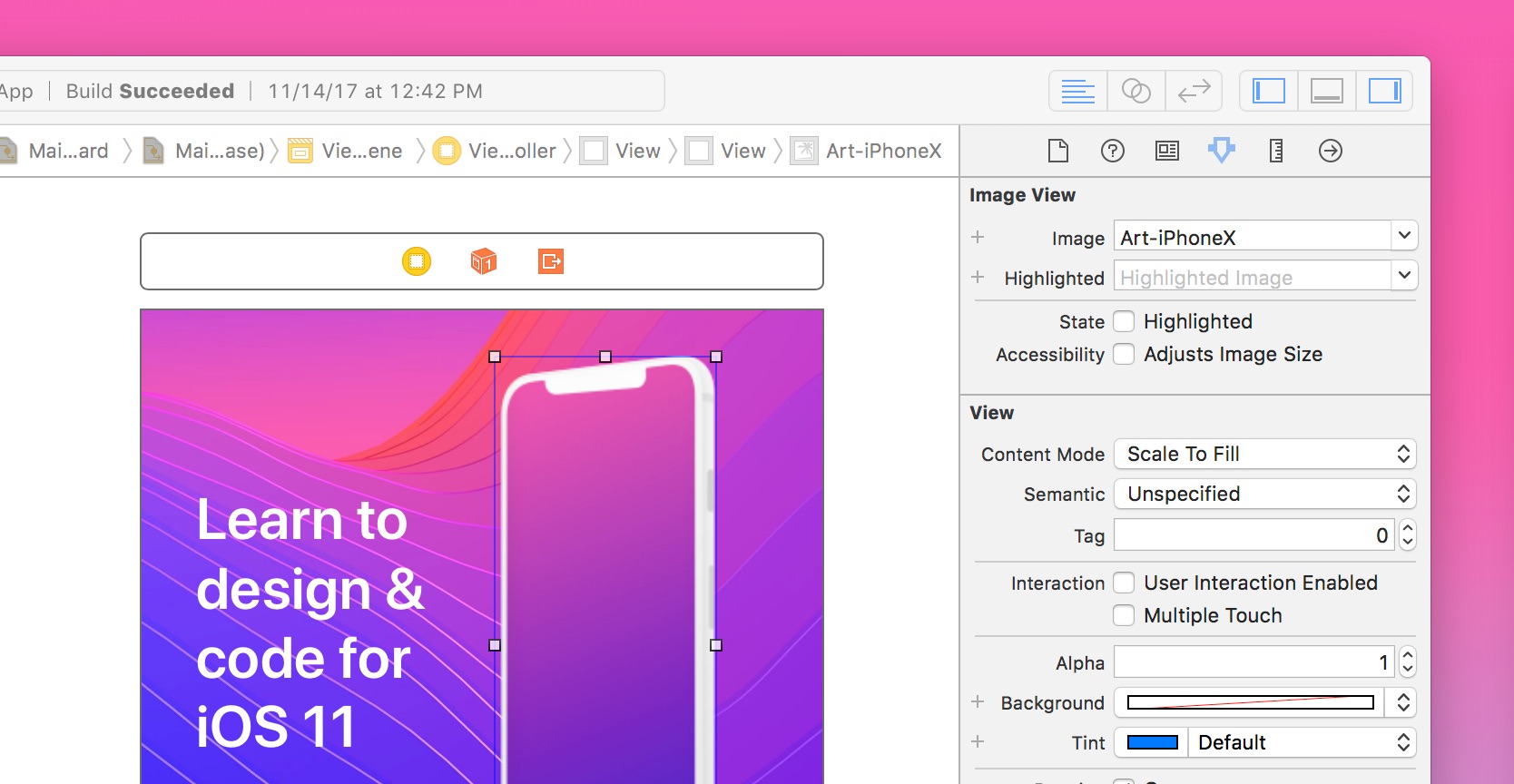
For the main title, we’ll drag in a UILabel. Double click on it and set the text to “Learn to design & code for iOS 11”. Set the color to white and Lines to 0. The size will be: x 30, y 86, width 160, height 172.
Change Font
The font can be changed by clicking on the T icon in the Attribute Inspector. Set the style to Semibold and size to 36.

Image
For the phone image, we’ll drag in another UIImage. Set the size to: x 194, y 25, width 123, height 319. Set the image to Art-iPhoneX.
Background Blur
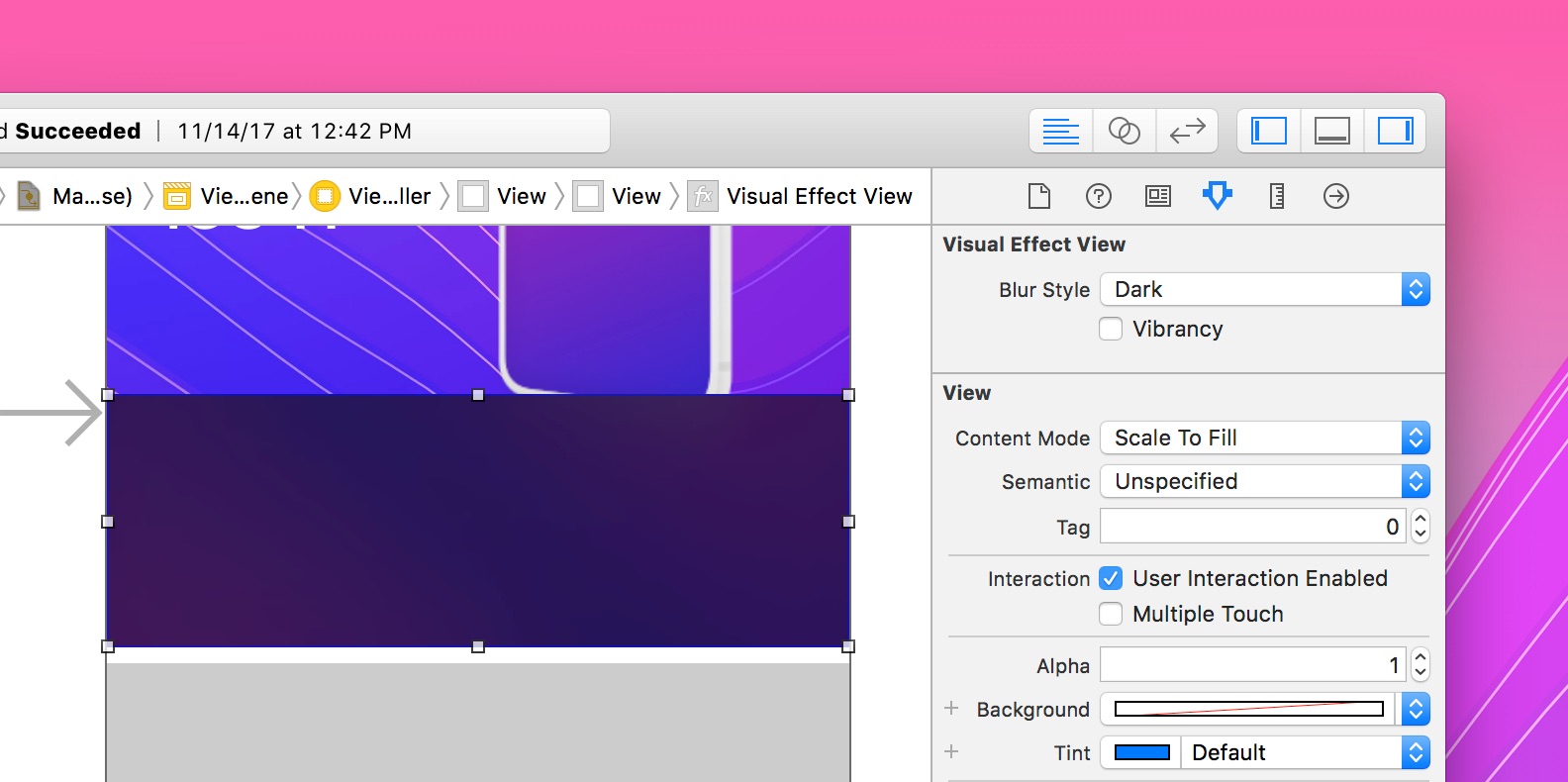
The Storyboard’s Object Library has a lot of interactive objects such as buttons, text fields, date pickers, etc. One of them is the Background Blur layer, which is prominently used in iOS and can be replicated in Sketch.
We’ll drop in a Visual Effect View with Blur object and set to the following size: x 0, y 322, width 375, height 130. The Blur Style is Dark.
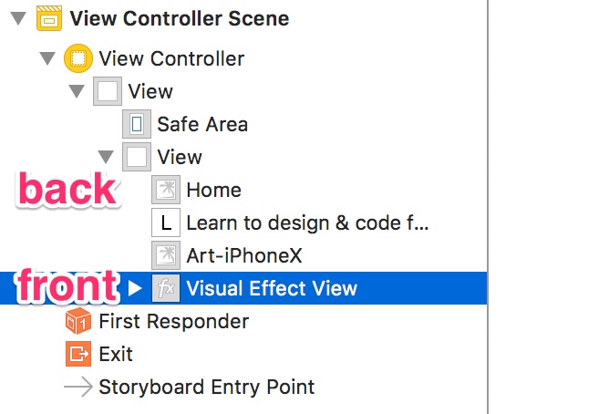
Layer Ordering
Notice that the layers in the left are ordered the same way as Photoshop, or the opposite of Sketch. Layers in the back are further up, and layers in the front are further down.
Stats UILabels
At this point, we’ll create 3 labels to show the stats of the book. Set the first label to WATCH with properties: Color white, Medium 15 pt, x 30, y 23, width 58, height 18.
Changing Color
For the Watch text, we’ll want to use a slightly opaque color. Clicking on the right part shows a list of preset colors for iOS. Clicking on the left part gives a custom Mac color picker and you can quickly change the opacity there. Set it to 60%.
Duplicating Object
You can duplicate by pressing Command + D to create the second label. Double-click to change the text to “44 hours”. The position is: x 30, y 39. Set the font to Semibold 30 pt.
For the third text, duplicate again and set the text to “of video lessons”. The font will be: Medium 15 pt. Position: x 30, y 75.
Size to Fit Content
At any point, you can wrap the bounding box against the text by going to Editor > Size to Fit Content. The keyboard shortcut is Command + =.
UIView for Line
Now, let’s create the 3 pt line below the stats. We’ll drag and drop a UIView object. Set the properties to: x 30, y 105, width 130, height 3.
Rounded Corners with Runtime Attributes
To add a border radius to the UIView, we’ll need to go to the Identity Inspector and create a new User Defined Runtime Attribute.
In the Key Path field, write layer.cornerRadius. In Type, choose Number and in Value, write 3. Please note that Runtime Attributes won’t be reflected in Storyboard, but will be shown when you run the app in iOS Simulator.
Using a HEX color or Eyedropper
For the color of the line, you can go to the color picker and click on RGB Sliders to find the Hex Color # field. Paste the HEX color value AF47B9.
Multiple Selections and Duplicate
Next, we’ll select all 4 objects by holding Shift. Once selected, Option + drag to duplicate to the right. Make sure to use the smart guides (blue lines) to align perfectly. Hold Option to view the distances from the left and use the arrow keys to nudge those objects until you get a 195 from the left.
Change the duplicated texts to: SEARCH, 50,000, words and images.
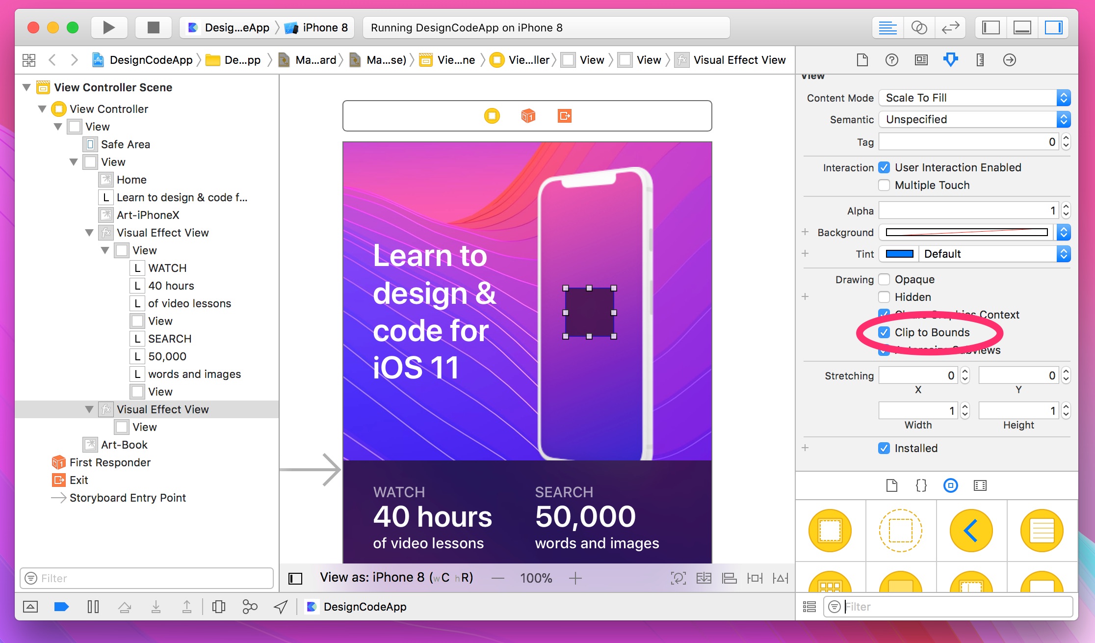
Creating a Circle
For the Play Video background, we’ll first need a blurred background wrapper. Drag and drop a Visual Effect View and set it to x 226, y 148, width 50, height 50. Go to Identity Inspector and set a new Runtime Attribute layer.cornerRadius, type number, value 25. The value to get a perfect circle is the width divided by 2.
Because the Visual Effect View has a sub-View, we need to enable Clip to Bounds in the Attributes Inspector. This is the equivalent of Mask in Sketch, which enables you to ensure that any sub-elements don’t appear outside of those bounds.
UIButton for Play Button
Drag and drop a UIButton inside of the Visual Effect View. Double-click on it to delete the text inside. Go to the Attributes Inspector, set the Image to Action-Play-Small. Set the size to x 0, y 0, width 50, height 50.
UIView for Book Container
Let’s create a container for the book content. Drag and drop a UIView with the properties: x 0, y 452, width 375, height 348. Grouping similar objects makes it easy to move and set up constraints later.
Media Library
For the book image, we’ll drag and drop directly from the Media Library. What’s great about this technique is that the asset gets perfectly sized from the start. You just need to center horizontally and set it at a distance of 50 from the container. Again, use the Option key to view the distances between elements.
Adding Drop Shadows
Let’s add a drop shadow to the book. Select the book and go to the Identity Inspector. In Runtime Attributes, add the following:
layer.shadowOpacity, Number, 0.25
layer.shadowRadius, Number, 10
layer.shadowOffset, Size, {0,0}
Because an image dropped from the Media Library has Clip to Bounds enabled automatically, we need to disable this in order to show the drop shadow.
Naming Objects
Typically, objects inherit their properties. For example, a Label gets the name of its text property. But for UIViews that serve as containers, we can give them a custom name by going to the Identity Inspector and change the Label property. For the first Hero container, let’s name it Hero View and for the book container, let’s name it Book View. Again, it’s good to be specific of the type of object it is by adding View at the end.

Conclusion
So far, we’ve learned how to use basic objects in Storyboard such as views, buttons and images. On top of that, we got familiar with distances, smart guides and runtime attributes. We have yet to set constraints for adapting our layout, which is what we’ll learn next.