Downloads for Adapting for iPhone X
To follow this tutorial, you’ll need Xcode 9 and the finished Xcode project from Auto Layout and Stack Views. You can download the final Xcode project to help you compare with your own progress.
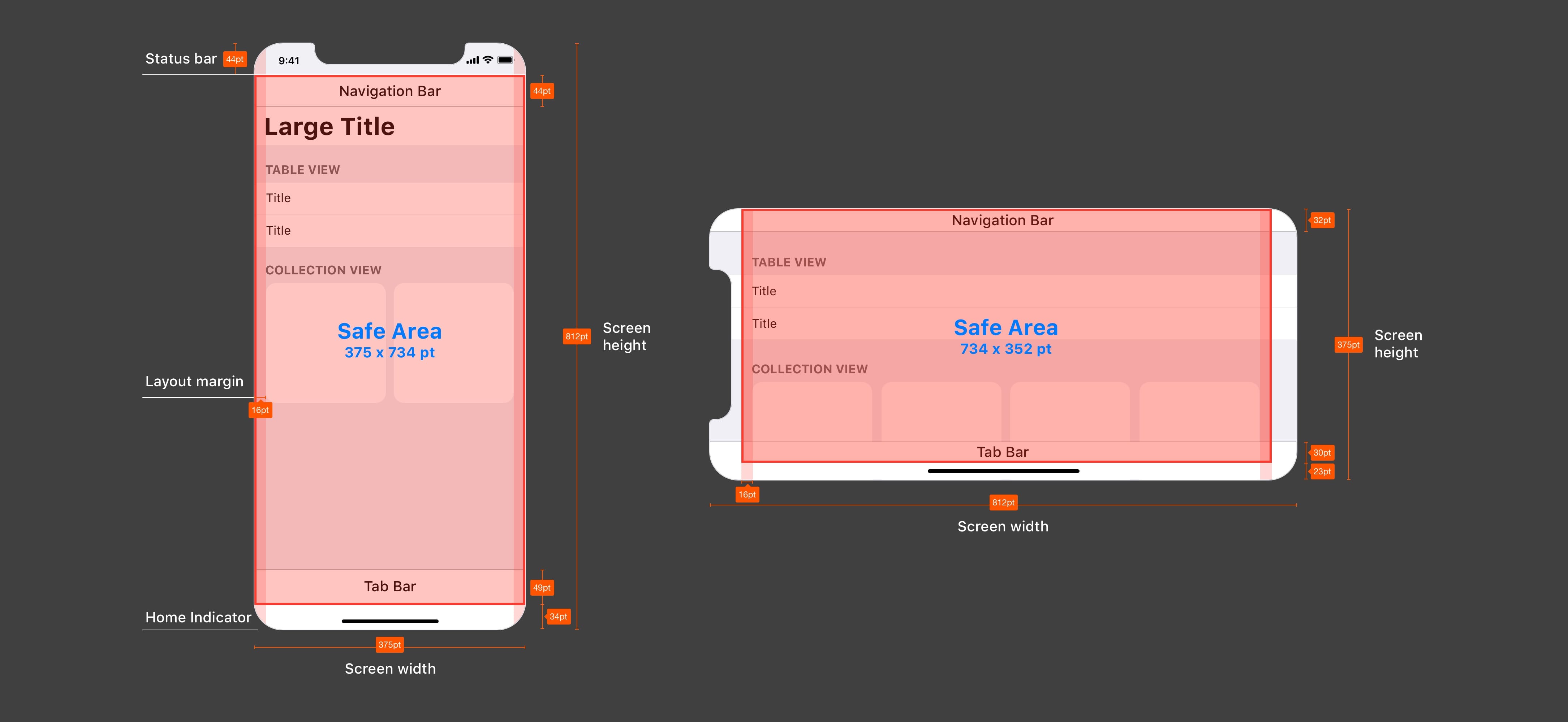
Safe Area Layout Guides
The Safe Area is enabled by default in Xcode 9 if you start a new project. As you can see from this illustration, the red area is your Safe Area where the Notch, corners and Home Indicator won’t clip your content.
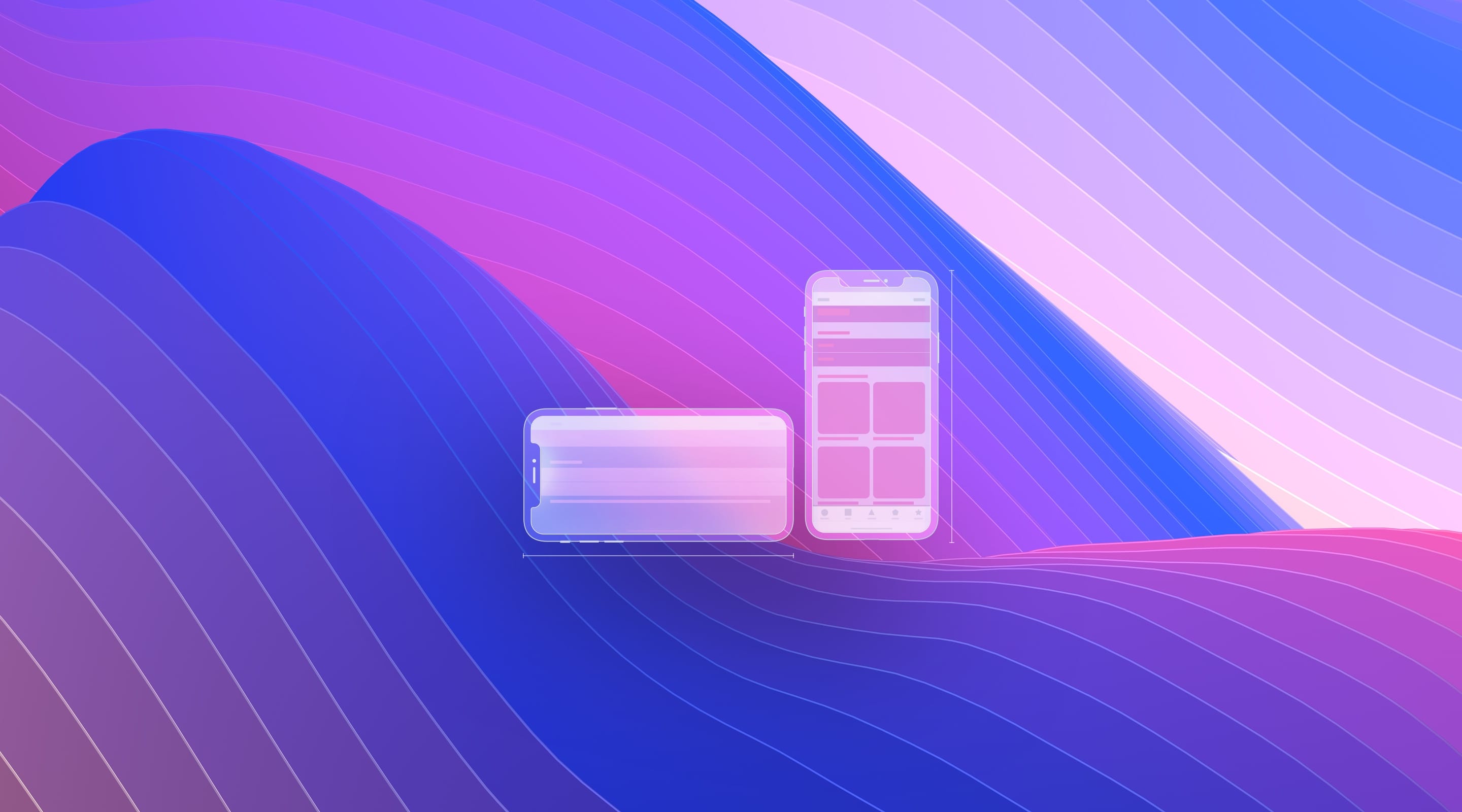
Preview on iPhone X
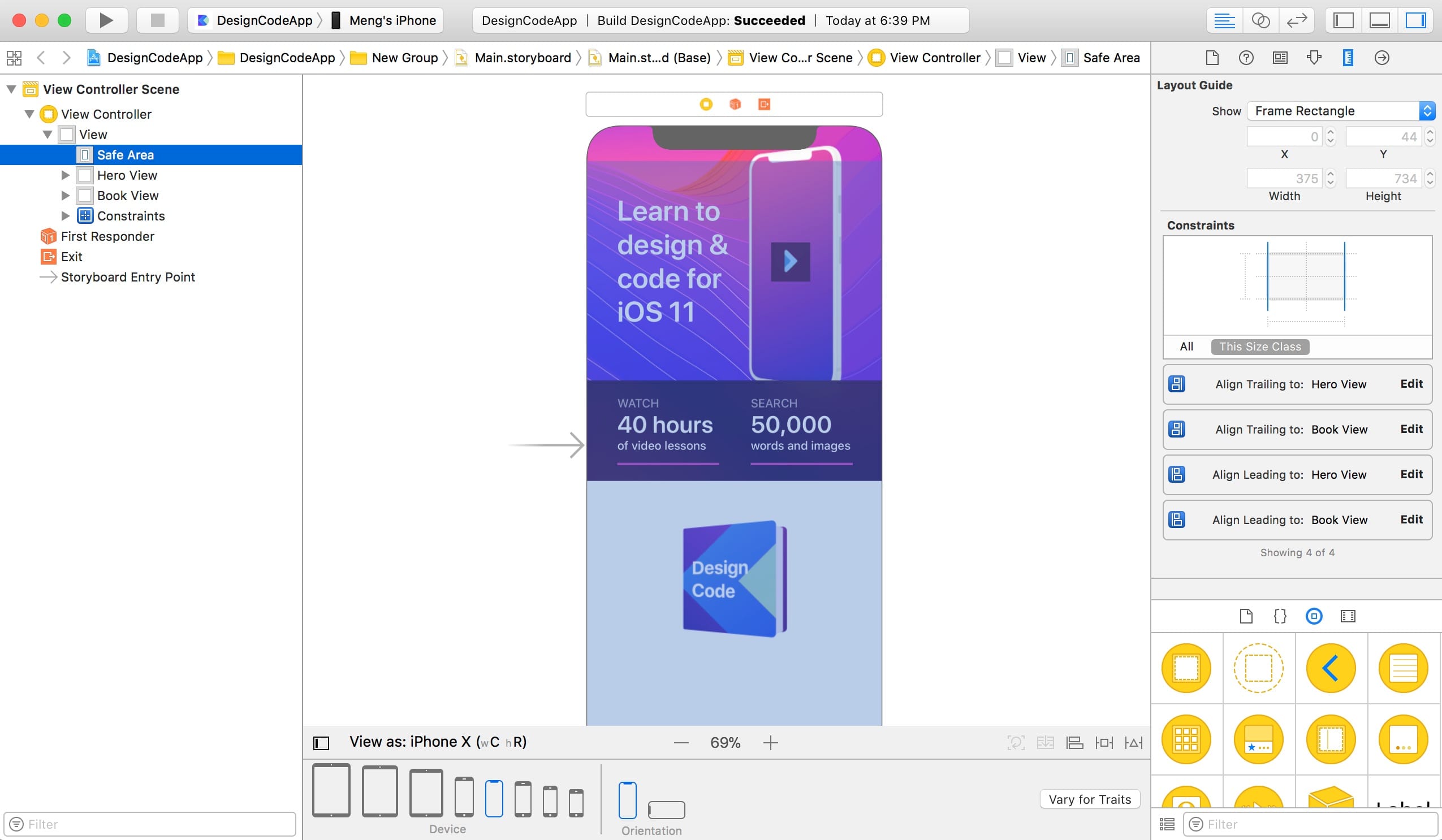
To design for iPhone X, the first thing we need to do is to set View as: iPhone X. Like this, we can see how our screen looks with a Notch and with large corners visible. Already, we can see that the device image is being slightly clipped by the Notch.
UIScrollView
The content is often larger than the screen height, so scrolling is a key experience in iOS. Virtually all screens are wrapped in a UIScrollView. For the iPhone X, it’s important to set the border constraints against the Superview and not the Safe Area, because often times, you’ll want the background image to be underneath the Notch or the corners of the screen.
Let’s drag and drop a UIScrollView from the Object Library to the Document Outline, right below the Safe Area. Let’s set the Size to x 0, y 0, width 375, height 812, which happens to be the size of the iPhone X screen.

Wrapping In Scroll View
We’ll need to put the Hero View and Book View to be inside the Scroll View so that it can be scrolled vertically should the content height exceed the screen height. Drag and drop both the Hero View and Book View inside Scroll View.
Then, select Hero View and set the size y position to 0. Select the Book View and set the y position to 452.
Add Missing Constraints
Thanks to these placements, Xcode will be smart enough to detect the missing constraints. Check the Auto Layout warnings by clicking on the red arrow in the Document Outline. Start Adding Missing Constraints one by one by clicking on the red square icon until you no longer have Auto Layout issues.
Keep in mind that this feature is not perfect. It may in fact add some unwanted constraints, but it really helps that we added a lot of important constraints manually.
Fixing the Device Image
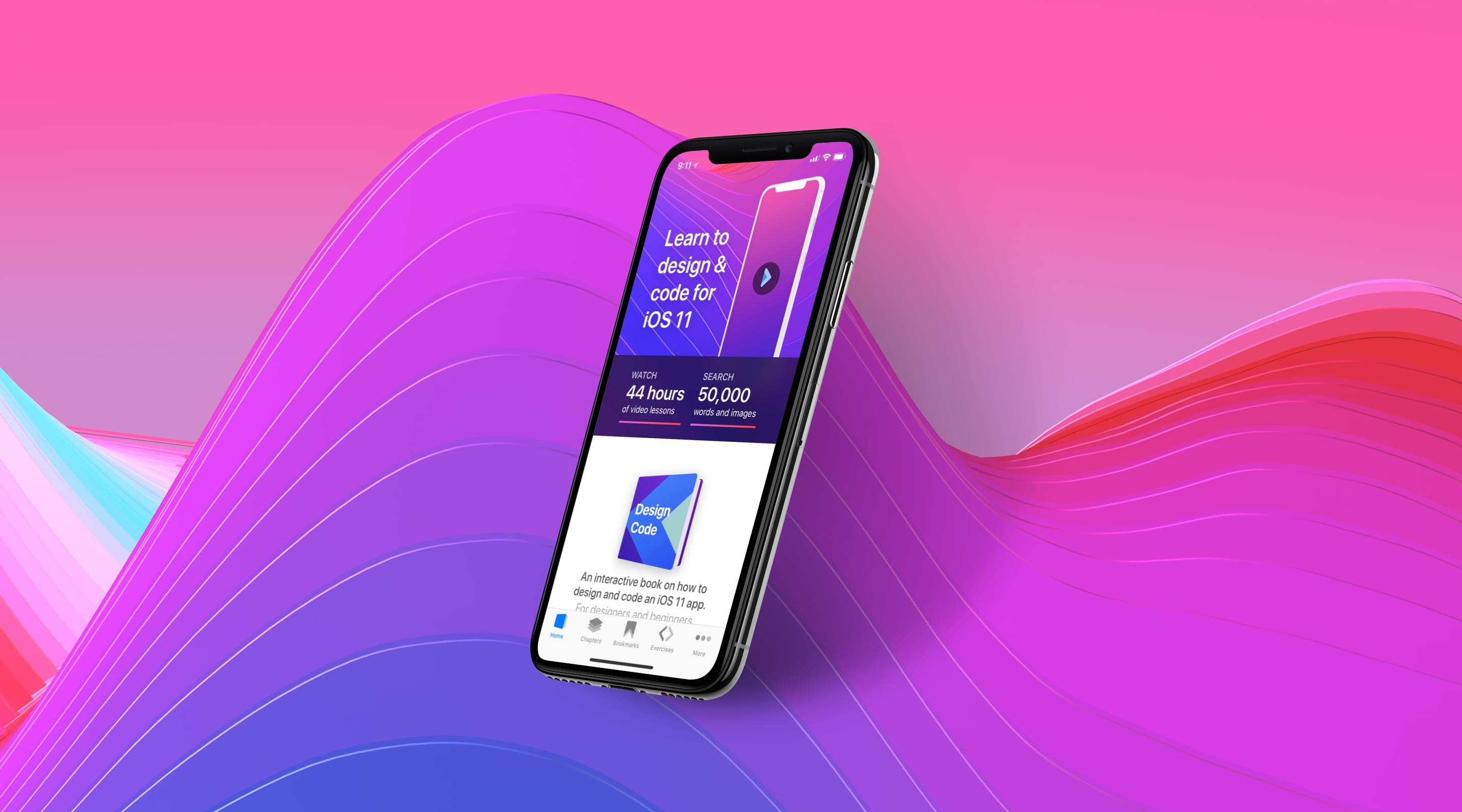
Let’s fix the clipping on the device image. Since the device image is relative to the y position of the title, we’ll change the title. By doing that, it will affect both the device image and the play button inside.
Select the title and double-click on the middle line. You’ll find a popover where you can change the -54 value to -34.
Text with Multiple Lines
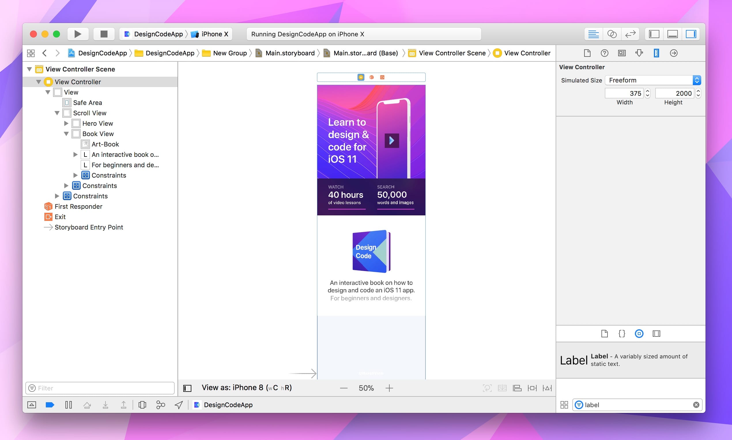
Drop a UILabel below the book and set the text to “An interactive book on how to design and code an iOS 11 app.”, at 22pt Medium color 404040. When you have multiple lines, you need to set the Lines property to 0, which means that there can be an infinite number of lines. Set the Alignment to center. Additionally, set the size to x 30, y 220, width 315, height 53.
Let’s duplicate the label and set the text to “For beginners and designers.”. Change the color to Light Gray Color by clicking on the right side of the Color property.
For the first label, control drag to the book image and select Center Horizontally. Set the constraints to top 20 and width 315.
For the second label, control drag to the first label and shift select Center Horizontally and Equal Widths. Set the constraint to top 0.
Make sure that the constraint is against the first label and not the book with the arrow. Automatically, the bounding box for the labels will wrap around the expected size of the text.
Custom View Controller Size
The content for our Home screen is getting larger than the viewable portion. To make it even taller than the iPhone X, select the View Controller and go to the Size Inspector. There, you can set the Simulated Size from Fixed to Freeform. Set the height to 2000.
Chapter View Container
It’s time to create the Chapter section where the Safe Area layout guides will be truly useful. Let’s create a UIView with x 0, y 800, width 375, height 380. Set the background color to F5F5F5. Change the name to Chapter in the Identity Inspector’s Label field.
Set the constraints to 0 top, 0 right, 820 bottom and 0 left. Afterwards, we’ll need to resolve the conflicting constraints by deleting the one that makes the least sense: bottom = Book View + 12. It’s confusing at first to keep track of all the constraints, but once you get the hang of it, you’ll know quickly which constraints don’t belong.
Finally, add the recommended missing Y constraint to the Scroll View.
Chapter Title Label
For the title, create a UILabel with text “CHAPTER 1: 12 SECTIONS”. Set the font to Semibold 15 pt, color 404040. Set the constraints to top 50, right 20 and left 20.
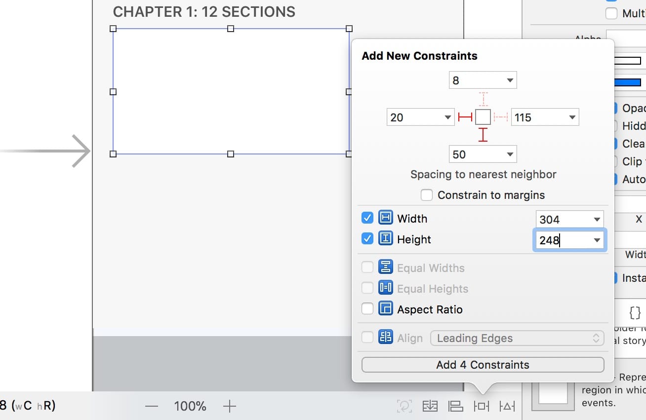
Chapter Section View
Let’s create a card UI for each section. Drop a UIView and set the constraints to left 20, bottom 50, width 304, height 248.
Testing on iPhone X
It’s important to constantly test your interface on the iOS Simulator or the device. To do that, select iPhone X and click on the Play button in Xcode (Command R).
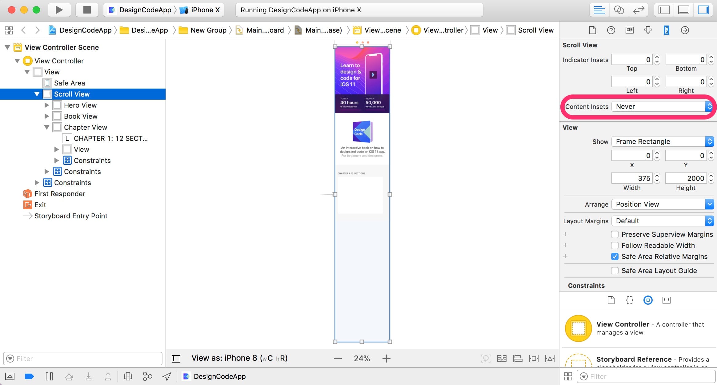
Fixing the Status Bar Background
Some visual problems won’t be noticeable in Storyboard but will be obvious when testing. For example, as you scroll back up, you’ll notice that there is a big white space. To fix this, select the Scroll View and go to the Size Inspector to change the Content Insets to Never.
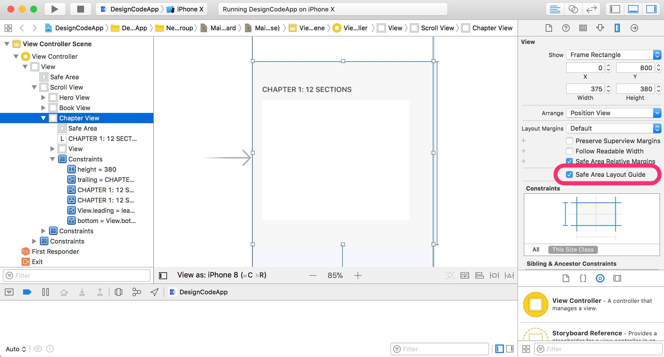
Enabling Safe Area Layout Guide
We also need to fix the Chapter content to have more margin on the iPhone X’s landscape mode. The Safe Area layout guide is perfect for solving this problem. By default, the layout guide is enabled at the Superview level, but not in subviews. To enable the guide, select Chapter View and go to the Size Inspector and check Safe Area Layout Guide.
Safe Area Constraint
Now we need to fix the left constraint for both the Chapter title and view. Select the title and click on the blue line on its left. Then, in the inspector, change the Second Item from Chapter View.Leading to Safe Area. Let’s do the same for the view’s left constraint. Change to Safe Area as well.
Conclusion
Designing for iPhone X is all about anticipating how the Notch, corners and Home indicator will affect your design. At the top of the screen, we pushed the device image down a little and we applied the Safe Area layout guide to our Chapter content. In addition, we learned how to continuously test our app on the iPhone X device. Now, our design works perfectly on the iPhone X’s portrait and landscape mode.