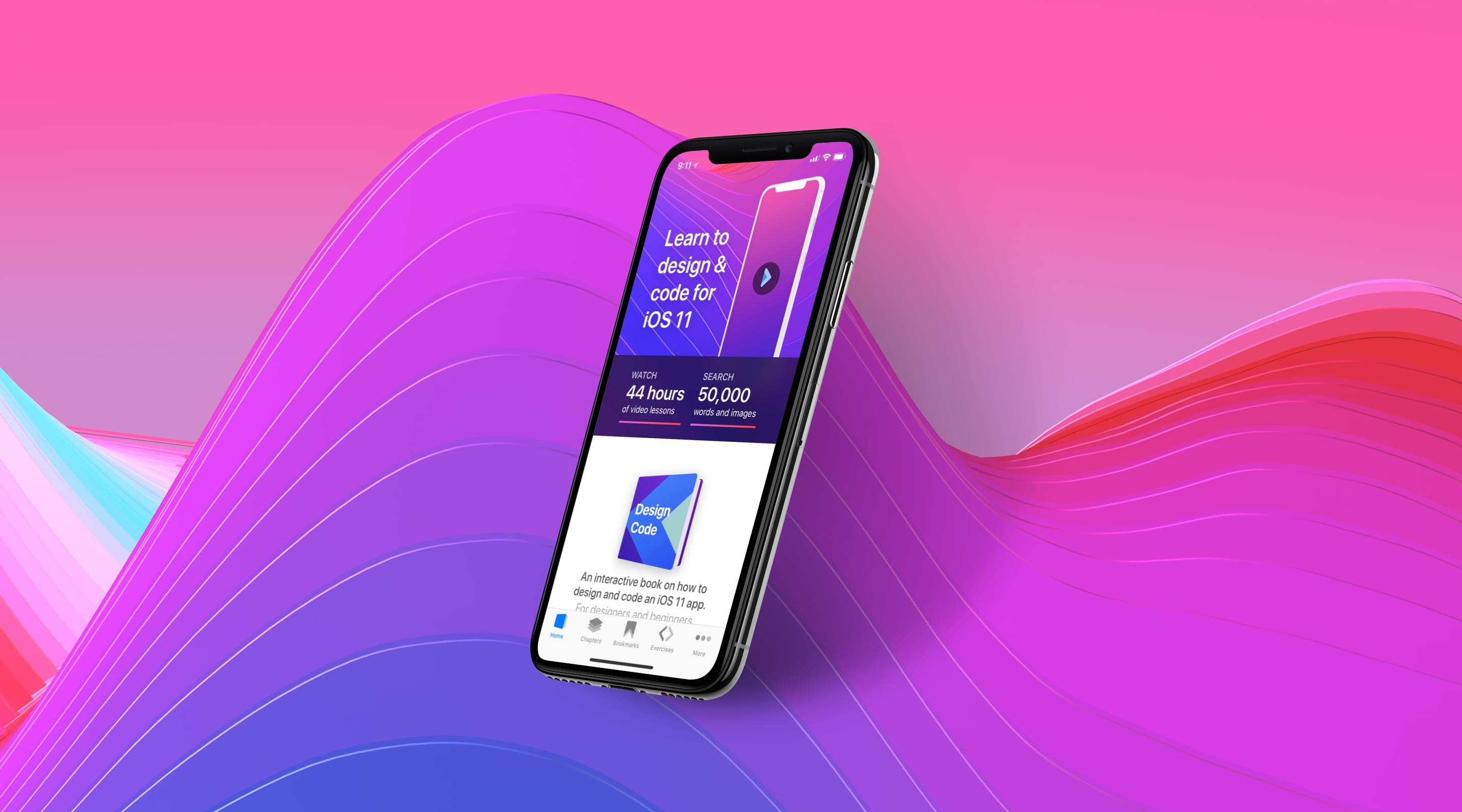
Downloads for Design in Playground
To follow this tutorial, you’ll need Xcode 9 and the assets. You can download the final Playground file to help you compare with your own progress.
Create a Playground
Let’s create a new document in Swift Playground. Let’s go to Xcode’s welcome screen and click on Get started with a playground. We’ll select Single View. Then, save DesignCode-Design to a folder like Documents. At this time, we’re not too interested in application logics. We want to code UIs.
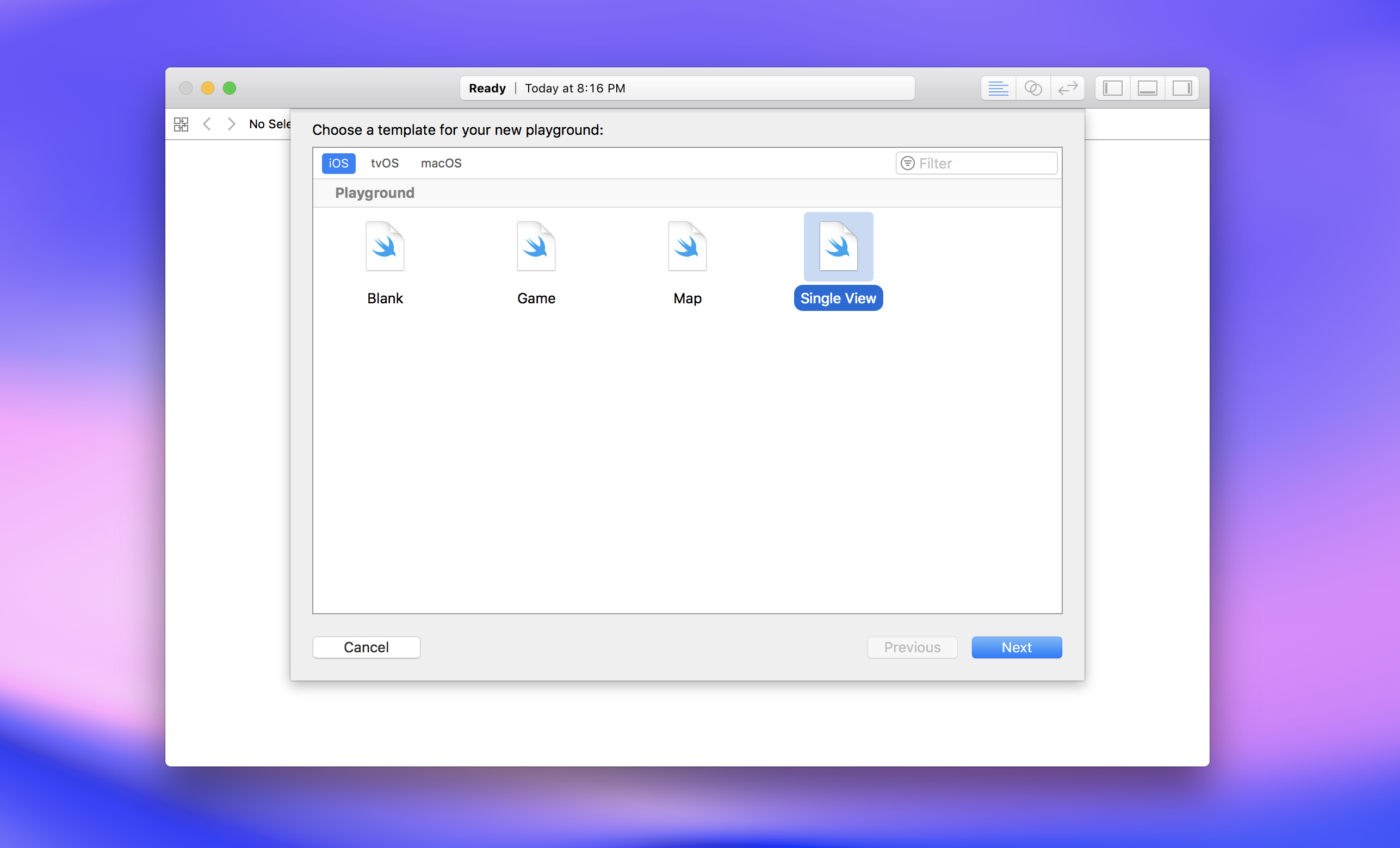
Single View Playground
Single View gives us a starting template that includes a white View Controller, with a Label of 200 x 20 pt.
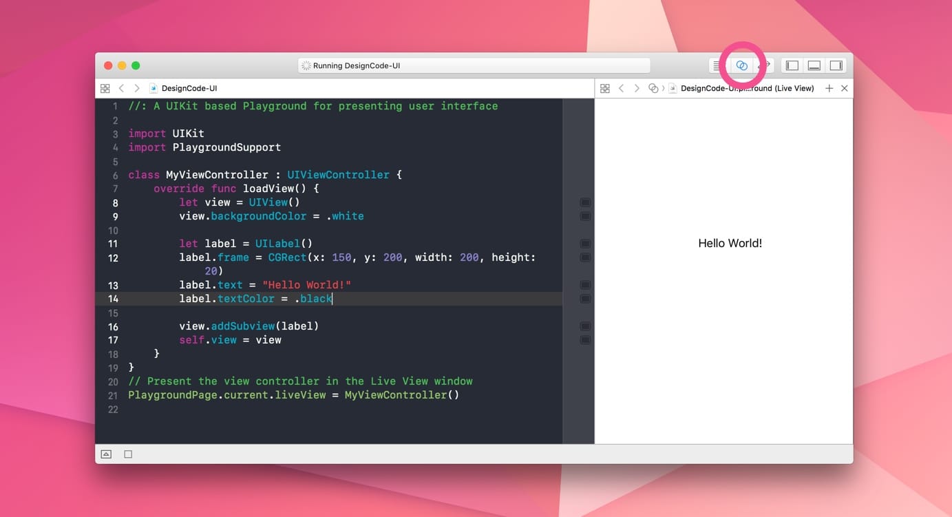
Enable the Preview
To see the live preview of your code, you can enable Show the Assistant editor in the far right of the toolbar. Once enabled, it’ll show you what the View Controller looks like.
UIKit
In the first line, you’ll find import UIKit. This simply means that we’re using the iOS framework called UIKit by Apple, which pretty much powers everything you see in iOS. Apple has made it really easy to design and build powerful apps without the need of a single library. Anything from ARKit, to multiple ways to animate, in-app purchases are provided in UIKit.
Playground Support
In the second line, we’re using import PlaygroundSupport, which allows us to preview animations thanks to the following code at the end:
PlaygroundPage.current.liveView = MyViewController()
This last line simply means that we’re using PlaygroundPage from the library PlaygroundSupport to create a live preview of the View Controller.
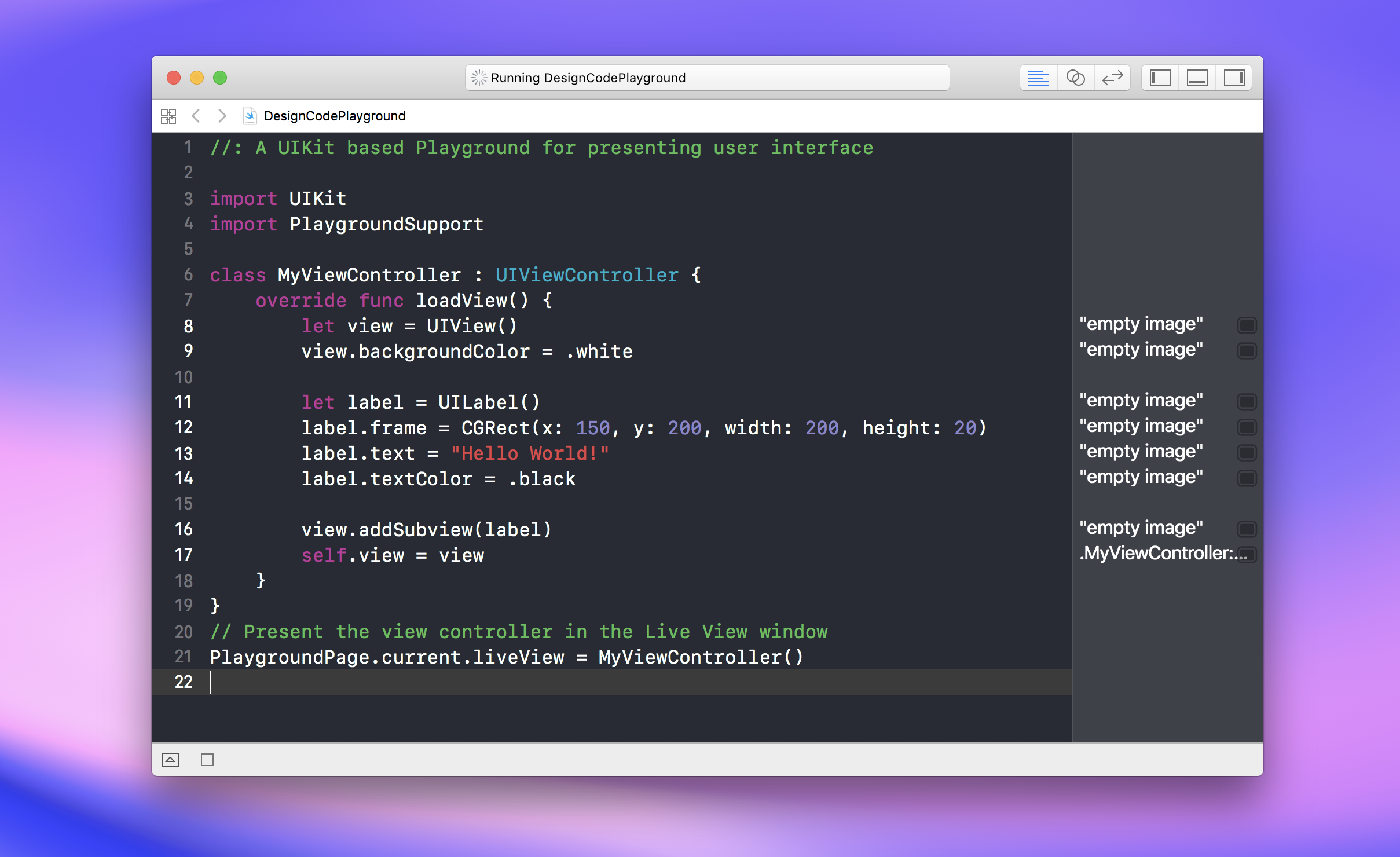
View Controller
We’re starting a View Controller class called MyViewController. A View Controller is the equivalent of an Artboard in Sketch. This screen is already set up with a white background and a black text that says “Hello World”.
class MyViewController : UIViewController {
    override func loadView() {
        let view = UIView()
        view.backgroundColor = .white

        let label = UILabel()
        label.frame = CGRect(x: 150, y: 200, width: 200, height: 20)
        label.text = "Hello World!"
        label.textColor = .black

        view.addSubview(label)
        self.view = view
    }
}
UILabel
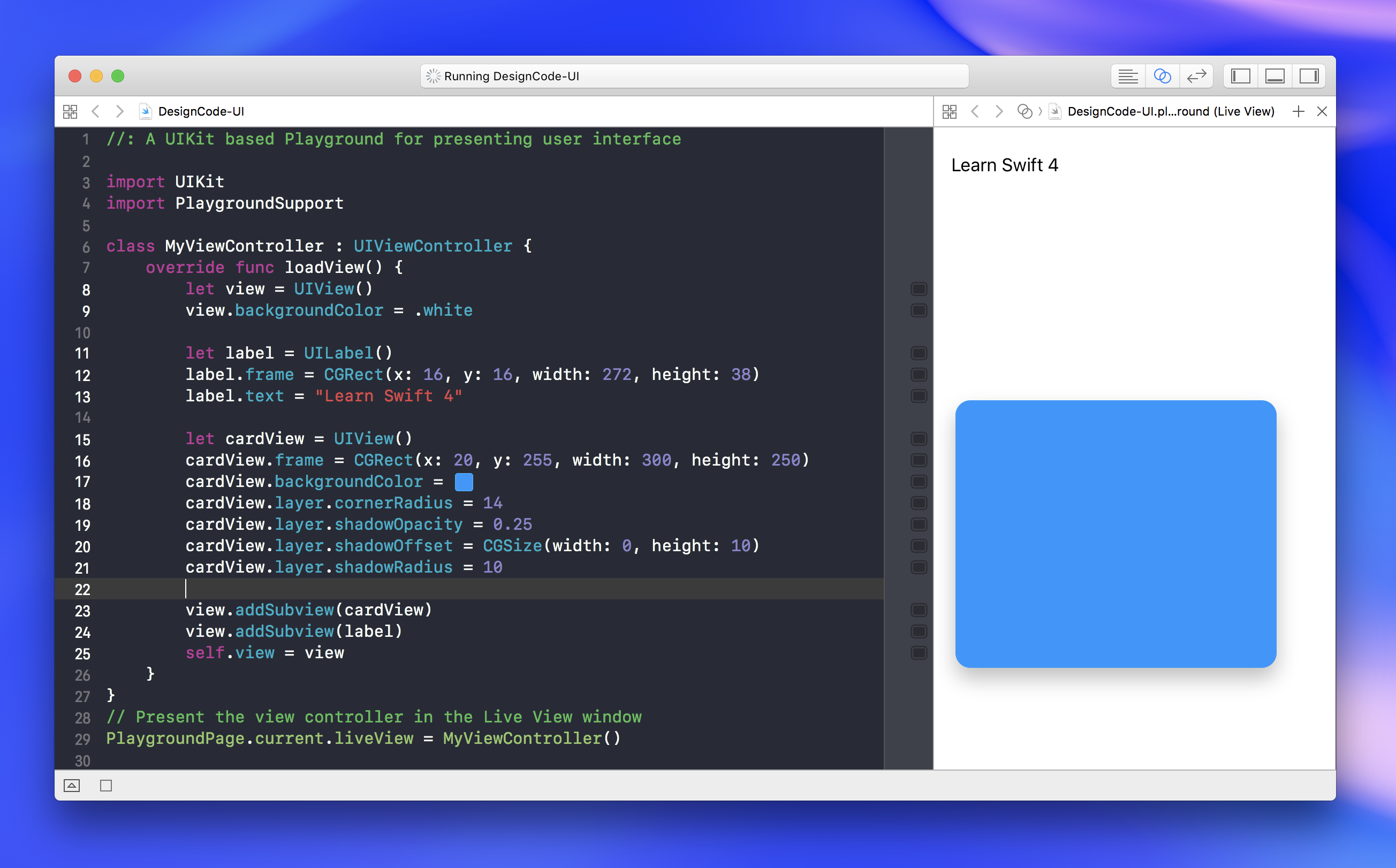
Let’s customize the label to recreate the title in the final screen. Change the frame’s position and size to the following. Pretty straightforward, since these values are common in most design tools.
label.frame = CGRect(x: 16, y: 16, width: 272, height: 38)
Let’s change the label.text to ”Learn Swift 4”. Already, you can see how changing the code affects the screen content.
label.text = "Learn Swift 4"
UIView
For the card, we’ll use a UIView. The UIView can be compared to a Rectangle in your design tool. You can set a bunch of properties like background colors, rounded corners and drop shadows. We’ll name it cardView. The first word card is for describing what the object is. View is important for calling the type of element.
let cardView = UIView()
As soon as you type UIView, you’ll notice an autocompletion window that shows you the suggestions based on what you’re typing. We can just press Enter to complete UIView. Then, type the left parenthesis, right parenthesis. This simply means that we’re initializing the object UIView.
Frame
With cardView declared, we’re going set the frame property. When you type frame, you’ll see what kind of value it is. In this case, it expects a CGRect. A CGRect is basically a rectangle. Type equal, CGRect, then press Enter to autocomplete. Type ( in front to show another suggestion window and select the 5th one. Start filling the x, y, width and height values. You can use Tab to move to the next value.
cardView.frame = CGRect(x: 20, y: 255, width: 300, height: 250)
UIColor
Let’s set a background color for cardView using the property backgroundColor. What you’ll notice here is that backgroundColor is expecting a UIColor as a value. You can type UIColor, dot, blue. Blue is a preset color among a few others like white, black, red, etc.
cardView.backgroundColor = UIColor.blue
Adding a Subview
Once we have a cardView with a frame and a color, it should be visible. Let’s go ahead and add it to the screen. In order to do that, we’ll use the addSubview method.
view.addSubview(cardView)
Avoiding Repetition
Since Swift already knows that backgroundColor is a UIColor, when you choose blue as a color, you don’t need to repeat UIColor, making the code more concise.
cardView.backgroundColor = .blue
Color Literal
Except for black and white, the preset colors are not very good-looking. Blue, for example, is oversaturated. Sure, we can initialize UIColor with RGBA, but you have to divide by its maximum value. In this case, it’s 255.
cardView.backgroundColor = UIColor(red: 255/255, green: 45/255, blue: 85/255, alpha: 1)
Color Literal allows you to set a color using the GUI. By typing Color Literal, you’ll get the autocompletion for that. Then, just double-click to pick the color.
Corner Radius
Every object is a UIView. The UIView has a layer property that allows you to set additional properties such as rounded corners, shadows, etc.
cardView.layer.cornerRadius = 14
Drop Shadows
To add a shadow, you need to set the opacity, offset and radius.
cardView.layer.shadowOpacity = 0.25
cardView.layer.shadowOffset = CGSize(width: 0, height: 10)
cardView.layer.shadowRadius = 10
Renaming Label
Because we’re going to have multiple labels, we shouldn’t name it label, so that it doesn’t confuse with other labels. Let’s rename to titleLabel.
let titleLabel = UILabel()
titleLabel.frame = CGRect(x: 16, y: 16, width: 272, height: 38)
titleLabel.text = "Learn Swift 4"
Let’s also move the label to be inside the cardView. Just like how we have the cardView to be inside view (the View Controller’s background), we now have label inside cardView. It’s the same organization as the Groups in Sketch.
cardView.addSubview(titleLabel)
UIFont
The Label can have a property called font, which enables you to set the typeface, size and weight. Let’s set it to system font, which is San Francisco by default, size 32 and weight Semibold.
titleLabel.font = UIFont.systemFont(ofSize: 32, weight: .semibold)
titleLabel.textColor = .white
Caption
The captionLabel will have a similar settings to the titleLabel. Let’s add Caption to the cardView.
let captionLabel = UILabel()
captionLabel.frame = CGRect(x: 16, y: 204, width: 272, height: 40)
captionLabel.text = "Design directly in Playground"
captionLabel.textColor = .white
cardView.addSubview(captionLabel)
Adding images to Resources
To use images in our Playground, you need to open the Navigator by pressing Command + 1. Then, drag and drop the image files found in the assets provided.
UIImageView
With UIImageView, you can use an image file and set its contentMode. Let’s set up coverImageView, with scaleAspectFill, which always make sure that the image covers the entire width or height, whichever is the highest, while keeping the aspect ratio. ImageView is basically a View that wraps around an Image. Now, let’s set the image inside.
let coverImageView = UIImageView()
coverImageView.frame = CGRect(x: 0, y: 0, width: 300, height: 250)
coverImageView.contentMode = .scaleAspectFill
coverImageView.image = UIImage(named: "Cover.jpg")
cardView.addSubview(coverImageView)
Image Literal
You can simplify the code by dragging and dropping from the Resources.
Clip To Bounds
You might have noticed that the cover image is larger than its cardView container. We need to use something like Mask in Sketch. In Xcode, you can use the property clipToBounds to create a masking. Then, set the rounded corners.
coverImageView.clipsToBounds = true
coverImageView.layer.cornerRadius = 14
Hierarchy
Just like when you read a page, there is an order in how you process the information: from top to bottom. Code works the same way. If you insert the image after the texts, the program will think that the image sits on top of the texts. To fix this, you need to re-arrange the order of the code.
view.addSubview(cardView)
cardView.addSubview(coverImageView)
cardView.addSubview(captionLabel)
cardView.addSubview(titleLabel)
Background Image
Since this is a prototype, we don’t need to recreate the elements we don’t want to animate or modify. For the rest of the elements, we’ll just use an image that takes the entire screen and add that to the main view. Make sure that the backgroundImageView is added before cardView.
let backgroundImageView = UIImageView()
backgroundImageView.frame = CGRect(x: 0, y: 0, width: 375, height: 667)
backgroundImageView.image = #imageLiteral(resourceName: "Chapters Screen@2x.png")
view.addSubview(backgroundImageView)
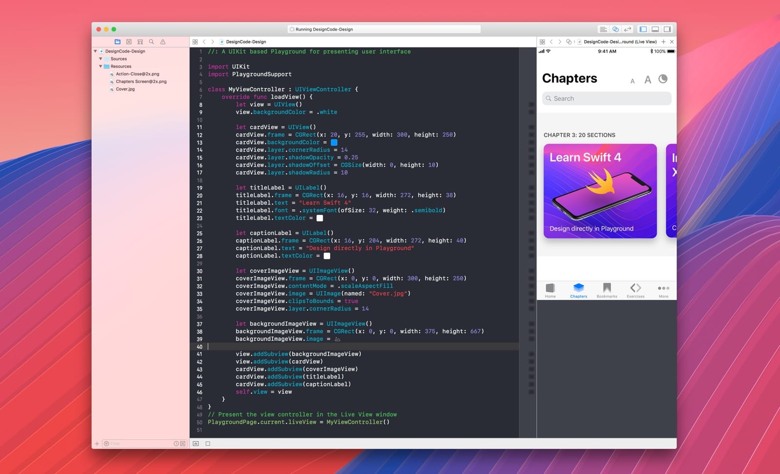
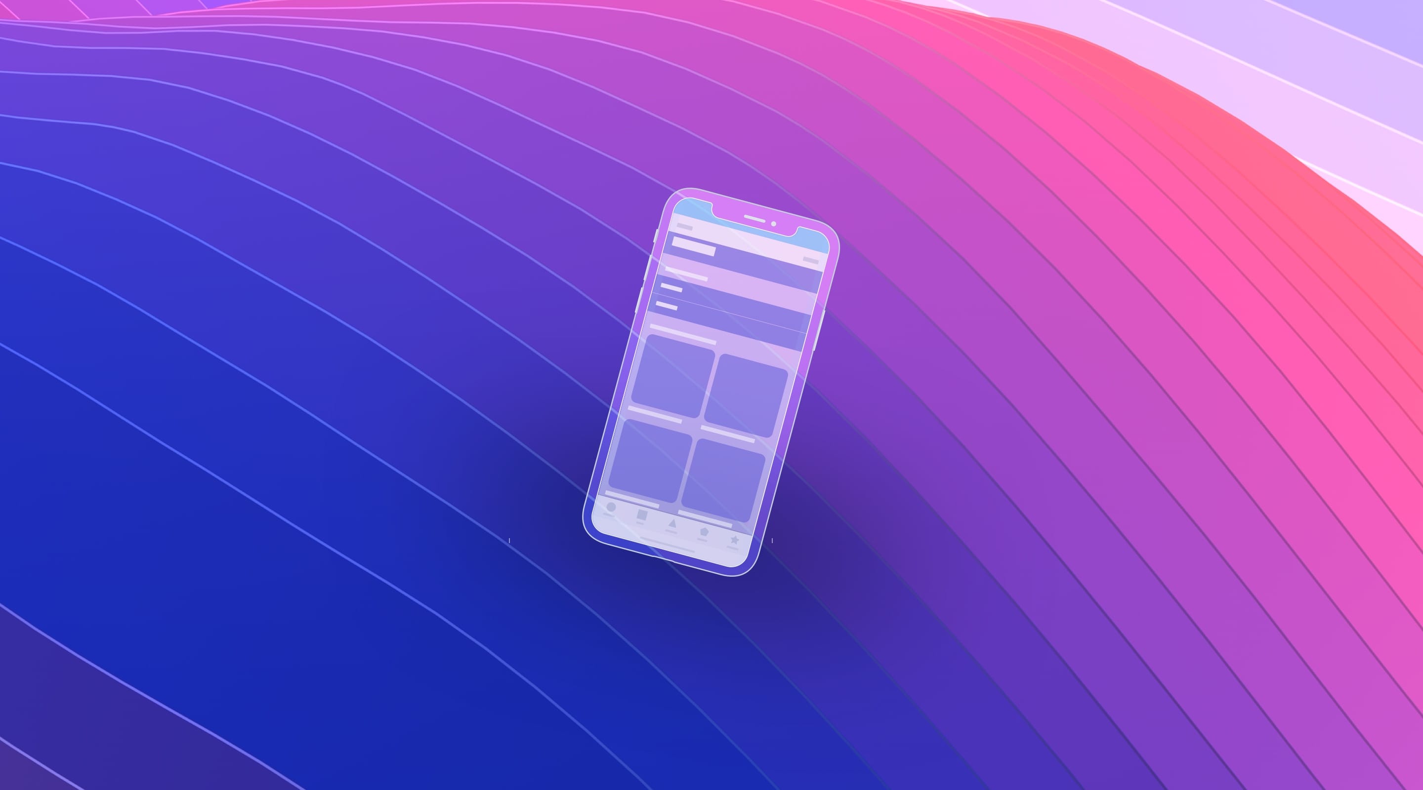
Conclusion
Your final Playground should look something like this. The code has been re-arranged a little to make sure that the hierarchy works as expected. Don’t hesitate to play with your code after this session. The best way to learn new lessons is by breaking the code and figuring out how to fix it afterwards.
So far, you’ve learned the basics of coding the UI objects in code. This is the initial setup we’ll need to start animating the card.