Disclaimer
This section uses an experimental technique. The errors you might encounter while performing this tutorial may be tied to the version of Xcode you are running.
Downloads for Storyboard in Playground
For completing this section, you will need Xcode 9. You can download the initial playground that comes with the storyboard set. In the end, review the final playground for comparison.
Card Controller
The initial playground file has been customized to have a Storyboard file linked to a custom UI View Controller children. By triggering Command+1, you will have access to all the inner files of this project.
Below the Sources folder, there is a Card Controller swift class file. Let’s have a look:
import UIKit

open class CardController : UIViewController {
    @IBOutlet public var card : UIView!
    @IBOutlet public var closeButton : UIButton!

    @IBOutlet public var cardConstraints : Array<NSLayoutConstraint>!

    @IBAction open func tapCard (_ sender : AnyObject) {}
    @IBAction open func tapClose (_ sender : AnyObject) {}
}
This class is the one from which we are going to build our View Controller used in the interaction. It has outlets for the elements we are going to animate. It also has an outlet collection for some constraints we are going to use later. And it also has actions to enable user interaction.
XIB file
Below the Sources folder, there is a resources folder that contains the resources for the close button, the chapters screen, and the section cover image. This group also contains a file called View.xib in which we are going to place our views and set some constraints and actions. When opened it displays a view customized with a blue background.
You will also see that on the left side of it there is a drawer for three items: a file owner, a first responder, and a view. You are already familiar with views, but you might be confused about what is the file owner. Select the File Owner yellow cube and, using the Identity Inspector (Option + Command + 3) check out the value of Class under Custom Class.
Some outline items represent objects that otherwise would have no visual presence, being on the View Controller. Select the Connections Inspector (Option + Command + 6) and see that this object already treats the View as its own.
View Controller
Let’s go back to the actual playground and write some code to leverage what has already been set. Begin by creating a custom View Controller that draws from the functionality we have built on the Card View Controller with the following statements:
class ViewController : CardController {}
Then, set the storyboard to instantiate the view controller into the Storyboard Live View:
PlaygroundPage.current.liveView = ViewController()
And trigger the live view by selecting the Assistant Editor and selecting Live View. It will show a colored canvas with the View Controller we have just created. Nothing else to see for now.
Loading the View
Now we are going to learn a little about what makes a storyboard file tick. Inside the View Controller class, set the following function:
override func loadView() {

    Bundle.main.loadNibNamed("View", owner: self, options: nil)
}
This line is an explicit explanation of what an iOS app does under the hood when it launches. It creates a view controller and loads the view inside while also setting its properties and outlets.
Placing the elements in the view hierarchy
Views are like layers and folders at the same time as they have properties and may have children. If you use Sketch, they correlate to a Symbol or an Artboard. If you use Framer, they act like Layers. Let’s go back to our View.xib file and place some elements.
Firstly, we might want to set a White Color for our background. Then, select the View and, under the Size Inspector, deactivate Safe Area Layout Guide. Also, lay the Chapter Screen.png centered inside.
Cover Image
Continue by also placing an Image View and using the Size Inspector, change the x 20, y 256, width 300 and height 250. Under the Attribute Inspector, set the image field to be Cover.jpg, change the content mode to Aspect Fill so the image stays in ratio while also covering its dimensions and activate Clip to Bounds, so the image does not show outside of its bounds.
Using the Identity Inspector, set its label to Cover Image under the Document section.
As we are using an experimental technique, you should save the file using Command + S and close the playground. Then, reopen it and go back to the playground to see it show.
Building up the hierarchy
Let’s examine the transition we are trying to replicate. Although it only has two states, we have to read and translate the layout precisely to constraints.
Object Library
The objective is to use the Object library to place some labels, buttons and views corresponding to the card, close button, title and subtitle.

Layout
In this part, we are going to translate the current layout into a constraint system layout that will help us build a multi-state interface that works on many screen sizes.
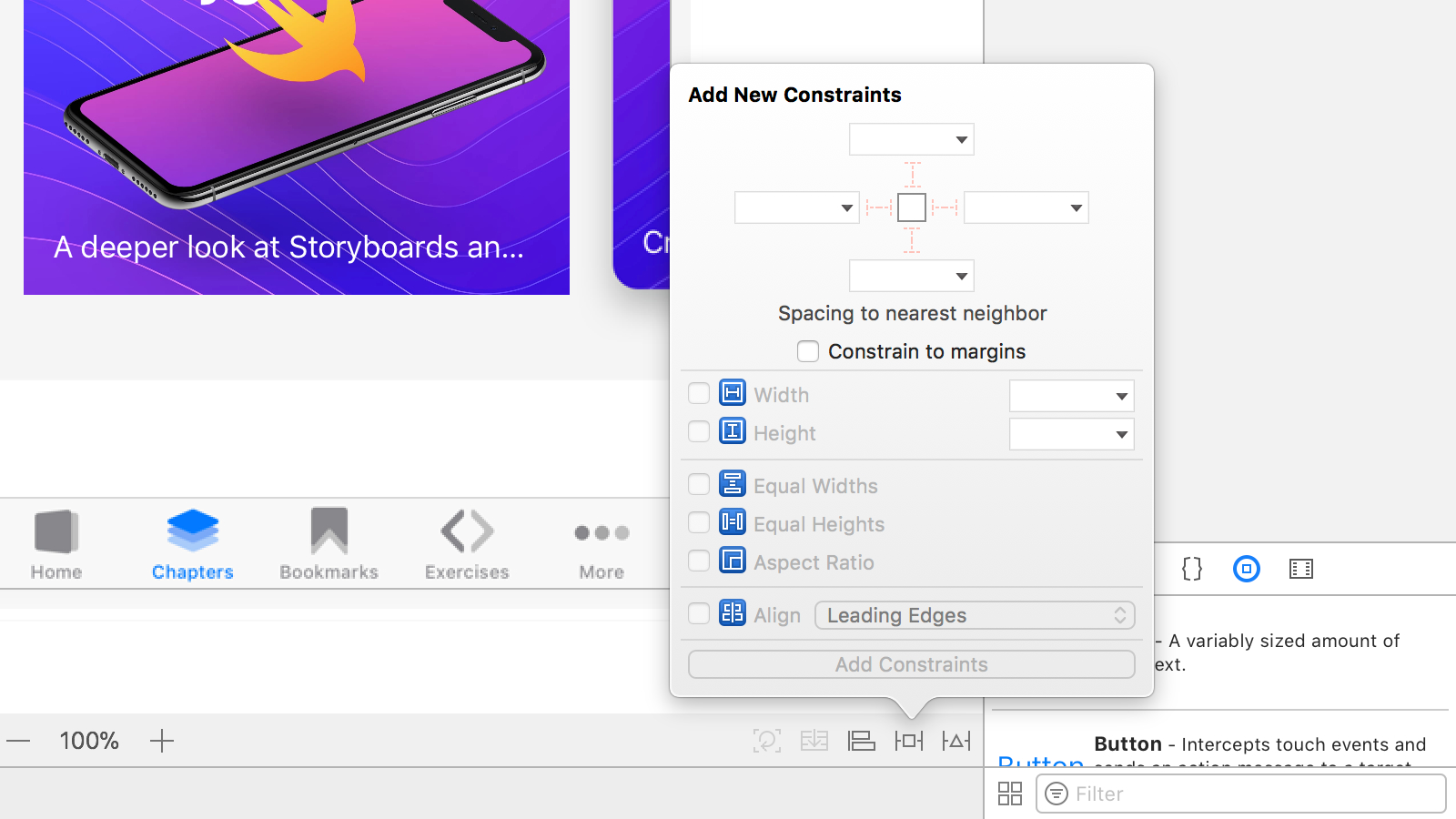
In this section, we encourage you to use the Add New Constraints dialog. It’s a helper that makes it easy to create constraints simultaneously and helps avoid unwanted behavior in Xcode’s automatic layout resolution.
Card
Let’s start by placing a View on top of the Cover Image. Select the Cover Image and trigger Editor > Embed In > View from the menu bar. Set its background color to White color and activate Clip To Bounds. Also, constrain it by left 20, top 256, width 300 and height 250.
That is going to be our card and contain all of its subviews. Using the Identity Inspector set the label field to Card View and create a Runtime Attribute of layer.cornerRadius valued to the Number 14
Finish by moving the Cover Image to its center and constraining it to all sides.
Title
Then we place the title using a Label. Filter for Label and place one under Card and edit its content to “Storyboard in Playground”. Change it to be a White Color 32 point System Font Bold. Also, set its number of lines to 0 so that it can resize itself.
Center it on the card and constrain it 16 points from the top, left and right. Let’s name it Title in the Identity inspector.
Subtitle
Do the same for the subtitle. Filter for Label and place one under Card and edit its content to “A deeper look at Storyboards and the view hierarchy”. Change it to be a White Color 17 point System Font. Also, set its number of lines to 0 so that it can resize itself.
Center it on the card and constrain it 16 points from the bottom, left and right. Select its bottom constraint and, using the Size Inspector, set its relationship to the Cover Image.
Let’s label it Subtitle on the Identity inspector.
Close Button
Now, we place the button filtering Button on the Object library. Remove the text from it and constrain it at 28 points in width and height and 20 points from the right and top. Also, set its image to be Action-Close@2x.png. Don’t forget to set its initial state to hidden under the Attributes inspector.
To make it more visible, let’s set a background color of 50% Black and, using the Identity Inspector, set a Runtime Attribute of layer.cornerRadius to the Number 14. Also, set its label to Close Button.
Labeling Constraints
We have created a lot of constraints for out card view. When doing a complex layout, the Document Outline may get a little out of hand when we reach some 20 constraints. To help manage that we are going to label them for easy identification.
Card Layout Constraints
Let’s begin by selecting the constraints for the top, leading, width and height of the Card View and changing their names to Card Layout Top, Card Layout Leading, Card Layout Width, and Card Layout Height.
Cover Image Constraints
Do that same process for the Cover Image constraints. Rename them to Cover Image Top, Cover Image Leading, Cover Image Trailing, and Cover Image Bottom.
Opening the card
Similarly to the last part, we are going to lay a couple of constraints that describe layout. Only this time, the full-screen layout. These new constraints are going live harmoniously amongst all the previous ones.
To make this possible, we are going to uninstall some of the constraints we already have, create new ones, decrease their priority and reinstall the uninstalled constraints. This process will help us build a conclusive layout using the minimum required information with no conflict.
Fullscreen Card
Select all the Card Layout and Cover Image constraints and uninstall them simultaneously using the Attributes Inspector.
Resize the Card
Resize the Card so it fills all the canvas size and set its constraints on top, bottom, leading and trailing to Superview. Prioritize them at 999 so they don’t conflict with the constraints we just turned off.
Cover Image
Select the Cover Image and constrain it to 420 height. Then edit this constraint to be Less Than or Equal to 420.
The Cover image now grows vertically to as much as 420 when the card unfolds.
Fitting
Then, simultaneously reinstall the leading, trailing and top constraints of the Cover image. Also, reinstall the bottom constraint, but first set its priority to 998.
The Cover image now has the same size as the folded card without competing with other constraints such as its maximum height or its superview's height.
The Switching States
To test how the layout works, we could try a neat trick. Installing and uninstalling the Interface Builder.
Select all the Card Layout constraints, and install and uninstall simultaneously using the Attributes Inspector. We can see how the layout is going to look at the two states of the animation.
Nice, right?
Controller
We’ve already established all we need for the animation to work. Now, we need to wire it to our controller.
Classes declared inside a playground file are not yet available to a .xib file inside a Playground. To work around this, we have already declared a subclass of UIViewController on a source file under the playground sources. It’s the Card Controller we have already reviewed in the previous part.
@IBOutlet public var card : UIView!
@IBOutlet public var closeButton : UIButton!

@IBOutlet public var cardConstraints : Array<NSLayoutConstraint>!

@IBAction open func tapCard (_ sender : AnyObject) {}
@IBAction open func tapClose (_ sender : AnyObject) {}
This class is the open class from which we already derived our own. It’s solely a bridge between the .xib file and the playground’s main file. Apart from that, you might already know how to link elements to corresponding @IBOutlet and @IBAction statements. These statements are the hints Xcode uses to determine what variables and functions Interface Builder may set up.
Let’s go back to the View.xib file and wire things up. In the Outline view, we already have the File’s Owner set to be a Card Controller. Let’s complete the required connections.
Connections Inspector
Select the Connections Inspector with the File Owner selected. There should be a lot of connections, many of those placed by us.
Connect the card, closeButton and view to its corresponding counterparts on the Outline.
Outlet Collections
Under Outlet Collections, you will see there is a cardConstraints. This item is a special outlet for it can connect to many items. Connect it to all Card Layout constraints.
Close Button
Let’s also connect our tapClose action to the Close Button on the Outline using the event Touch Up Inside.
Tap Gesture
The last step is to go to the Object Library and filter on Tap Gesture Recognizer. Move it to the outline on top of the Card view. It should automatically be connected as a gesture recognizer to the Card. Also, connect its selector to the tapCard: action on File’s Owner.
To have the playground acknowledge all the changes we have made to the View.xib file, save it and close the playground. Reopen it and go back to the playground’s main file and trigger the Live View.
Activating and Deactivating Constraints
We have everything from Card Controller file wired up to View.xib.
Bundle.main.loadNibNamed("View", owner: self, options: nil)
As you may remember, upon loading the view from the View.xib file, we have it set as the File Owner. This will automatically give us access to the attributes such as card, closeButton, cardConstraints, and receive tapCard: and tapClose: actions.
The connections, view creation, and layout are what essentially happens under the hood when using Storyboards.
Overriding Functions
We’ve already tested and proved that by installing and uninstalling certain constraints, we can switch between the closed and open state of the card. Now, we need to find a way to do just that on our view controller. A way to do it is to override the tapCard: and tapClose: function. Begin by setting their overrides inside the View Controller class:
override public func tapCard ( sender : AnyObject) {

}
override public func tapClose ( sender : AnyObject) {

}
Opening
For it to unfold, the Card Layout Constraints have to be deactivated when the card is tapped. Symmetrically, we reactivate them to fold it back again. Luckily, we have already set a card constraints variable.
Deactivate them inside tapCard: like this:
NSLayoutConstraint.deactivate(cardConstraints)
closeButton.isHidden = false
Activate them back again in tapClose like this:
NSLayoutConstraint.activate(cardConstraints)
closeButton.isHidden = true
In this part, you can see that the View Controller will activate and deactivate the constraints that make the layout look like a card according to the action that was called while also showing and hiding the closeButton.
Finer Details
Our interaction already opens and closes the card. Still, we have some layout inconsistencies while also doing the interaction with no animation. Let’s fix that.
In the tapCard function we should animate like this:
let animator = UIViewPropertyAnimator(duration: 0.7, dampingRatio: 0.7) {
    self.closeButton.layer.opacity = 1
    self.card.layer.cornerRadius = 0
    self.card.layoutIfNeeded()
}

animator.startAnimation()
Symmetrically, let’s do the opposite for tapClose:
let animator = UIViewPropertyAnimator(duration: 0.7, dampingRatio: 0.7) {
    self.closeButton.layer.opacity = 0
    self.card.layer.cornerRadius = 14
    self.card.layoutIfNeeded()
}

animator.startAnimation()
This View Property Animator will interpolate all the values changes inside it. Additionally, when UI Kit tries to layout the card on layout if needed, it also animates the constraint changes.
Conclusion
iOS and Xcode have a lot of untapped possibilities and functionalities, among those is the use of Storyboards in Playgrounds as a method of prototyping and learning about how the technology works.
In this section, we’ve learned not only how to coordinate those two features together but also demystifies some of the allure behind how Interface Builder’s Outlets and Actions work. We also saw how solving layouts and layout animations is part of Auto Layout functionality.
Don’t forget to review the final playground and see if you can improve. There are countless ways to do the same layout, all with its potential and drawbacks.
Credit
Special thanks to Tiago Mergulhão for co-authoring this section.