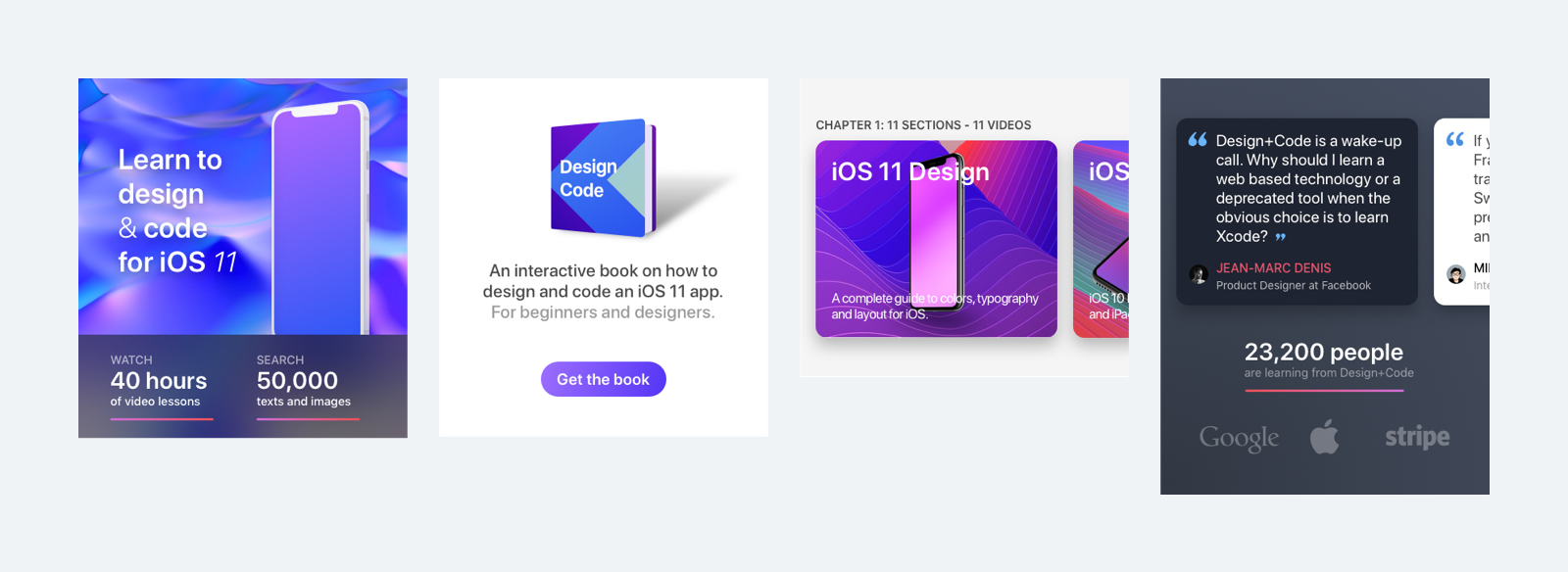
Design+Code Home Screen
We will be designing the new Design+Code Home screen in this tutorial. It contains a hero image, headline, introduction, call-to-action button, chapter and people section.
Setting Up the Basics
It is recommended to design at 1x size because it will be easy when you are exporting assets to 2x and 3x. We are going to use iPhone 8 at 1x (375x667) for this Home screen design.
Create an Artboard
Create an Artboard by choosing Insert › Artboard from the toolbar, or press A. A list of preset Artboard sizes will appear in the Inspector on the right. All these dimensions are already at 1x. You can change to Material Design or Responsive Web from the drop-down, along with a toggle for Portrait and Landscape orientations. Click on the iPhone 8 from the list and Sketch will create an Artboard for you.
Layout Margin
In this Home screen, we use a layout margin of 16px from the left and the right. Like this we ensure that the user interface stay focus in the middle of the screen and doesn’t look cramped against the edge.
Choose View › Canvas › Show Rulers or press Control R to display Rulers. Select the Artboard, move the mouse over to the top ruler and click at 16px area; you will get a vertical guideline. You can draw a 16px box, select it, move the mouse over to the top ruler, and the line will snap automatically to the edge of the box. With this, we can make sure the line is in the right margin.
Rulers Guide
You can change the color of the Rulers guide by going to Sketch Preferences › Canvas › Guides and click on the color palette. We use Magenta because it has more visibility when you are designing in Sketch.
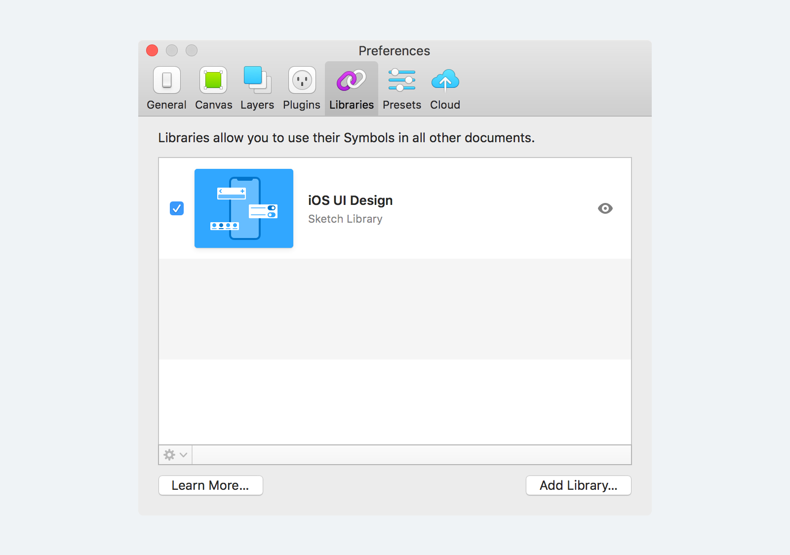
iOS UI Design Library
Because we’re designing an iOS app, we try to make the design as realistic as possible. We can use the Sketch preset iOS UI Design library to grab elements that we need. Go to Sketch Preferences › Libraries to make sure the iOS UI Design library is enabled.
Status Bar
We need a Status Bar for the top of the screen. You can find the Status Bar in the Insert menu at the Toolbar. If you’ve installed Sketch Runner, you can search it easily. Go to Plugins › Runner › Run… or press Command + ‘ (apostrophe) to activate Sketch Runner. Select the Insert tab and type the keyword “status bar black” and double-click the Symbol and then, place it in the Artboard.
Replace Symbol
Our hero image has a dark background, so it is good to change the Status Bar to the white version. So, we can have a better contrast on top of each element. Right-click the Status Bar and go to Replace With › iOS UI Design › Bars › Status › White and click on it. Now, you have a white status bar on the Home screen.
Hero Section
Our Hero Section has a background image, headline, and some stats. We can draw the user attention to start exploring the app by using an attractive headline, real statistics, and a beautiful background.
Insert a Background Image and Masking
Your image might not be cropped in the exact screen size as your design. You can use Masking to place the hero image layer in a container. Draw a container using the Rectangle tool and then, put your image on top of it. You can drag the picture from anywhere on your Mac and drop it in the Sketch Artboard, or you can just copy the image file by pressing Command C and then go to Sketch and press Command V to paste it in the Canvas.
Once the image is inserted in the same Artboard as the container, select both of them, then right-click and choose Mask in the context menu. Now the layer at the bottom, which is the container, will become a Mask for the image. Adjust the image to the position as you like.
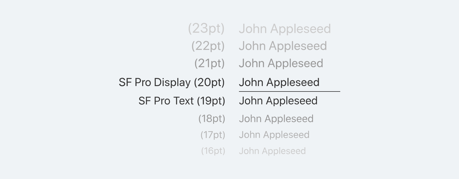
San Francisco Font
Next step is to put the hero headline. You can use a larger font size for the headline. It is hard to choose a suitable typeface and also not recommended to use more than two different typefaces. If you’re not sure which font to use for iOS app design, you can always go with Apple’s San Francisco font. The San Francisco typeface was designed to be highly legible at both small and large sizes. For font size equal to 19pt and below, you can use SF Pro Text; for font size equivalent to 20pt or above, you should use SF Pro Display. Download the San Francisco family of fonts or read more about it in the Apple Human Interface Guidelines.
Insert Headline
We are going to insert “Learn to design & code for iOS 11” as the headline. Go to Insert › Text or press T to start typing. Resize the text container to match the background image so that you won’t cover up the iPhone mockup. You will notice that we’re using a different font weight and style for the headline. With this, we can make the headline looks more exciting and less monotonous.
Drop Shadows
The headline might look too flat on top of the hero image. You can add a Shadows to the text layer and give more depth between the text and image. Select the text layer, go to the Inspector panel and click on Shadows. A default value of Shadows will be applied to the text. Make some adjustments to the Shadows so that it will look smoother and natural.
Statistics and Background Blur
I’ve done the one statistics section with a dark background, but it doesn’t look appealing to me. What we can do is to make it half transparent and then, add a Background Blur to the dark background. Select the dark background layer, then go to the Inspector panel and change the Fills Opacity to 50%. Then, click the Gaussian Blur drop-down and choose the Background Blur and set the Amount to 24px. Now, the statistics section looks more appealing.
Finish the Statistics
Let’s finish up this statistics section by completing the second stat on the right. Since the layout of the stat is pretty much the same as the left one, we can duplicate it by selecting it and hold the ALT key to drag it to the right. Now, we can start inserting the correct text for this stat.
So far, we have completed all the elements of the Hero Section, and we should group all these layers into one Group called “Hero Section”. That way, the file is more organized.
Get the Book Section
We have completed the Hero Section. Let’s move on to the Get the Book section. In this part, we have a book image, a short description, and a call-to-action button.
Consistent Spacing
Having a consistent spacing in the design will make your layout look more clean and legible. This can help users have more breathing space to consume the content in the app. We are using a 50px padding around the Get the Book section. Between the book image and descriptions, there is 20px. Between the description and the button is 50px.

Call to Action Button
Apple highly recommends to size all the controls at a minimum tappable area of 44pt x 44pt. With this, users can efficiently tap and interact with the buttons in your app.
Type “Get the Book” for the button label and then, set the font size to 20px. We can draw a shape with a 44px height and put it behind the text layer. Give the button a 20px padding to the left and right. Add a radius of 44px to make the button rounded. Align the text in the center of the button and apply a color to it. Here we apply a gradient for the button. While selecting the button, click the Fills color in the Inspector panel and choose the second option, Linear Gradient. We apply #9C6FFF for the left and #5334F5 for the right in the spectrum of colors. You can adjust the position of the gradient by dragging the top dot to the top left and bottom dot to the bottom right. Lastly, change the text color to white. Now, we have a good looking and approachable button.
If you are not sure what color to use for the buttons, we recommend using blue. About 50% of apps made by Apple uses blue for their controls.
Chapter and People Section
We are going to use a Card-based user interface for the Chapter and People section. The card-based design model is used almost everywhere. Card contents are easy to digest, visually appealing and flexible for different kinds of screen sizes from iPhone to iPad and Desktop. All these factors make card design popular and with a great usability.
Card-based Design
This card design is going to be used multiple times in the Design+Code iOS app. We will need to convert it to Symbol. The Chapter card content includes a section title, description and background image. Select all the relevant layers for the Chapter Card and click Create Symbol from the toolbar to convert them into Symbols.
Duplicating
Once we have done converted the card into a Symbol, we can start duplicating more to the right. Like this, the users can swipe left to view more cards.
People Cards
Finally, we have the card design. Repeat the same workflow for the People section card design. For that section, we use a darker background color so that it can be contrasted against the Chapter section. We also show this section in the footer. Our goal is to show the number of readers and the well-known companies that read the Design+Code too. With this, the Home screen is done!
Credit
Special thanks to Pizza Yap for co-authoring this section.