Navigation Menu
The website doesn't have Tab Bar. A navigation menu is always on top of the screen and this is convention style and behavior adapted by users. Most importantly, we should design a easy-to-use and intuitive navigation menu for the users.
Scrolling
Scrolling is conventional for websites too. People always worried about what if the user doesn't scroll their website and stop at the above the fold, but the research results show that everybody scrolls. Scrolling is quite cool nowadays if you’re doing it right. For example, one of the famous scrolling patterns, is the Parallax Scrolling, it’s always used by Apple on their product details page. We are fond for the Parallax Scrolling and you can see it live on our Design+Code website.
Scrolling is a continuation; clicking is a decision. — Joshua Porter
Typography
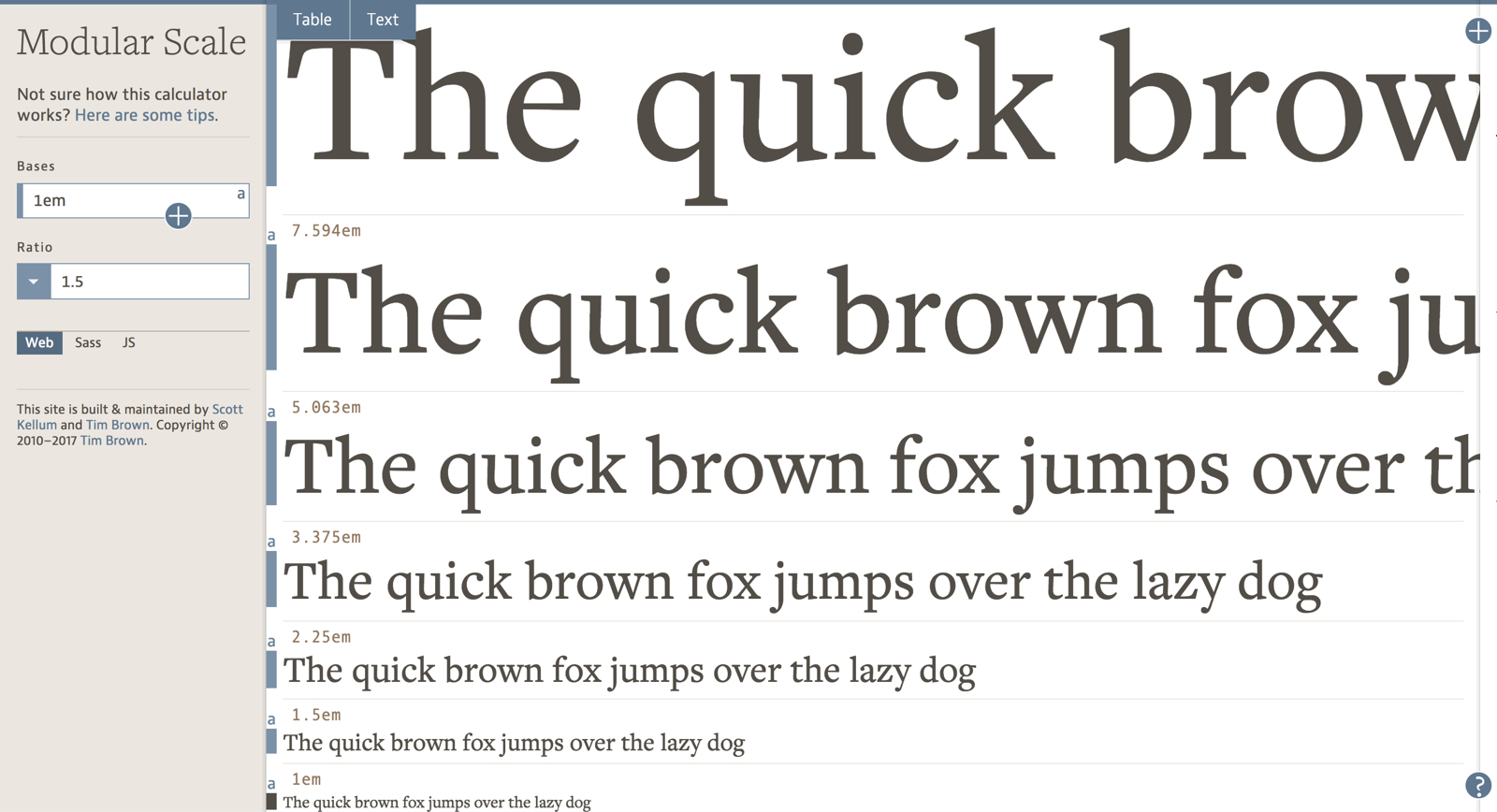
Another thing to take note is Typography because it is one of the most noticeable elements in your design. For iOS design, there is a typography rule like 17px for the body text, 34pt for the large title. The web is using a similar strategy, but the base body text is 16px, this is easy for web development because of 1em = 16px. You can learn more about Web Typography here and here. There is no maximum size for the large title, and you can go crazy until 200px font size. There’s some websites using the large title, and the results are fantastic!
A Wild Wild West for Web
Apple has a Human Interface Guideline for iOS design, but there’s not an actual standard guideline for Web. So we’re free to use any techniques that have wow effects yet user-friendly. Primarily your design should provide a similar experience, regardless of the device they are using.
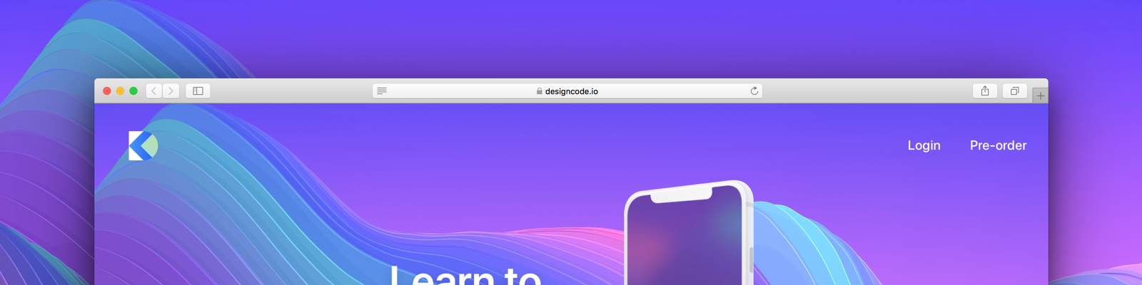
Enough talking, let’s start designing the Design+Code landing page! You will need to download the assets required to follow this tutorial.
Grid System
Setting up a Grid System for your web design is a good practice and very helpful when you're designing for various screen sizes. It will help web developers to match your design. There are some commonly use Grid System you can refer to the web, from 8 columns up to 16 columns grid. If you’re not sure which Grid System to use, you can stick to the 960 Grid System that enormously used on the web. Otherwise, you can go with the default desktop 12 columns grid from the Bootstrap Framework. Ultimately, you can customize your own Grid System for your design, and there’s no limitation to this.
Regular Grid & Layout Grid
Let’s create an Artboard in Sketch by pressing A. Choose Responsive Web from the preset drop-down menu and select the Desktop HD (1440 x 1024) as our Artboard for this tutorial. Select the Artboard, then go to the top-right of the Sketch app Toolbar, you will see the View drop-down button there and click on it. The Grid Settings is to set Regular Grid for the Artboard. Usually, we won’t use Regular Grid because Layout Grid is a better option to apply in the Grid System.
Choose the Layout Settings and then, a modal will be slide down. You can define columns and rows. When grids are applied on the Artboard, any objects will snap to the grid when you moved it. You also can change the Colors of the grid and the Visuals of the grid to Fill Grid or Stroke Outline. Once you’ve set up a Layout Grid, select the Artboard and click on the View in the Toolbar to choose Show Layout to view the Grids on your Artboard. Or, you can simply press Control L to toggle the Layout Grid.
Using Rulers to Customize Grids
We’re using content width concept for the homepage Grid System. We have 1000px, 800px, 640px and 480px of content width. You can use Rulers to draw the guidelines and treat it as the custom grids to achieve the Grid System.
Let’s draw four rectangle with the size of 1000px, 800px, 640px and 480px on the Artboard respectively. Then, align all with the center of the Artboard. Press Control R to activate the Rulers. Select the first 1000px rectangle and hover to the top of the Rulers bar. The guideline will be snap automatically to the edge of the rectangle, click on the top Rulers bar, and a guideline will be created. Repeat the same method to create guidelines for all the left and right edges of the rectangles. Now, you have a set of custom Grid System for your design, and we are going to use this guideline quite often in this tutorial.
Hero Title
There are Logo, Top Navigation Menu, Hero Title, iPhone X Mockup, Video Button, Stats and Background image in the Hero Section. You can get most of the assets from the assets folder that you have downloaded.
Top Navigation Menu
The navigation menu on the Design+Code website is relatively simple. We only have a logo on the top-left, Login and Pre-order text button on the top-right. The Design+Code logo serves as a back to homepage button too.
First, draw a rectangle by pressing R, set it to full width and the height to 800px. We will use this rectangle as a container for the Hero Section.
Let’s insert the Design+Code logo to the top-left of the Artboard and resize it to 44 x 44px. Give it a margin of 40px at its top and the left. Then on the right side, insert two texts “Login” and “Pre-order” by pressing T. Set both of the font size to 20px SF Pro Display Medium and in white. Give 40px right margin for Pre-order and also 40px gap between Login and Pre-order. Vertical-center-align both of the text layer with the logo. You can draw a rectangle and use it as a bound for the logo and the two buttons, uncheck the Fills because we want it to be transparent. Group the logo, the two buttons and the bound, name it “Top Navigation”.
Background Image and iPhone X Mockup
Copy and paste the background-1.jpg to the Artboard. Resize the background image width to 1440px so that it is full width on the homepage. Then, copy another image iphone-x.png and paste above the background image and place it within the 640px grid. You will notice that the background image height is taller than the Base layer. You can right-click the Base layer and set it as a Mask. Group all the Top Navigation, Background image, iPhone X mockup and the Mask and name it “Hero Title”.
Hero Text and Text Style
There is a text file that has contents for the hero section. Copy the text “Learn to design & code for iOS 11” and paste in the Hero Title group within the 640px grid. Set the font size to 64px SF Pro Display Semibold in white color. Resize the width of the text so that it won’t overlap with the iPhone X mockup. The text is too flat in the background, and we can add Shadows to give the text more depth. Select the text layer, go to Inspector panel, and you can find Shadows in one of the options below. Click on the + icon and change the color to #5E37C4 with 100% opacity. Also, change the values to X:0, Y:20, Blur:40, Spread:0. Now, the Hero Text stands out more than the previous style.
We will use this header style for other sections too. To keep the style consistency, we can create a Text Style. Once the Text Style is set, you can apply it to other text layers to get the same style across the document. Let’s say you have multiple text layer are using the same Text Style, and you change one of its properties. You can update them with ease by just clicking the Refresh icon beside the Text Style. Let’s select the text layer, go to Inspector panel and click the No Text Style drop-down, choose the Create New Text Style from the menu. Just name it as “H1”.
Stats
Next, is the Design+Code statistics. We can attract people by placing those figures above the fold. All of these Stats are real data from Design+Code! You can copy the stats text in the assets folder 1. Hero Title › content text file. There is three stats content, and each of them contains three text layer. Let’s do the first stat, below is the font value for each of them:
- Watch: 15px, SF Pro Text Medium, White with 60% opacity
- 44 hours: 30px, SF Pro Display Bold, White
- of video lessons: 15px, SF Pro Text Medium, White
Stack these three layers from top to bottom and align left to each other. Next, draw a line with 130px of width, 3px of height , 3px of Radius and place it under the “of video lessons” text layer with an 8px gap. Change the color to gradient by clicking on the Fills in Inspector panel and choose the second option: Linear Gradient. Zoom in the line and move the top dot to the left, bottom dot to the right, with this, the gradients will appear from left to right. Set the left gradient color to #C86DD7 and the right color to #E95054. Group the three text layer and the line and name it “Stat”. Place them within the 640px grid with a margin-bottom of 40px.
Convert Stat to Symbol
We can convert the Stat group to Symbol because it is going to be used for other statistics content too. Select the Stat group and click on Create Symbol in the Toolbar. Now, you can duplicate the Stat Symbol and put in the text accordingly.
How to Choose Gradient Colors
If you cannot decide on what gradients to apply, you can try to decide on one color first. Then, change the value of H, which is Hue in the Color Picker. By default, the Color Picker is in RGB values, but we prefer to set the color with HSB. You can toggle between the RGB and HSB by hover to the RGB/HSB label, click on it and it will toggle accordingly. Let’s say you have decided the first color with #C86DD7, then select another gradient dot and set it as #C86DD7 too. Now, you can increase or decrease the Hue value to find the perfect gradient color that you like. This is our favorite tips for choosing gradient colors, or you can go to the Grabient website to use the gradient color you want.
Hero Body
In the Hero Body section have a short description, a call-to-action button, and other discount info. This section will place within the 480px grid.
Let’s increase the height of the Artboard first. Then, insert the image-book.svg and image-book-shadow.png from the asset folder 2. Hero Body. Place the Book image in the center of the Artboard with a 120px top margin. Then, put the Book Shadow behind the Book and adjust accordingly.
Next, insert the text which you can get from the assets folder. Below are the Typeface, Weight, Font Size and Color for each of them:
- An interactive…: 32px, SF Pro Display Semibold, Black, Center Align
- Early access and Launch 11.14: 24px, SF Pro Display Regular, #888888, Center Align
- $12.99… and Plus, get 20% off…: 20px, SF Pro Display Regular, #888888, Center Align
For “An interactive…”, “$12.99…” and “Plus, get 20% off…”, resize their text container width to 480px, so that it is easy to snap within the 480px grid. For “Early access” and “Launch 11.14”, set their text container width to 240px, which is half compared to other text layers then, arrange them side by side. Give a 24px top and bottom margins for all of these text layers.
Strike a line for the text “$12.99/month” and “$150” because this is the future pricing for the Design+Code after the pre-order period. Select the text and go to Inspector panel, click on the Option and choose the fourth option which is the Strikeline icon. We also bold the “Sketch”, “Angle” and “Paypal” text because it will be a clickable link on the actual website.
Call-to-Action Button
The last thing for Hero Body section is the call-to-action button. Insert the text “Pre-order for $50” and set its font to 24px SF Pro Display Semibold white and center align. Draw a rectangle with 60px height and 30px of radius. Vertical-align the text in the middle of the rectangle and increase the rectangle width so that the text has 30px margins on the left and right.
Let’s give the button a Linear Gradient. Move the top dot to the button top-left and the bottom dot to bottom-right. The color on the left is #9C6FFF and on the right is #5334F5. Add a Shadow and set to black color with 15% opacity, X:0, Y:10, Blur:20 and Spread:0. Now the call-to-action button is more prominent. Lastly, group the rectangle and the “Pre-order for $50” text and name it “CTA”, an abbreviation for “Call-to-Action”. Then, align this button with the center of the Artboard and place it in between the “Early Access” and “$12.90…” text. Group all the elements here and name it “Hero Body”.
Demo Section
Next is the Demo section. In this part, we have the video demonstration of the Design+Code iOS app and a few reasons of why people should purchase the book. Since this is a Sketch mockup, we can’t insert a video file into Sketch, but what we can do is add an iPhone X mockup of the app.
Let’s draw a full-width rectangle with 700px of height and give a 120px spacing away from the Hero Body section. Insert the “background-2.jpg” image from the “3. Demo” folder to the top-right of the rectangle and resize it to 1440px width. Select both the rectangle and the image and click on the Mask icon on the Toolbar. Following by insert a title in this section which is “Design, code this app.” and apply the H1 Text Style for it. Align the title to the center of the Artboard and a 80px of margin-top.
Next, copy the “iphone-x-big.png” mockup and paste on top of the section background image. Align it with the center of the Artboard and leave 40px of margin-top to the title.
Demo Body
Below the iPhone X frame is the placement of contents which will be sitting inside the 640px grid. Insert the first content from the assets folder “3. Demo › content”. For the title, set it as 20px, SF Pro Display Bold, #5856d6 and change the text width to 160px. For the description font, set it to 24px, SF Pro Display Regular, black color and change the width to 448px. For the “Why Pre-order?”, give a 32px margin right to the description. Select both of this two text layer and click Align Top, leave a 40px gap between the iPhone X frame. Lastly, group both of the text layer and name it “Demo Reasons”. Then, you can repeat the same workflow for rest of the contents by duplicating the Demo Reasons group. Once you finished, just group them all as “Demo Body”.
Cool, now we have finished the Hero Section, Call-to-Action Section and Demo Section. In the next Design for Web Part 2, we will cover Chapter Section, Benefits Section and the Footer. By then, you will have a final design of the Design+Code landing page in Sketch!